Hacker News new | past | comments | ask | show | jobs | submit login
Ask HN: What are good high-information density UIs (screenshots, apps, sites)?
474 points by troupo 1 day ago | hide | past | favorite | 353 comments
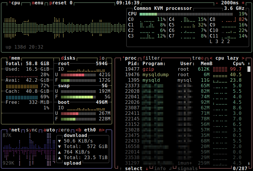
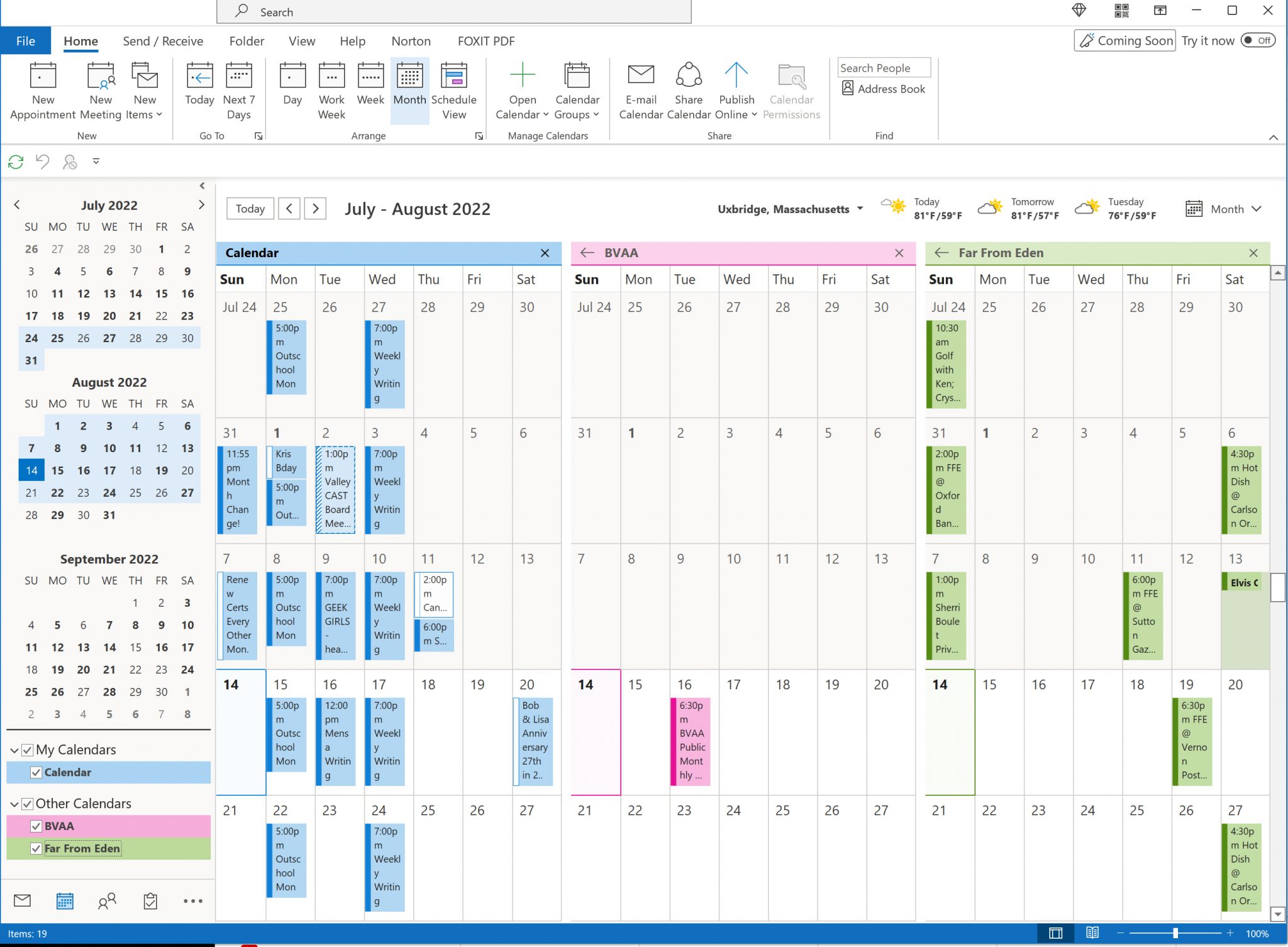
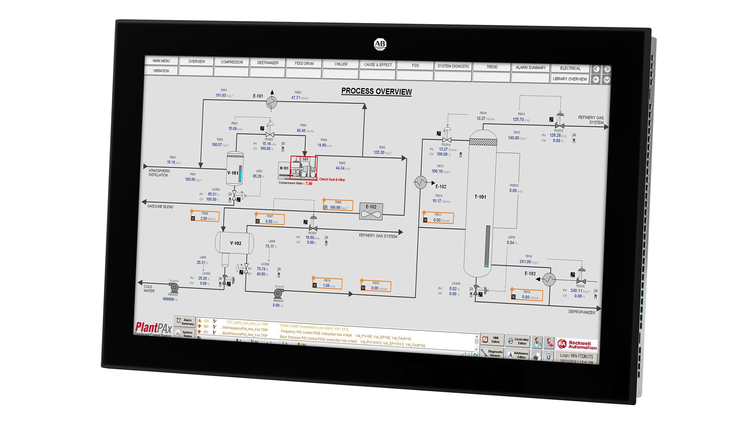
Just yesterday I tried to find examples of good high information density UIs... and seems to be an impossible task.

Search engines are full to the brim with vague articles repeating each other's talking points, and exception being this blog post by Matthew Ström: https://matthewstrom.com/writing/ui-density/

Image search is no better, with largely irrelevant results.

In the age when everything is spaced out and zoned out gray on gray, what are your go-to examples of UIs that pack a lot of info?


I didn't see anyone mention the McMaster-Carr website [1]. It may not be the "densest" out there, but it's clean, functional, and nicely presents a lot of information at once.

[1] https://www.mcmaster.com/


There is (was?) an absolutely fabulous answer on quora.com which detailed how this site came to be --- from memory:

- initial ecommerce site was a mess (basically a page-by-page recreation of the catalog?) which saw minimal usage

- the redesign, which focused on usability --- notably reduced cognitive load --- resulted in an immediate uptick in orders which grew markedly for a long while until it represented the vast majority of their business EDIT: and also optimized for repeat orders on a schedule

If someone could find that, or a better writeup, I'd be grateful (it's _not_ the Medium.com article) and this page: https://iacollaborative.com/work/mcmaster-carr/ is just a mentioning by the company which did the underpinnings, not the overall architect. This link is decent: https://www.bedelstein.com/post/mcmaster-carr

There was of course previous discussion of this here:

https://news.ycombinator.com/item?id=34000502

Video on why the site loads so fast:

https://www.youtube.com/watch?v=-Ln-8QM8KhQ

(which is from the Medium.com article)


I did some searching and I'm not sure the answer you remember exists. All I can find after a bunch of keyword + date-restricted searches in Google, Quora, & HN is Ibrahim Bashir (https://www.quora.com/Who-designed-UI-UX-and-developed-the-w...) who worked there 2003-2005 (https://www.quora.com/How-many-people-work-for-McMaster-Carr...) and who writes:

> McMaster-Carr has a Systems department which handles internal software development, including the website. I actually worked on a lot of the front-end functionality (among other things) during my tenure there and we had 1 person who was essentially the UX lead (I'm sure the team / function has expanded since then). > > The design philosophy for the website was heavily influence by Edward Tufte and myself and several folks from my engineering team were enrolled in his course to familiarize ourselves with key concepts. > > When I interviewed with McMaster-Carr I distinctly remember a Director who told me about building the first version of the website himself and not realizing it would become "a real thing" one day. I cannot for the life of me remember his name, but he was a sharp guy and I'm sure he's off doing great things. We walked into work one Monday morning, and his desk was empty and his whiteboard said "poof".

Given the timing and his description of what he did, it seems unlikely any other McMaster-Carr insider would have been writing about it, and this has to be what you are remembering, if anything.

(And https://iacollaborative.com/work/mcmaster-carr/ seems useless here.)


This suggests having your front-end and design staff take Tufte's trainings would not be a bad investment.

Absolutely agree --- they are _amazing_ sessions, and if you can't make it, the books are highly recommended:

https://www.goodreads.com/author/list/10775.Edward_R_Tufte


Are the classes still offered? I was looking to take it a few years ago, but couldn't figure out how to sign up. It seems like only video lectures are available now.

Still seems worth it, just wondering


Good question.

Now that I think on it, I haven't seen an ad for them since before the pandemic, so I guess not (in person).


Tufte's books should be essential reading for UX designers.

That's it! Thanks!

I wonder how much additional traffic, links, seo benefit and general brand awareness this site has generated simply off doing things to this standard.

A fly wheel of benefits.


Actually, I'm pretty sure I've never seen a McMaster link in any search engine. Even if you google a direct McMaster part number, like "91251A449", McMaster will not be among the results. While the url to that product is just https://www.mcmaster.com/91251A449/

No idea if intentional or not, but the reason is this noindex directive:

    <meta name="robots" content="noindex, noarchive, noimageindex" />

If you have a lot of product pages (millions) it can make sense to not have all of them indexed by a search engine. If you have pages that are more profitable and might hit more keywords than some very specific product SKU it makes sense to index these primarily.

"Black oxide screw" on the other hand appears.

Those numbers could be anywhere, on completely unrelated things. They are not a good search query.


Maybe, but I never seem to have trouble searching for even further incomprehensible part numbers on other items. Give me a DigiKey part number like "WM7610CT-ND" and google finds it first thing. Digikey is also the first result for the manufacturer part number "0533980671".

For my McMaster example, google gives 9 results, none of which are the McMaster site. That not specific enough? To be fair, I believe McMaster to be fairly protective of their catalog.

At least their part numbers are fairly recognizable - they are usually about 10 characters long, all numbers, with an "A" near the end. That's usually enough to get me to check the McMaster site first.


There's an interesting dynamic here: if McMaster part numbers are searchable on Google, people are going to use Google to search for McMaster part numbers, rather than the McMaster site itself. Which gives all its competitors a chance to bid on those long-tail keywords, or optimize for them.

On the other hand, if you train people that if you want to use McMaster part numbers, you have to use the McMaster site... once you have a customer, as long as your site and inventory don't frustrate them, you have a customer for life.

You're sacrificing inbound for retention, in a highly measurable and testable way, for your unique audience and/or subsets of that audience. I have no doubt this is by design.


This… is brilliant. Google and Facebook are highly lucrative because they designed a system where your profit margins (as a business) are largely sucked up by Google and Facebook by making you bid against your competitors at higher and higher values until someone is willing to give up almost all of their margins to be the top bidder for the favored “top spot”.

Hypothetically, if you make $1 in profit on your product, theory says that some competitor will bid up to $0.99 to secure that sale and if you don’t bid this amount also, your sales will suffer.

The end result is that Google and Facebook end up consuming all the profits for a large number of businesses online that have to survive by advertising, which explains Google’s immense profit margins.

Assuming what you say is true, this is truly a ballsy move by McMaster. Betting that their website is unassailable by their competition and thus such a value-add that they can forgo playing the losing game that Google and Facebook has setup is brilliant. I have such respect for that.


Great post very interesting thanks

I am not here to shill for Google, but I cannot believe that Google doesn't have a special arrangement with McMaster to index all of their part numbers! The advertising potential is very good. As a related point, I am almost sure they have special handling for programming searches to prefer StackOverflow over other sources. A few times, SO.com has made some incredibly tiny change to their webpages that made them virtually invisible to Google. After some internal email exchanges, SO.com was "fixed", and again, dominated Google programming searches. (Of course, this was 2010s... long before the AI slop era!)


If you don't care about SEO, Single-page Applications usually reach the same feeling? when the components are well designed, and clicking something just fetches the parameters for the components that are primarily loaded on the initial render. But usually the implementations are poor or there is additional bloat so we don't see them as fast.

So, SPAs are the communism of the web app world?

I have no idea what you mean.

I assume the analogy meant, "It's great in theory, but in practice no one does it right."

I'm going to go against the crowd and say that I prefer DigiKey and Mouser's sites over McMaster. The filter/apply pattern they use when trying to narrow things down is a lot quicker than waiting for Mcmaster's auto updating window. Usually, when I'm looking for something, it's not for an exact specific item, but to know what options are even there in the first place. Selecting ranges of things in McMaster has always felt a little cumbersome, but Digikey has always had it right.

The other thing McMaster does that's kind of annoying, but also kind of funny, is that they go out of their way to purge the branding of the items they stock. Very understandable why they do that, but sometimes they do it when it doesn't make sense. Want to buy a generic "graphing calculator" for $126 which is definitely not a Texas Instruments TI-83 Plus? Here you go! [1]. Look, you're not fooling anybody here.

[1] https://www.mcmaster.com/8392T11/


The calculator is an extreme example, but I've wondered in the past if the reason they scrub everything is so you can't take the manufacturer part number to buy elsewhere. McMaster is undoubtedly more expensive in many cases, but the service they offer is consolidating a million parts into one catalog with CAD drawings, specs, etc. Hiding branding prevents you from taking advantage of that without making a purchase.

I spoke to a McMaster web team member at a bar. They told me that the real reason there's usually no brand information is that they buy the same bolt (for example) from many different suppliers to guarantee availability.

They will only put a brand on a product (example: 3M DP420) when it truly comes from a single source and has special meaning/implications.

That said, I order tens of thousands of dollars of McMaster Carr items each year. They almost always come in packages from the OEM with OEM part numbers. So if I want more bolts like that, I just look at the box they were delivered in. The info is just not on the web interface.


It's pretty much the same business model invented by the Sears Roebuck Catalog. For many years everything was pretty much unbranded, then they created "White Label brands" like Craftsman (and a few others) which grew to become standalone consumer brands which have outlived the parent.

IMO digikey has a better search than McMaster, but McMaster has a much better interface for filtering categories to find what you want.

I think everything McMaster dates to it being a physical book first. They still operate on that same business model, but we have the internet now. The supplied product might change, but it still meets whatever specification is in the catalog that is released yearly. If they could guarantee a TI-83 Plus was what you were going to get they would have put it in the catalog, but they couldn't so they don't. And they STILL operate out of that physical book for some customers, so the website has to match it too. That's my take.

Oh yeah, the books are impressive in their own right. However many items you think they sell looking at the website, the book reveals you were a couple orders of magnitudes off. 1000+ bible-thin pages of well laid out tables and product photos. It's pretty much what the website would look without any filtering of the items.

The books are fun to leaf through on occasion, or if you need to take up an extra 3 inches on your bookshelf with something yellow. If you have one, it makes you feel like a real engineer. But I greatly prefer the website.


The old grainger catalogs were like that. Uline is similar but not even 1/4 the number of products.

I kind of like how they genericize everything. It reduces the cognitive load of making decisions, and presents all of the options in the most uniform way, based on their hard specs, and not marketing BS.

It's ok most of the time, but it's not like they sell McMaster branded stuff in McMaster packaging. They are a supplier, and might want to obfuscate to keep you from buying direct from the actual manufacturers.

On the other hand, on my desk right now is a bag of springs, the info printed on it says it was made by WB Jones, part number 4011. We ordered it from McMaster. Why not? They stock the item and ship super quick. If I want another bag of the same springs, it's not like I can go to McMaster, type in "springs 4011" and expect to find it. Instead, I'll have to search up purchasing requests I've made, maybe ask a coworker if they ordered them, etc. to find the mcmaster number again. If I didn't know Mcmaster sold it to us, I'd have no idea they sold it at all.

To be fair, if they sell things that are interchangeable, like screws, it would be a lot to list every manufacturer they use. They have 5 locations, and probably stock from a different manufacturer or multiple manufacturers at each one.


Buying from McMaster is like ordering mil spec part numbers. You don't really care who makes it or what vendor-specific p/n they give it, you just want the part built to spec for the cheapest price and soonest delivery date.

What you're looking for is rockauto.com but for your industry.

In my opinion it is superior to McMaster


Well, on McMaster you don’t really need to know the brand because they only have good stuff that meets spec.

On RockAuto, watch out, because they stock some hot garbage.


McMaster serves a different market than Digikey/Mouser...

It’s one of the first examples in the link the OP shared. It’s a high quality post!

And there's something utilitarian in its internal and external design. No flashy, no fancy.. 99% informational and low lag.

The low lag part is especially impressive. Here is Wes Bos taking a deeper dive into the intricacies of technologies used to accomplish this: https://www.youtube.com/watch?v=-Ln-8QM8KhQ

I've always assumed that making a fast and responsive website isn't a technical problem, but a social/political one.

It's easy to create a website where interactions simply fetch the necessary resources and update the DOM as required. But managers then insist on adding 20 trackers so every little click and interaction gets logged somewhere for analytics.

Or are frameworks REALLY that slow?


> Or are frameworks REALLY that slow?

Of course they are. There's a significant overhead from a virtual DOM and reconciliation with the real DOM. Then there's the larger overhead from relying on JavaScript for everything. The JS VM in modern browsers is very performant, but it can't optimize poorly written code, whether that's from frameworks, the gazillion libraries modern web sites depend on for analytics, trackers, ads, shims, helpers, etc., and, of course, any custom JS specifically written for the web site.

Browsers can enable very rich and responsive interfaces, but web development is bogged down by the insane state of popular frontend stacks. There's a recent trend of rejecting this insanity (htmx, Nue, Datastar), which I hope gets us on a track where we optimize for user experience using native web technologies.


I remember people digging into this because it used good sense over vanilla js instead of complicated stack.


tl;dw - ASP.net, image sprites, yui, jquery, preloading, and caching

the also use asp.net

Similarly good, but small mechanical component specific: https://shop.sdp-si.com/

I have written a couple internal parts databases and this was my starting point as far as design/UI/UX.

I love McMaster but the multi-tab experience could really be better. Search filters don't carry through opening a link in a new tab (try searching M3 screw then ctrl-click socket head screws). Sometimes ctrl-clicking product numbers/product detail doesn't work at all. IIRC the back button sometimes breaks too. Pretty annoying since 80% of the time I'm researching the best component and want to backtrack easily.

Part of its pleasure is the way it reduces an intrinsically dense catalog of parts to such a consistent and sensibly-structured interface.

Even though it’s never failed to connect me with precisely the part I’m seeking, to this day their interface spooks me a little: where are they hiding the endless walls of text and part numbers, the kaleidoscopic wall of bins?!


Absolutely! Every time I see it mentioned, I end up browsing it just marveling what a nice job they did. It's laid well very well, has just the right information, it's lightning fast, I like the color scheme.

If there is a UI design award somewhere, they should definitely get it.


RS is similar though was better in the past

example: https://uk.rs-online.com/web/c/?searchTerm=zync+7010


It’s one of the most purest Web adaptations of an existing product catalog I think there is.

of of course, RockAuto.com

one of the most unconventional websites ever for sure

Very ext.js looking.

Wow that’s beautiful. The grayscale works surprisingly well with high fidelity. Thanks for sharing

And here is a knock-off of the McMaster Carr UI built with Next.js:

https://github.com/ethanniser/NextFaster


There is a project that implements the site in Next.js https://github.com/ethanniser/NextFaster

This was absolutely amazing to navigate on mobile! Very fast. Instant response. Loved it.

This is incredible. Almost feels like another world.

I particularly enjoy Rock Auto’s website as well.

Absolutely no BS. It dumps you right onto the list of car makes.


Look for tracing/profiling/binary analysis UIs:

- https://superuser.com/questions/1117466/using-windows-perfor...

- https://github.com/wolfpld/tracy

- https://github.com/WerWolv/ImHex

3D modeling / CAD software:

- Blender/Rhino etc

- Similar for audio you can search for 'DAWs' (https://blog.landr.com/best-daw/)

Many examples on https://x.com/usgraphics/media only some software.

Not on the data side but can be useful just for contrast from todays software:

- https://www.zachtronics.com/wmp-skins/

- https://cari.institute/aesthetics


Agree on DAWs. Even though I'm familiar with the general concepts, every time I try out a new one (Logic, Reaper, Ableton), it's quite overwhelming at first. You have a pretty good idea about what's supposed to be there, but the sheer amount of knobs and buttons... But once you get in the flow, you quickly find out it has all the information you need, nothing more nothing less, it becomes second nature.

(Notable omission: GarbageBand. It has the opposite effect, it instantly puts you into action, but becomes more frustrating the more you use it.)


Ardour has really good default settings.

Another, maybe forgotten one is Wavosaur on Windows [1]. Great modularity, one can quickly remove cruft that's not needed, or add a lot of data on waveforms when necessary. I admit being a fan of the Classic Windows era UIs, though. :)

A third, also forgotten one from the Win2k/9x GUI era is maybe Waveshop [2], also a great example of keeping things simple.

Funny thing: I used Reaper for years (occasional pro-level radio production), then had to switch to Pro Tools because of studio demands. Afterwards tried going with Reaper again, but got really overwhelmed with all those endless possibilities for customization. So... I ended up using Ardour, which was easiest to grasp from day one. Really well thought out and polished GUI. Possibly a great example of why it makes sense to have a subscription/payment based, non-free open source project.

Oh, and Audacity up to version 1.26 was also great. After 2.x, it started to add bloat IMO. I remember Eric S. Raymond highlighted it as a great example of modular, unix-y design in "The Art of Unix Programming" [3].

1: https://www.wavosaur.com/

2: https://victimofleisure.github.io/WaveShop/

3: http://www.catb.org/esr/writings/taoup/html/ch06s01.html#aud...


Logic Pro X really impressed me with its accessible UI. Yes, there are a lot of functions, but they don't get in the way, and the important ones are fairly discoverable. Reaper, OTOH, not so much. Its routing is ... flexible, but unfortunately also in places where it doesn't matter, or even gets in the way.

DAWs and audio plugins are a good example. Digital audio workstations can be somewhat varied in UI, but plugins can be vastly different from each other even for two of the same tools.

Creating intuitive interfaces for complex technical controls is challenging. Fabfilter has been a popular developer for years. Oeksound and Denise Audio are great examples too. Newfangled Audio makes good stuff and their limiter elevate handles multiple pages well. They all pack parameters into tight, cohesive UIs that look good and remain intuitive.

Fabfilter often uses submenus that can feel convoluted, but they're arguably necessary given their plugin's depth. Denise Audio takes a different approach with standard, simple UIs across their product line. Everything is visible with no submenus, though they may offer fewer controls overall.

Deciding what controls to expose and how to organize them intuitively presents a unique challenge. Multiple pages like how Newfangled does it works well. I don't find Fabfilter's submenus to be the best but that's often because they are unlabeled and use small, unique icons that are hard to grok. The overall UI for primary features is usually quite good though.


Renoise is a DAW with a very high density tracker UI that I think works well. It is a bit friendlier to new users than any oldschool tracker I have tried to use.

https://www.renoise.com/products/renoise


I like that the U.S. Graphics Company link has a bunch of TUI examples.

htop came to mind.

https://htop.dev/

Here's a gallery of a bunch of TUI apps.

https://www.linuxlinks.com/100-awesome-must-have-tui-linux-a...


https://ui.perfetto.dev/ is also good in this line.

heh, I worked on that one so I didn't feel like I should put it. I'm happy you thought of it though.

I love Rhino's CLI-focused UI. Too bad it is nearly impossible to run it on Linux with Wine [1]

[1] https://github.com/smola/wine-rhino3d


have to agree with you on the DAWs. The first time I opened FL Studio I felt like I was looking at an aircraft's control panel.

The zachtronics website is completely broken on mobile with constant full-screening images, had to re-open my browser to exit..

As someone who recently tried to use Blender for an extremely simple task... Blender's UI is absolutely terrible and should not be used as an example of anything except how to design an unintuitive UI.

Professional tools are often made for the efficiency of a professional user and are hard to grok at first glance. Other examples from the parent, like DAWs, suffer from this and Blender is no exception. By all accounts it used to be a lot worse.

I think intuitiveness and density are orthogonal properties (although often both desirable).

Regarding Blender specifically:

Do you have a background in 3D modeling?

I am genuinely curious.

I don't come from an digital art background and I bounced off Blenders UI several times but after doing a tutorial or two now I find I can use it for simple things. I have always wondered how much it was 3D modeling in general vs. Blender specifically.

In a similar case I have used both Inkscape and Illustrator as an amateur and, much as I love open source, there is no comparison. Illustrator was significantly easier to use and worked better.


It is geared towards keyboard use, but I agree, the UI is not structured very well - too much mystery meat!

Sometimes I watch HOWTOs with Blender and it says stuff like "Hit NumPad +" and it makes me think, damn they going to tell me to start using the META key next?

I am developing this project, which replaces product lists with what I call "product charts":

https://www.productchart.com

The idea is to sort products not by one parameter (like price or release date) but by two - which creates an x/y chart. The product info is displayed dynamically - by default only the image is show. On hover, more info is displayed in a tooltip. And when you click "details", all data is shown.

This way, 300 products easily fit on the screen.

You need to watch it on a monitor to see the chart interface. On mobile, I just display a normal list.


Nice idea. I worked for a while on a "computer blue book", e.g. to answer the question how much a laptop of given specs should cost.

For something like laptops, I recommend providing the option to look at a CPU benchmark score. A list a CPU models isn't super helpful, and even then a "intel i5" can mean something very different depending on the generation.

To me there seems to be a vast overemphasis on screen specs (7 spec lines)


You made some other projects too to search movies for example right? I can't remember the name at the moment.

edit: found them.

https://www.gnovies.com/ and https://www.movie-map.com/

There are other projects to find music and art too. I have only used movies one a number of times.


Yes, these are also projects of mine.

I wonder if you can help the user move between a 'must have' filter (like on the left) and a looser 'pefer' filter, like choosing an area of the chart (like Select in paint apps.) Maybe it could be as simple as changing the checkmark/slider options to have 3 values: null, must, prefer. For example, check a few CPUs as your required spec, but also a few others as the prefered.

Like/dislike might be a better description. Then make the chart show color or size to indicate the preferences.


Great website, the monitor section does not easily cover the use case of macOS users. We want Retina grade displays (5K at 27-inches, 6K at 32-inches). I don't think you even have Apple's monitors?

Yes, product selection is not perfect yet. I originally set out to display the 300 most relevant products in each category. It is probably better to have a larger set of products in each category.

I will tackle that. Not sure yet how hard / easy it will be. Because more than 300 items on the screen initially might make them too small. And adding more as one uses the filters might be confusing.


Oh and that drive (https://www.productchart.com/ssd_drives/22778) is marked as 20$ per GB, when it's a 1 TB drive for 50$. Many drives have the same problem.

It is 20 GB per Dollar.

Oh hell, I was parsing it backwards.

I like your project. If I may suggest a feature, DPI option in the side panel would be valuable to me. I won't consider any products that have a screen with less than 220 DPI (e.g. laptops, tablets, monitors etc).

All categories with screens (laptops, tablets, phones, monitors) have the option to switch the axis to "pixels per inch". Hover one of the axis arrows with the mouse to select it.

Does that help?


This is good. The users this caters to are also higher than normal earners. Hate to ask, but what is the monetization plan?

Affiliate commissions and license fees from companies who want to use the interface for their use-cases.

Probably affiliate commission

Good idea, but wow, the popup mechanism is obnoxious. It needs to be off to the side in a fixed location that doesn't obscure what you're looking at, or make you chase the 'Hide' button with your mouse.

Hmm... the way I use it is that when I put the mouse on an item, that is the one I am looking at. So it is fine that some others are hidden. And when I want to see all items again, I move the mouse into an empty area (usually right next to the item I just looked at) so the popup goes away.

Also, I usually use the filters first. Say for laptops, I set the screen size to >=12inch and the weight to <=3pounds. So there ain't that many items left on the screen.

Do you use it differently?


Assumptions about how users will interact with your UX always end up badly.

I saw the "big grid" and was curious, so I hovered on the icons, moving along a line, just to get an idea of what the thing does. Doing that, I kept accidentally moving the mouse pointer off-axis so it went into the popup, and was "stuck" there, until I dragged it outside the popup again, and promptly lost track of what I had already glanced at.


This makes sense. One suggestion would be to add a "Click to hold" button, which will push the dialog pop-up into a corner, maybe in a condensed view, and allow you to select more items. Then you can do a selective comparison of multiple items at once.

"Click to hold" isn't a good name for the feature, but hopefully the idea makes sense.


Have you seen the "compare" button in the popup when you hover an item? It lets you highlight multiple items and compare them later.

I did, it just seems to highlight the items in the view? I was hoping to see all of the dialog boxes at once, somewhere. I'm using a laptop FYI so have plenty of screen real estate for that

It highlights the items, and the highlighted items are than offered as a comparison when you hover other items.

I like it. I wish the larger image would immediately vanish after I scroll off rather than take a few seconds.

Great way to present a large amount of data though


this is great!

I call it Trader UI vs VC UI. Traders want as much info jammed onto the screen as possible. VC backed companies use bootstrap, and want rounded corners on a pricing page with little actual information.

I have been working on Buckaroo, a table UI for dataframes that runs in jupyter notebooks. It's much more TraderUI, with sparkline size histograms, and decent baked in formatting for numeric columns.

https://github.com/paddymul/buckaroo


Another way of breaking this down, is UI that gets out of the way, and UI with a big ego.

So many SaaS business tools have ego-driven UI, where it's all about keeping you in the tool, increasing engagement, etc. The problem is that people buy business tools to improve their productivity, the best tool for a business is one that requires zero time to use and provides some value. You want to get in, get value, and get out as quickly as possible so you can move on to delivering value to your business.

Slack used to be good at this when it was just about IM, but then they became all about replacing other forms of communication... the problem is they weren't as good, some email does need to be email. Engagement went up, but "managing Slack" was a big time sink. My old company trialled Facebook Workplace, and probably because it was built with a social network mindset instead of a productivity tool mindset, it was an immediate time sink with very little value.

There are lots of examples of the flip side, UI that gets out of the way, but they're usually pretty boring.


When it comes to something you're buying, if it's a novel thing, the vendor wants to "chat" because there is no real market price so they are going to try to rob you. But if it's a commodity, the vendor wants to waste as little of your time as possible because they could otherwise lose the sale to any of the dozen other vendors selling the same thing for the same price.

This is such a nice package, I've been wanting something like this forever. I can't believe how clunky it is to just browse data in a jupyter notebook, given that its entire purpose is for data exploration.

Thank you. I'm putting the finishing touches on auto cleaning which integrates with the low code UI. Should be out today

Can Buckaroo be used outside of a jupyter notebook?

Great work. Buckaroo looks very slick.

Chinese end user UIs tend to all be high-density per local user preference. Take a look at any of the mini-apps on WeChat or AliPay or pretty much any Chinese local app. Almost everything is linked within about 1-2 taps of the front page.

Programs used by pro creatives. Some people regularly spend 8h/day using a single such product as their primary work tool.

E.g. pro desktop versions of photo, print, video, sound, etc editing software usually feature good UX and high information density.

One well known example of that is Blender - here is a chapter from their manual about its user interface: https://docs.blender.org/manual/en/latest/interface/window_s...


I am still hoping that one day we get an open source image editing application to the level of Photoshop (and for Darktable to become as good as Aperture / Lightroom).

One of the things that Blender did right is adhering to industry standards, especially keybinds. When Blender did their huge UI rework they decided to normalize to the keybinds of its closed-source competitors, along with some of the workflows.

Meanwhile open source image editors go out of their way to have keybinds, workflows and button placement that deviate significantly from Photoshop. Smells strongly of NIH.


Did they?

I am only an occasional blender user, but I have been using it a long time. since 1.7

the main key binds I have always used have not changed. tab, g, r s, e, b, A, f, ctl-click to add points.

Are you telling me those are the industry standard keybinds (surprised pikachu face)

One thing I always felt blender did better than the "industry standard tools" was it's quick/natural workflow. I have not used Maya since collage in 2000 but back then it was very clunky compared to blender for quick vertex based editing. My theory is more that the "industry standard tools" caught up to blender. but by then blender had a bad reputation as being quirky, so the "big redesign" was more a press-release. Give it a menu bar make it dark mode and most importantly got to cure that bad-reputation so tell everyone it is completely different now.


What the heck happened to Photoshop and Illustrator (and the whole Adobe suite)? They monochromed all of their icons and removed most of their text and tooltips.

As a casual user, I used to be able to use their tools fairly proficiently, but now I find them virtually unusable.


GIMP did this too.

Bless Irfanview and Inkscape for having color icons still...


Affinity designer went the opposite way and colorized them in 2.0

> They monochromed all of their icons

One reason I heard is that color needed to be removed to not alter your color perception when editing a photo.


Don't hold your breath for Darktable; the devs are hellbent on being as user-hostile as possible. It needs to be forked or replaced to make any progress.

Somebody forked it and was trying to do just that; I don't know the status of that project.

https://github.com/aurelienpierreeng/ansel


There are already two top quality offers available in Affinity and Pixelmator, both for extremely cheap prices. No need for any open source project.

There is always a need for open source software.

Agreed! I use Cinema 4D, Illustrator and other tools on the daily and I love the fact that I can rearrange my panels how I need. That's something that I notice modern web-based UIs based on 1960s gestalt doesn't really have. Plus all of them are dense because of functions, not for fluff. I really, really like Cinema 4D for that reason, their design choices are top notch.

This is the answer! Information density is not inherently a virtue. For many tasks, you want to focus the user's attention, which usually means less density. But professionals often want as much as possible accessible from a single screen, so they don't need to click around too much.

In addition to creative software, look at professional stock/crypto trading platforms, EHRs, POS systems, CRMs, or any software targeted at a vertical—veterinarians, fleet management software, etc. Many of them will run counter to "good UI" best practices. But if you interview their users, you might be surprised by what they love about these interfaces.


"8h" is "a decent 9-to-5 workday". Then you sometimes have overtime...

https://old.reddit.com

We used to have an even denser display, but they sadly got rid of it. It was the original reddit mobile interface (served as a webpage, not an app).

There is a screenshot on this blog post (by one of the guys who worked on it): https://pdx.su/blog/2023-04-06-rip-reddit-compact/


This.

I still use old reddit with RES. It's a bit ugly but perfectly functional. Tried the newer web versions a couple of times over the years and just hate the whole experience.

A couple of years ago I considered building a web client for Reddit but then the whole API thing happened.

Maybe it's time to build a new Reddit? :)


> Maybe it's time to build a new Reddit?

Alexis and Kevin are already trying to do that with the new Digg. ;)


Oh woah didn't know!

> Maybe it's time to build a new Reddit? :)

Lemmy is serving my former reddit needs quite well.


I’m grateful that “compress the link display” still works, at least! Thanks to whoever internally is keeping it alive.

Came here to say the same. Old Reddit is such a fantasticly dense, yet readable UI. It doesn't have too much whitespace, but there is enough so there's always room to click on nothing.

It is absolutely my preferred UI for consuming large amounts of information quickly.


It's not quite like the old Reddit, but I created a userscript[1] that makes the new Reddit interface denser by displaying posts in multiple columns.

[1] https://greasyfork.org/en/scripts/371490-reddit-multi-column


Reddit absolutely dropped the ball with the redesign

The most egregious and unforgivable part of their failed redesign is that they forced adoption by redirecting and walling mobile visits and attacking third party apps.

And the sole motivation for the redesign? Monetize the content users created. More ads. Force you to see images automatically so ad images and videos show up with the “this is an ad” text below the scroll instead of needing to earn your interest and permission first.

As bad or worse than the shift to algo vs time based social content.


And they keep dropping it...

They migrated from that React SPA to Lit web components and the UX still sucks


I'm a rover driver / arm operator for Curiosity and we have several excellent tools that fit your description here at JPL. Chief among them, in my opinion, is RSVP Hyperdrive. See the 5th screenshot on https://www-robotics.jpl.nasa.gov/what-we-do/applications/us... . I'm also a developer on RSVP and have contributed bug fixes and features to Hyperdrive. I'm hopeful we can open-source it someday. (This is my opinion, not JPL or Caltech or NASA's opinion)

This is incredibly cool -- thank you for sharing!

You know, I just took another look at that screenshot and realized it's from a 2012 build. We have added input and output constantly since then... so it's a lot more information dense now lol... probably twice as much "stuff" on screen. I guess it could be considered cluttered now, but I'll take that any day over programs with poor feature discoverability.

Command line system monitoring tools like htop, atop, btop, etc: https://static.linuxblog.io/wp-content/uploads/2021/11/btop....

Cisco IOS, highest density information per screen of old days CLI, like "sh int" (show interface) to get almost all required information at one glance.

Wow btop looks fantastic out-of-the-box. I spent a long time configuring htop and still don't really like how it displays info (although it is an improvement over plain-old top)

Bottom is also great. I switched from btop because I preferred the config format.

https://github.com/ClementTsang/bottom


btop is so good for rapid, dense information communication

glances is my favorite as far a density goes

I recall seeing some discussion about the UI density Japanese websites (specifically Japanese news sites). For example: https://www.asahi.com/ Now that I think about it, news sites in general have fairly high density UIs, not that I consider them to be shining examples of great UIs. https://www.yahoo.com https://www.bloomberg.com/

Regarding Bloomberg, the Bloomberg Terminal is also a good example of a really information dense interface. There is a few videos on YouTube where Bloomberg shows examples of how to use their terminals.

Like this one [0]. I don't understand most of it but I can appreciate how few clicks it takes to get the info you want

[0] https://youtu.be/h0hYYIGryJ4?si=LkBtTVWyomvyEjlM&t=69


Yes, exactly. It probably makes more sense if you understand the terms used in the financial industry. Overall I'm just fascinated by the whole system, everything from the design language, the UI, the infrastructure and the keyboard.

https://kakaku.com (A shopping comparison and review site) has menus not as long as McMaster-Car (down the left side), then more menus in the body and tabs thrown in to boot when you reach a product. Each product page is jam packed with more information. A lot of information yes, good design, not so sure.

re: Japanese web design

https://youtu.be/vi8pyS076a8


The desktop version of Charles Schwab's expert trading platform, thinkorswim. Or TWS from Interactive Brokers. Basically these are trading platforms designed for day traders and the highest end of the retail investors market. These necessarily have to good high-information density UIs: imagine trading an option showing all strikes (SPX has hundreds of strikes), both calls and puts, and showing the option Greeks (delta/gamma/vega) and pricing information (bid/ask) for each option. Then you need to give users ability to quickly send trades. You need to support complex strategies: an iron condor has four legs for example. You need to support complex orders like stops and limits and combinations thereof and these need to be built via an UI with THEN/AND/OCO relationships. Some will want a fast-updating candlestick chart; others will want to see the order book; still others will want to plot probabilities or expected prices using Black Scholes model. It's complex.

You should sign up for paper trading and see these UIs feel like.


I was thinking the same thing. I've used TOS for years (2010) and it is crammed with info while still being fairly easy to use. The fact that you can also group multiple UI elements to always show the same symbol (change one, they all follow) lets you go a bit nuts in the analysis dashboards you can make.

The TOS mobile app is also not too bad. A couple of years ago they tried to add some less data-dense info to the main screen and the they got a review riot which caused them to make the view optional and untouched sense then.

I've got a lot of respect for them being able to keep that UI stable for so long.


One thing I like about TWS is that related widgets (candlestick chart, newsfeed, L2 table, etc.) can be easily linked or separated. For example I can link a chart and a newsfeed together and if I switch the chart to a specific stock the newsfeed will switch over as well. Another commenter has mentioned that this is a TOS feature as well.

Those widgets can be resized and moved around on a grid and I can create different tabs with separate layout for each.


Ableton Live digital audio workstation, is a good example in my opinion. As with many professional tools, there is a steep learning curve, but once you get the hang of it, it becomes very productive. There are many nested collapsible sections, so you can choose to have an all-at-once view or focus on fewer elements.

Here is a blog post talking about the different ui elements http://nenadmilosevic.co/ableton-live-redesign/


Bloomberg is the obvious example.

It is an extremely well-designed and effective high-information density UI designed to be very efficient to use but requiring some skills to get the most out of it.


Yeah, in general financial software designed for expert users (hedge fund managers / traders) is extremely info-dense.

I'm also reminded of World of Warcraft; in my role as a "healer", keeping track of changes to the health levels of maybe 20 other players in a raid (in addition to all the health / spells / weapons / maps / etc for my own avatar's immediate needs) required an impressively info-dense UI.


Bloomberg Terminal was the first example that came to mind for me too:

https://commons.wikimedia.org/wiki/File:Bloomberg_Terminal_M...


Edward Tufte had a good series of books on how to create high density infographics: https://www.edwardtufte.com/books/

However, the books are old and specifically call out the low resolution computer displays at the time. Does anyone have an updated list of references for high density visual information?

Bret Victor's https://worrydream.com/MagicInk/ was a good starting point for me.


Grafana can get pretty info dense very quickly. Try some of the dashboards or the Explore feature here https://play.grafana.org/

I worked there as a product designer for a couple of years, I now work on even more data dense UI in the cyber security domain, e.g. https://elastio.com/blog/cyber-recovery/three-clicks-to-rans...

As with almost all UI design the answer is "It Depends". If you could provide a little more context around the domain you're working in I'm sure I could point you at some specific examples


I think e621 would count. (Disclaimer it's a highly NSFW furry booru so I'm not going to provide a link on HN)

It has has one of (if not) the best tagging systems of any website and between the tags and search filters you can find anything you like.

Each page has a header with useful links, a list of tags to the left, and a grid of paginated images with basic stats on the rest of the page. Click an image and you get a bigger version of it with download options, all of the tags that apply to it specifically, and comments from users.

It's basically as good as it can be.


For weather data, I'm partial to Wunderground's 10-Day forecast[0] view.

In one component you can see temp highs/lows, precipitation, cloud cover, humidity, wind speed, etc. by the hour, for the next week.

Full disclosure: I worked on this as a junior engineer, the lead engineer was fantastic. The code hasn't changed in 10+ years.

[0]https://www.wunderground.com/forecast/us/ca/san-francisco/37...


This page view is invaluable to me for various reasons. I have been viewing it every day for years. Thank you for your work.

So sad when I remember Wunderground and that it's basically dead now :( I still send PWS data though.

See also: NOAA/NWS hourly chart [1], though it's only a 2-day view.

Yours has a much smoother aesthetic, though I could go for either

[1] https://forecast.weather.gov/MapClick.php?lat=44.2705&lon=-7...


Some video games have them, mostly the ones with customizable UIs like Eve Online [0], World of Warcraft and the like.

"Pro" trading websites, for stocks or cryptocurrencies (e.g. Kraken and Coinbase have different interfaces for regular and "pro" users)

[0] https://www.researchgate.net/profile/Panagiotis-Zaharias/pub...

[1] https://mtthwx.com/wp-content/uploads/2018/11/wowow.jpg (silly example)


I find Geizhals' filtering options reasonably compact and information dense. https://geizhals.de/?cat=gra16_512&xf=132_16384&pg=1&view=li...

I like the simple table view of RPiLocator. Only a few columns, but lots of rows, no unneeded clutter. https://rpilocator.com/

Not as compact as possible, but at least shows quite some information: GSMArena. It could fit more phones into the comparison table with less whitespace/greyspace though. https://www.gsmarena.com/compare.php3?idPhone1=10386&idPhone...

All sites as viewed on desktop, on mobile this would likely not work out.

I also want to echo the command line tools mention in another comment. GDB's TUI is reasonable for my use, but after some experience this recently posted terminal debugger might be better: https://github.com/al13n321/nnd via https://news.ycombinator.com/item?id=43905185

Also the hex editor I am currently using, despite some problems: https://github.com/WerWolv/ImHex

An example of an information dense GUI that might be a bit overwhelming is Ghidra: https://en.wikipedia.org/wiki/Ghidra (page includes a basic screenshot, you can fill your screen(s) with as many sub windows and information panes as you want)

As a side note, while trying to find examples I realized just how few websites there are (any more?) that show a lot of information at the same time. Worst recent offender is YouTube's redesign with only 3 video tiles in a row on a 1440p screen, luckily easily fixed via a ublock rule.


English version of Geizhals: https://skinflint.co.uk

Any EMR (electronic medical record) would probably fit this description. For example Epic, the leading one in the US: https://www.emrsystems.net/epic-ehr-software/ Or Orbis, the leading one in Europe: (there's not many good screenshots of it online but this PDF has a few) https://www.bfarm.de/SharedDocs/Kundeninfos/DE/09/2023/32261...

There's a myriad of other ones as well, they all have similar UIs, with the primary goals being to never hide any important info from the user, and to let the user take important actions quickly. That naturally leads to high density. Nevertheless it needs to be reasonably intuitive, since doctors and nurses tend to not be very tech-savvy, which leads to some interesting design constraints.


I worked as an EMR consultant for a few years, helping teach medical staff to use these things. The thing that struck me was that while some of the UIs look "outdated" by web standards, the software often did a great of taking medical staff through their daily workflows. I feel like a lot of websites do the opposite - they look nice, but using them is a pain.

(Conversely, most staff hated new EMRs, because it enforced doing things the hospital wants its staff to do for liability and billing, but the staff doesn't want to do - for example, asking Maternity nurses to talk to new mothers about smoking cessation.)


My mom builds EMR workflows for a major hospital and my father and sister are doctors (both very tech savvy--my sister has a computational bio background for her Bachelor's prior to her MD).

None of them have anything good to say about Epic.


They are infamous for being trash and difficult to use though. There's an entire field of "EMR consultants". It's also why there's a EMR startup on hacker news every other week.

The outcome can vary wildly, even in the same EMR software, depending on the implementing team. I worked a place where it was the implementation team's first time, but they listened heavily to requests from different departments. The most common request was to reduce the number of different views and screens, compared to the old custom software that was being replaced. Resizable fonts without having to change screen resolutions was another one.Staff also wanted to keep the rest as much the same as possible, but add a few little things here and there..

The new EMR software was highly configurable, so lots of this happened. Staff teams signed off on it, and had training from the implementation team.

Fewer screens? Check! …Wellll, sorta: some very long scrolling views…which didn't play nice with mousewheels. It would seem like the page randomly and mysteriously stoppe scrolling, then suddenly scroll normally. There were lots of weird data entry errors, from all staff, regardless of prior reputation for accuracy. They were just getting used to new software, right? Nope. I tracked this down to the dropdown lists scattered on the long scrolling pages. As a page scrolled, random lists ate scroll events, changed the list item to either the first or last item, then permitted scrolling to continue.

Fonts worked mostly great…except some of the typefaces follow the should-be-criminal design of allowing various characters to to look identical. Font sizing worked as expected. I think Pre-cert desk liked Candara, for the way numbers stood out.

Notes fields…these were our downfall, sometimes multiple times per day. Anything put into them was inserted as raw text into SQL:

Patient said xxxxxxx -- ESR

…or…

something-something 'quoted thing'

…would mean the database locked up, no exams savable or queryable, no patient intake, no checkout until I.T. admin could fix it. The implementation team was gone, and non-responsive, so sticky notes with a list of forbidden characters seemed to be everywhere.

I believe some contracts for referrals were lost, due to delays and errors. Some staff quit, after months of no fixes. But I later heard from one of the most affected staffers that the same EMR software was installed at our biggest competitor, and no issues at all.


If you are looking for a UI framework, checkout IBM Carbon: https://carbondesignsystem.com

I used it to build a merge conflict tool: https://codeinput.com and while it required a much deeper understanding than just reading the docs (tons of bugs), it is by far the most comprehensive UI framework out there. Most UIs either lack lots of components or are made by a couple front-end/react/css guys. This inevitably means that they lack research into things like typography, accessibility, patterns, etc..


Lol, they managed to use the word "AI" 12 times in the landing page of an UI framework...

"AI" on landing pages is doing numbers of reps the old "seamless" and "effortless" tag-team could only dream of. I hate it.

I thought about carbon too, but unfortunately it gives me extreme IBM cloud ptsd. The number of bad associations products building on that design system have to start with is probably not worth the time savings.

Palantir's Blueprint UI toolkit might scratch the same itch if you're looking to build very functional, dense UIs: https://blueprintjs.com/docs/

Not even close to the IBM one. Think of icons/pictograms or animations, you can have use a library for that but you'll have to do your own custom styling to match it with your theme. Carbon is the most encompassing one that comes with lots of things you might need that are already integrated in style and patterns with the core framework.

I am not sure there is that many people (beside IBM) that are using it. In fact, they have a pretty much dead Discord channel with very few users. My only explanation was either people didn't like the very corporate style or that it had a steep initial cost to implement.

> but unfortunately it gives me extreme IBM cloud ptsd

Sure. It did give me some of that PTSD but then every UI framework I struggled with had lacking that gave me severe headaches. At some point I realized that Carbon is not that bad after all.


I brought it to production and had to fork some packages due to incomplete APIs, and there was a lot of glue code and writing custom components because the existing ones didn't meet my needs. It looks great but in the end it took more of a backseat than I'd have wished. But under the hood, the architecture of the current major version is great. Clean, modern best practices, especially regarding styling.

I'm working on a Hacker News front page with the idea of UI density as a foundational concept.

https://hcker.news

I haven't did a Show HN yet but I'd love to get some feedback on it first.

It's got a lot of configurable views and can be made extremely dense (dense mode on + columns: auto). The aesthetic itself was made to deviate as little from the HN frontpage as possible.

It's got a lot of filtering knick knacks like being able to view by top comments/points, view hn as a timeline of top stories by comments or stories or view hn by top n over day/week/month/year/custom.


One of my biggest gripes against HN's front page is that there's so little context to go on --- just an <= 80 character headline, often not especially informative.

My own news-page rewrite includes several paragraphs of lede context, which is probably a bit on the overkill side. But a hundred characters or so should help.

I'm also wrestling with the sort-order aspect. Current cut is time-ordered within sections (another thing I wish HN had), but I'm going to be extending the article count in the next iteration.

That said, your design is clean and light, I like it.


Thanks! Great to hear it.

  > My own news-page rewrite includes several paragraphs of lede context, which is probably a bit on the overkill side. But a hundred characters or so should help.
Stay tuned, I've been thinking about the right way to do something like this too.

  > I'm also wrestling with the sort-order aspect. Current cut is time-ordered within sections (another thing I wish HN had), but I'm going to be extending the article count in the next iteration.
Hope you don't mind if I email you later for new feature feedback.

  > That said, your design is clean and light, I like it.
Thank you.

A key problem with extracting article context is that there are so many distinct sources.

That said, power laws and Zipf functions apply, and a large fraction of HN front-page articles come from a relatively small set of domains. There's further aggregation possible when underlying publishing engines can be identified, e.g., Wordpress, CMSes used by a large number of news organisations, Medium, Substack, Github, Gitlab, Fediverse servers, and a number of static site generators (Hugo, Jekyll, Pelican, Gatsby, etc.).

I suspect you're aware of most of this.

I have a set of front-page sites from an earlier scraping project:

(For the life of me I cannot remember what the 3rd column represents, though it may be a miscalculated cumulative percentage. The "category" field was manually supplied by me, every site with > 17 appearances has one, as well as several below that threshold which could be identified by other means, e.g., regexes on blogging engines, GitHub pages, etc.)

  Rank  Count    ???  Site :::: Category
  ------------------------------------------------------------- 
     1  7294   5.175  n/a :::: n/a
     2  3803   7.873  nytimes.com :::: general news
     3  3495  10.352  techcrunch.com :::: tech news
     4  1580  11.473  arstechnica.com :::: tech news
     5  1344  12.426  bloomberg.com :::: business news
     6  1288  13.340  wired.com :::: tech news
     7  1171  14.171  wsj.com :::: business news
     8  1099  14.951  youtube.com :::: video
     9  1026  15.678  wikipedia.org :::: general info (wiki)
    10   921  16.332  bbc.com :::: general news
    11   911  16.978  bbc.co.uk :::: general news
    12   893  17.612  theguardian.com :::: general news
    13   866  18.226  washingtonpost.com :::: general news
    14   846  18.826  reuters.com :::: general news
    15   829  19.414  economist.com :::: business news
    16   781  19.968  theatlantic.com :::: general interest
    17   631  20.416  arxiv.org :::: academic / science
    18   628  20.862  npr.org :::: general news
    19   622  21.303  nature.com :::: academic / science
    20   614  21.738  newyorker.com :::: general interest
    21   505  22.097  eff.org :::: law
    22   475  22.434  stanford.edu :::: academic / science
    23   471  22.768  ieee.org :::: technology
    24   456  23.091  reddit.com :::: general discussion
    25   448  23.409  amazon.com :::: corporate comm.
    26   445  23.725  microsoft.com :::: technology
    27   416  24.020  theverge.com :::: tech news
    28   410  24.311  venturebeat.com :::: business news
    29   408  24.600  quantamagazine.org :::: academic / science
    30   407  24.889  cnn.com :::: general news
17,782 sites in total, if I'm reading my past notes correctly.

More on that project in an HN search: <https://hn.algolia.com/?dateRange=all&page=0&prefix=false&qu...>

(Individual comments/posts seem presently unreachable due to an HN site bug.)


Further thoughts on article extraction: one idea that comes to mind is including extraction rules in the source selection metadata.

I'm using something along these lines right now to process sections within a given source, where I define the section-distinguishing-element from a headline URL, as well as the plaintext, position (within my generated page), lines of context, and maximum age (days) I'm interested in.

That could be extended or paired with a per-source rule that identifies the htmlq specifiers which pull out title, dateline, and byline elements from the source.

A further challenge is that such specifiers have a tendency to change as the publisher's back-end CMS varies, and finding ways to identify those is ... difficult.

But grist for the mill, at any rate.


Please add an option to kill the gutter space. You want density and get rid of a substantial part of the viewing space with empty space on the sides.

thanks for the feedback. you can now kill the gutters!

That's great! An API for the filters would be nice so i could bookmark it.

Thanks! By API, do you mean you'd like to have bookmarkable filters so you can always return to a particular view?

The official HN front page is already pretty good on UI density, so it’s promising that you’re using that as a starting point.

Is there any chance https://hcker.news is related to https://hckrnews.com? The dense layout feels similar.


I haven't set up my about page yet but I was going to attribute much my design to their page. I've taken a ton of inspiration from hckernews.com because it's the front page I always frequented prior to making this. My primary issue with it was that I wanted more sorting capabilities (aggregate mode), and wanted to be able to see the highest engagement threads (by comments).

Very cool. I have something similar that's more of a running timeline than a view of the front page. I need to work on the controls so you can better specify thresholds.

https://hnr.app

(hckrnews.com credit in footer because I also found it helpful)


this quite nice as it reminds me of a good ol rss reader.

regarding controls, one of the dumb reasons i wanted to remake hckernews is i don’t like the two taps to change the view.. im happy with the brutalist settings panel up top.


How do you decide which stories to include in the list for a given day, and how to rank them?

In timeline mode, it's just a pure top 10/20/50/100 stories by points (or comments, if chosen) for each day (in your time zone). The stories are presented in chronological order in which they were submitted (top is newest).

The timeline view can get wonky when it's like 12AM-2AM when there are relatively few stories in "today".

  Misc:
  1) it doesn't filter out flagged stories
  2) second-chance pooled items, should they rise in ranks, will be shown on the day the item was originally submitted, not the day it got popular.
I may do to a "rising" type of view but I'm curious about what others want to see first.

Thanks for keeping the HN API open for these alternative UIs.

I think more of this is probably in HN's future, if it's to thrive long-term.

On first look this looks slightly more usable that hckrnews.com, which I'm currently using(mostly).

It would be perfect(for me) if it had some more (light)themes, with yellow-brownish background, like 'manila paper', or something like that.

Will continue trying it out.

Anyways, thumbs up so far...


Added a manilla theme, let me know what you think of it!

Yes. Acceptable. Though it's looking slightly orange/apricot/peachy. But that's in line with HN, so be it ;>

Thank You!

Edit: After a few minutes I'm thinking its better than both hckrnews.com, because that has too bright BG, and less disturbing than HN, because no jump between grey borders and that pale yellow they use. MUCH LESS annoyance/eyestrain.


Awesome. I'll try use the manila theme and tone it down if the peachiness bothers me too.

Also, I'll also have to fix the fact that I've been misspelling "manila". Feel free to email me (in the about page) if there are any other features you'd like to see.


You gave me some more ideas.

Christitus Winutil https://github.com/ChrisTitusTech/winutil

https://i.imgur.com/v9RiOUI.png

Windows MMC consoles like Computer management, Cert manager etc.

https://i.imgur.com/MqbpdBe.jpeg

Windows ADUC Attribute Editor and ADUC in general

https://i.imgur.com/VWrONfD.png

Anything for Windows 2000s server admins before 2012 destroyed the UI


Chrome debugger tools? htop? visidata [1]? Clicker games are interesting in that they start bare and end up filling the screen with controls. Rerun visualizations come to mind too [2].

--

1: https://www.youtube.com/watch?v=N1CBDTgGtOU

2: https://rerun.io/viewer


I'm not sure this is what you're looking for, but these two come to mind:

- Mixx: https://mixxx.org/screenshots/

- darktable: https://www.darktable.org/about/screenshots/


shout out to mixxx, a truly excellent piece of free software

Mixxx is fantastic software. Definitely better than the supposed "industry-standard" Rekordbox.


I'd nominate modern fighter cockpits, such as: - Saab Gripen: https://www.youtube.com/watch?v=4QVIMD3DA7I - F-35 JSF: https://www.youtube.com/watch?v=88vCjQ8fCb0

Google now forces designers to make huge interfaces on mobile. Tap targets smaller than 54px get a “tap target too small” penalty applied to the sites usability score. This score in turn can hurt your rankings for mobile searches. Which can in turn damage your business. So what are we to do?

The 48x48px touch target is estimated to be ~9mm. That's tiny for touching by finger, since you can't see through your finger to aim (styluses could do it).

For mobile, look for UX patterns that don't hinge on my big thumb hitting a tiny patch of screen. For example, gestures like swipe to either side to expose actions for item.

Most of the things talked about in this thread are not mobile UIs, and are not limited by such concerns.

And finally, information density can be separate from available action density.


Yeah, I have really big fingers as well. However for web forms, this rule really does make everything look too big IMHO. There are cascading impacts of these decisions as well, a field which is 48px tall must have a significant amount of padding around it as well, to look balanced with the field size. Typically the rule of thumb i've seen designers use is 50% of the field height. When you factor in field label sitting above the field things get even bigger. I did however recently find a pretty nice solution which moves the field label inside the field, allowing for a slightly more compact layout while still hitting the tap target size requirements. https://m2.material.io/components/text-fields#filled-text-fi...

> There are cascading impacts of these decisions as well, a field which is 48px tall must have a significant amount of padding around it as well, to look balanced with the field size.

My podcast app shows a list of episodes etc as just rows with only subtle horizontal lines separating them (no "cards"). There's 3-4 lines of text with just a little bit of whitespace inside each block, a button on the right, and dragging the row left/right shows more buttons. Below the Android-global-convention top nav there's room for 7 episodes on my phone's screen size. I genuinely wouldn't want the text to be any smaller. The screen is not wide enough to use a multi-column grid without wrapping episode title text like crazy. Thus, the only way to compact that more vertically would be not showing as much metadata (date, download size etc seem unnecessary; maybe pinch-zoom to expand details of a single row when wanted). I could accept that, but even then given my not-great eyesight, the icon and episode title take up as much vertical space as the button. As long as it displays a recognizable icon, a two-line title, and duration and current offset, the button will fit just fine.

Mobile just has inherent limitations, both because of small screen size and because of inaccurate pointing.


This is probably the most densely packed ui I have ever used[1] to rename photos from their EXIF data. It's not pretty, but I prefer this over a ten step wizard.

[1] https://www.bulkrenameutility.co.uk/assets/img-bru/darkmode....


Reminds me of finviz's sorting/selection UI for stocks/funds.

oh wow, BRU, I had forgotten about that beautiful beast!

Here is another utility that I use every day: https://www.mythicsoft.com/agentransack/information/#screens...


It's not just information density but rather intended use design. A lot of engineering/manufacturing parts suppliers tend to have good information dense websites that are really catered to their customers for finding parts.

Take mouser.com, digikey.com, grainger.com rockauto.com or mcmaster.com. They all have a bit of a "landing page" but once you go to search for parts you've got something that was really designed to be an intuitive parts search. Compare that with jameco.com which competes with mouser/digikey but has a more classic webshop search system. It’s a bit more frustrating to use.

Some news sites also do a great job of presenting headlines and highlights well in a small area. I think semafor.com is probably my current favorite, but I'll readily admit that it's not the most information dense.

CAD software also tends to be good at this, but that might be just because the UI has chugged along since the 90's. AutoCAD/Inventor/Solidworks/SolidEdge/KiCAD/Altium/Virtuoso are all great examples where if you've got prior experience with them (or even similar software) you can sit down and quickly get up to speed on a project and see what's been done. I think the distinction is that a lot of software/websites are designed to keep the average user focused on a single aspect and so they are designed to either remove or hide the complexity but for more “professional” level tools you need all that data and information. You can probably blame (for better or for worse) material UI for a lot of this spaced-out thing. In my mind that was the first mobile first UI scheme that really took off and it's basically influenced everything that's come sense then. Computer first software might be your best bet to get some examples. Because a lot of the web is mobile first/mobile forward now you probably aren't going to find a lot of examples on that. I would love to see examples of information dense mobile first sites.

A few other examples I just wanted to brain dump:

- labgopher.com

- tld-list.com

- The Bloomberg Terminal

- Ghidra

- Most plane cockpits, especially modern fighter planes if you ever get to see/sit on one.

- A lot of “professional level creative software” – Reaper, Affinity

- Train control and monitoring systems


I find the imgui UIs to be very high density (https://github.com/ocornut/imgui and the gallery issues) See for example the tracy profiler: https://github.com/wolfpld/tracy. It seems the game dev community has pretty powerful tools to understand and interrogate their work.

The Bloomberg Terminal [0] has been very high-density and high-contrast since its early days of being an 80x25 terminal interface. Some would say it's not the prettiest UI (although as a former employee I still have a soft spot for it) but it's incredibly functional and also unmistakeable at a distance.

[0] https://assets.bbhub.io/image/v1/resize?width=auto&type=webp...


https://www.bahn.de/ / https://www.webpagetest.org/result/250508_AiDc5H_8VR/ Huge functionality with minimum cognitive load. IMO a mix of google and yahoo. Also the Android/iOS app of bahn.de is very intresting.

Articles:

- Density and Audition: https://www.nngroup.com/articles/windows-8-disappointing-usa...

- Density is Cultural: https://www.nngroup.com/articles/china-website-complexity/

- Conventions: https://www.nngroup.com/articles/breaking-web-conventions/

- Information per cm² https://www.nngroup.com/articles/designing-effective-infogra...


I initially built https://plaintextsports.com because I was annoyed with how slowly other sports websites loaded, but since then I have come to appreciate it more for the density of the information, and how few clicks it takes to get to the info you care about (usually at most two or three).

Try doing a Google search for "Call center software" or "workforce scheduling software" and clicking images.

They have also been victimized by the designers wanting a ton of whitespace, but those are both spaces where the customers push back.


I worked on software for doctors to use at clinics for a while and hands down those programs have some of the most information dense UIs I have ever seen. Doctors want everything possible on a single screen, it's wild

Unfortunately I don't really know how to get screenshots or examples for you, given the nature of healthcare data privacy and such

But I would suggest searching around and seeing what you can find for clinic software. I bet you can turn something up


I would expect, from past experience, that you'd have at least one fake patient, with made-up details for all tests, images voluteered (and signed off) for the purpse, and other nonce data. (-:

This is a great example!

In the UK, most GPs use SystmOne. Some screenshots:

https://support-s1.ardens.org.uk/support/solutions/articles/...


When people talk about UI information density it always reminds me of this HN discussion about the flight controls on a plane:

https://news.ycombinator.com/item?id=23702560


Garmin's GI-275: https://www.garmin.com/en-US/p/719027

This one 3-1/8" inch instrument displays more than 15 pieces of information, is somehow perfectly legible even in turbulent flight, _and_ is more reliable and accurate than a whole 6-pack[1]. Synthetic vision unlock is only $500. This is all without switching different pages.

Get two of them, and the FAA considers the possiblities of both of them failing at the same time so low, that you can cover one of them to satisfy partial panel failures in a checkride - well, all you do is to switch the "working" one to the PFD page, and you haven't really lost any capabilities!

[1]: https://pilotinstitute.com/six-pack-instruments/


Yes, it’s great.

The densest UI is a direct democratic simulated multiverse: imagine a long exposure photo as a 3D scene, in which you can walk or fly.

“Point and scroll the mouse wheel” to focus on a particular moment of time, make it crisp, or “scroll back” to see billions of years of time as a hazy long exposure scene.

Example: 14 bln years of our planet look like a hazy ocean (our planet was a water-world most of the time), with the Sun arcs static in the bright sky.


This is my own software, but – as a project engineering data exploration tool – high information and functional density was a key goal:

https://engdata.com/


What UI framework did you use to build this? I love these types of interfaces in native applications.

This was build originally with WPF and C#, but with an in-house MVVM framework. I have been slowly moving it to Avalonia, which I highly recommend.

Looks impressive

My go to for UI inspiration especially packing in a lot of information in a small space are mobile apps in the audio editing/creating domain. Loopy Pro is one I always bring up, but there are a lot of audio apps that have to fit a lot of information on the screen at once while being highly intuitive because the app itself is not the primary interface, a midi controller or instrument is.

Ham radio is rife with information dense UIs, some good, many not so good. Most software is designed for power users and there is an expectation that new users will read the manual. e.g. WSJT-X, VOACAP: https://www.voacap.com/hf/

I made this UI for realtime ham radio signal spotting a couple of years ago, which was an interesting challenge in that regard: https://ft8.live

I used Ant Design and Deck.gl for this which are both quite good for building dense UIs and data visualisation platforms


I always thought video games were a good thing to look at here. They're NOT always an appropriate reference (being an entertainment medium), but you often have to get a pile of info up on the screen, legible, quickly. The Game UI Database is pretty cool, with 1300-ish games: https://www.gameuidatabase.com

The basic, classic Salesforce UI. In this screenshot the classic is on the left, the new one they pushed already years ago on the right: https://www.newfangled.com/wp-content/uploads/2016/06/LEXOpp...

Once upon a time I day traded and the go-to interface was TradingView[1]

[1] https://www.tradingview.com/


The crypto exchange I built 11 years ago is still pretty dense. New users don't love it, but I do. We set the standard. https://www.bitmex.com/app

Looks almost exactly like Kraken's UI.

I’m making a new version [1] of https://www.physician.fyi that has this as a key trait since I'm trying to show medical practitioners' complete individual profiles as well as aggregate patterns across practitioners. I took inspiration from https://www.plasticlist.org. I'm still trying to figure out how to integrate the chart(s) and map now, so I'd appreciate any ideas.

[1] https://ibb.co/VYQpcz9Z


https://www.rockauto.com is the best experience I've had finding parts for cars. It's designed so you can find the compatible parts as quickly as possibly and organizes the options by price range.

I remain appreciative of Native Instruments' original Massive VST [0], which has a good balance of dedicated interaction surfaces and tabbing. More recently, I think the Bitwig DAW has become a great contender for UI clarity and density (its layout is very configurable) [1].

[0]: https://www.native-instruments.com/en/products/komplete/synt...

[1]: https://www.bitwig.com/overview/


I really like the density and legibility of weather underground's forecasts: https://www.wunderground.com/forecast/us/ca/san_jose

Used to be so much better before the acquisition, but I agree, they were wonderful at it for a while and some of the UI remains.

Agree. Weatherspark is great too — https://weatherspark.com/map?pageType=4&yearNumber=2025&ids=...

Each of those icons is a full year of weather data. Left to right is Jan to Dec. Bottom to top is the hours of the day. The pixel color tells you cold vs hot.


FoxGlove UI's https://foxglove.dev/examples

Those demos run at 60fps (interactive) in the browser, but they recently started requiring google login to view them which is a shame.


High density UIs are the norm in China. Check out Meituan, Taobao, https://qq.com, https://4399.com, etc.

I think the home buying sites do a decent job here for both search and drill down.

Redfin search: https://www.redfin.com/zipcode/94110 Redfin listing: https://www.redfin.com/CA/San-Francisco/3000-3006-26th-St-94...


I develop a HN/Reddit clone [0] that has high density settings. The home page is fairly high density by default. But if you go into the settings [1], then you can really crank up the home page UI density by setting posts per page to 50 and post spacing to 2. The density is more apparent on desktop since the lines don't wrap.

[0] https://www.commentcastles.org

[1] https://www.commentcastles.org/settings


Not a web site, but the best information I've come across on information density is Tufte's books.

I vote blender.

High density can and often is done wrong, but it is often the hallmark of interfaces for professional users, an intricate tool designed to be used as quick as passable for hours on end, to accomplish this you try and reduce intermediate steps. this means putting everything up front, redundant panels(to do the same thing from different viewpoints), no overlap(why obscure information?) etc.

The end product usually ends up being intimidating as hell for new users. But is much more ergonomic for experienced ones.


> Thanks to our past experience with switches, combined with the figure-ground principle, a skeuomorphic design for a toggle switch will make it obvious to a user how to instantly turn on a feature.

(Figure-ground is how we perceive three-dimensionality in a 2D space.)

This is one of the best arguments for skeuomorphism I've read. It doesn't address the _look_ (ie, brushed metal) but it absolutely addresses the _style_ (looks like a real toggle switch, a real button, etc.)


Rock Auto has a fantastic to use website. It uses a very intuitive tree based representation and has search that actually works. It also shows you if a part is going to be shipped from the same warehouse as another part in your cart so you can save on shipping.

rockauto.com


Most ECAD software packages have very high information density - look at Altium Designer, Mentor XPedition, OrCAD Cadence, Proteus PCB, Eagle, or KiCAD for examples.

There's some annoying parts to using it, but the query tool for the Air Force Civil Engineering Center's CERCLA records database is otherwise good and information dense, IMO. https://ar.cce.af.mil/

I'd say the OLD Bank of Nova Scotia page is a good example. There are a lot of details and almost everything is a hyperlink but it's quite easy to navigate once you've used it a few times. The new UI they are trying to publish is the opposite of that and being resisted by long term customers. Currently both are in use. I'm sorry but can't put a screenshot without risking leaks of my personal info. here are a couple of screenshots I found on public pages:

https://d33v4339jhl8k0.cloudfront.net/docs/assets/5be07d872c...

https://www.scotiaitrade.com/content/dam/slf/images/HowToAcc...


Have a look into Japanese UI design (https://medium.com/design-bootcamp/common-elements-in-japane... )

In addition practically every Chinese app is extremely dense, look at Taobao, Meituan Waimai, Eleme, Alipay, Xianyu


Rate Your Music has a famously divisive UI which would send the userbase into open revolt if ever changed. Primary examples:

An artist page: https://rateyourmusic.com/artist/stereolab

An album page: https://rateyourmusic.com/release/album/stereolab/dots-and-l...

I personally adore it - RYM is permanently open on my 3rd monitor throughout the work day as I churn through new music.


Chrome Devtools (and firebug) are classic, well thought out dense interfaces. so are VSCode, Jetbrains IDEs.


An observation from the article: I hate the Bloomberg terminal design so much. It's impossible to read if you haven't spent 10+ hours a day looking at it for the past decade


Links 3rd and 4th don't work. Also, the second one, holy shit it has to be the densest imgui UI I've seen.

strange - maybe HN cut them off? or maybe github does something special?

URL 3: https://private-user-images.githubusercontent.com/13691253/4...

shortened: https://www.naturl.link/mDBwyX

URL 4: https://private-user-images.githubusercontent.com/14961870/4...

shortened: https://www.naturl.link/sOVcsG

Or maybe it's better to link to the post in the issue

#3 https://github.com/ocornut/imgui/issues/8333#issuecomment-26...

#4 https://github.com/ocornut/imgui/issues/8333#issuecomment-28...

In any case, you can follow the first link and browse the galleries.


Datadog does a good job with their logs explorer and custom dashboards.

Yeah, Datadog's pretty amazing at having an absolute ton of depth but concealing most of the complexity behind a friendly-ish interface. Came into this thread to compliment them in particular.

(If anyone from Datadog reads this, please 1) introduce a hobbyist tier so I can afford to use DD on my Pi bramble, 2) consider hiring me, or 3) both)


Another vote for ableton. Also After Effects. Comparing legacy vs new (rush, etc) Adobe video editing UI is a good way to see both of these dynamics in action. I used to work on the UI kits for Adobe. We supported multiple densities for this reason.

Something you'll find in both ableton and after effects are smart, adaptable panel abstractions/conventions. Both have fairly rigid application frames and large distinct sections where discrete types of work happen. But they also have panels where things can get nearly to a free for all. Think custom video effect controls, or individual midi instruments. There are norms (knobs look and work similarly), but things can get totally custom as well (custom graphs, etc). Lastly, at the very edge (~1% of use cases), there are ways to escape the constraints of UI entirely. AE has a code editor for things like custom wiggle animations. Ableton has M4L (which subsequently supports JS and possibly some C, IIRC). You can get yourself into trouble here in ways you normally couldn't: it's possible to straight up break things.

Greedy whitespace nonwithstanding, the most pernicious modern UI trend you'll need to buck is the idea that your UI should be simple because it is for simple people. Sometime UI is cluttered because of sloppy design or bad abstractions. Sometimes UI is cluttered because it's meant to empower people who think and care about multiple things simultaneously. Modern UI trends will tell you not to serve a man a steak because a baby can't chew it. Serve steak, babies be damned.

I guess that was mostly about functionality, and only adjacent to density. For actual density: vintage (2016ish?) 538 tables, vintage (pre 2010?) stockkeeping and cashier UI. These are basically TUIs with just a hair more polish. * Much less text heirarchy. This means even line heights, which means easy dense grid layouts. Achieve contrast with boldness rather than size, side borders, inverted backgrounds, etc. * The opposite extreme: very big items for very big tasks. Wide touch areas for each food item that a server can rapidfire tap through, everything else tucked to the side. * Thoughtful truncation: grid layouts often ask that things overflow. Do they elipsis at the end? Do they drop the middle? Do they condense 3 pieces of information into 3 smaller pieces of information? Etc. * Prefer text to icons for all buttons, menus, etc. A tab menu of just text is easy to parse. Icons add noise, and non-text buttons force users to speculate instead of read. * Intentionally non-responsive panels. Having fixed sizes for sidebars, panels, etc makes it easier to reason about how subcomponents snap to grid, and greatly shrinks the workload created by having to allow for fluid item reflow.


One of the motivations i build lanes.pm (a project management tool) was to counter that the only information dense UIs still being around seem to be spreadsheets / table views. Tables have their place but also lots of drawbacks for many workflows. One other great example is ableton live and a few other pro video/ 3d/ music suites. Especially ableton live is as dense as possible while still feeling elegant without tripping over or feeling fiddly.

Anthony is building MarketMonkey - https://www.youtube.com/watch?v=XPYLx1RtvAU Autodesk Flame is a great example of fixed-layout high-density UI - (look for tutorial videos and screenshots). Maya, Houdini - most apps from the high-end VFX space.


Tracy [1] is the first thing that comes to my mind, then RenderDoc [2].

After that Visual Studio while debugging. In general, I think graphical debuggers and profiling tools do a relatively good job of packing lots of information into many, small windows.

[1] https://github.com/wolfpld/tracy

[2] https://github.com/baldurk/renderdoc


Late to the party, but no mention of Winamp? My all time favorite UI, masterwork in maximizing utility for it's size

Also Foobar2000


Literally usable

I’d be interested in opinions on how y’all think the density of my site is

https://ont.fyi/entity/Q6109517


I will go against the grain here and suggest that this UI has become gracefully more and more terrible after being pretty good like 5-10 years ago. The more they have tried to do the worse the core functionality has become.

Airplane cockpits are an obvious example (but not on a computer screen, of course). All the controls readily available.

sites that allow you to build your own list of weblinks such as https://start.me , eg. here is a specific example https://start.me/p/GEQXv7/osint-us

Do an image search for SCADA, they are the most information dense systems I've ever worked with.

General PLC HMI (Programmable Logic Controller, Human Machine Interface) design as well. Here's a good example:

https://rockwellautomation.scene7.com/is/image/rockwellautom...

Not only is this showing details for every tank, valve, pump etc in the system, it's also highlighting those which have warnings or alarms against them, so the operator knows which values are nominal and which ones need action to be taken. Depending on the system, you may also be able to tap on each value to pop up a dialog which shows that value on a graph, lets you set alarm thresholds, or lets you switch a piece of equipment from automatic to manual control (from the operator station) or local control (from physical buttons on the equipment) or maintenance mode (safely locked out).

I'm not claiming that all of these SCADA/PLC HMIs are good, but they're really interesting examples of what a user interface can look like when information density and usability matters more than being pretty, and where you can require your end users to have training to use the system.


I feel the Ars Technica front page in List View (you have to pick List View at the top!!) is quite nicely dense. Just a straightforward headline, blurb, and image list. https://arstechnica.com/

Too bad the website somehow has comments which make Reddit look saintly. Seriously, their moderation is abhorrent.

Is there a high information density (small font size, little whitespace, thin window borders, no transparency) GNOME theme, ready for everyday use in Ubuntu? Combined with a similar Chrome theme and Firefox theme, it would be awesome.

The ft has some good stuff, this is probably a good jumping off point https://www.ft.com/content/c7bb24c9-964d-479f-ba24-03a2b2df6...

This webshop is legendary and haven't changed much since the 90s.

https://arngren.net/

It's extremely dense, but not very good


My personal favorites:

* Deluge Torrent Client

* Gimp before they changed the toolbox icons

* InkScape

* Blender

* Bless (Merge tool)

* htop


Software made for professionals/power users in the late 90s/early 2000s. Microsoft Project 2000, Total Commander, Borland Delphi IDE, Final Cut before version 10, older versions of Adobe AfterEffects...

Netvibes if you set it up that way. I use it for RSS feeds by Federal Agency, filtered by some concepts and keywords.

https://imgur.com/a/TtruELg


I have to add this.

Back in the day, we sold accounting systems.

Now the beauty of accounting is that everyone needs accounting, the fundamentals are all quite solid and common, but even still, everyone does accounting differently. Matter of taste of the Controller, industry specific bits, etc. While everyone has a chart of accounts, no two chart of accounts are the same.

So, anyway, we ate our own dog food, we used our own accounting system in house for, you know, accounting stuff.

But the funny thing is that when you opened up the Accounts Receivable Invoice screen, and this is on an 80x25 color terminal, I would say it was 60%+ a collection of fields regarding the invoice. Customer, dates, terms, etc. Probably 20 fields on that screen, all crammed together, because real estate was always an issue on 80x25 terminals.

But, we were a simple business, and the bulk of those fields are optional for specific use cases, and those options are based on the customer.

So, when you entered in the customer for the invoice, 80% of the fields just vanished from the screen. Feature of the system. But it made a very busy screen into something quite stark. It doesn't resize, it just makes the field go away. The top half of the screen was, essentially, blank.

I always found it amusing to see all of that information vanish.


Vitaly Friedman gives a great talk on complex UIs: https://youtu.be/2hlQqMigGZg?feature=shared

In our package repository web interface we aimed for high information density over design fluff: https://cppget.org Especially our builds page.

my quick impression while browsing on smartphone: the website uses way too often ellipses.

> Search engines are full to the brim with vague articles repeating each other's talking points

You just described the modern search experience on any topic.

As much as I hate it, i'd suggest asking a few "AI"s and trying Kagi.


Aeronautical charts have incredible information density. https://skyvector.com/ for zoomable charts

Matchbook.com is a good example of something with a lot of numbers, the apps are especially good (you might need international dns depending on your region)

One of my hopes for AI is to read my screen and reflow it into a higher density format friendly to screen readers, custom css dialed to 11.

    > What are good high-information density UIs (screenshots, apps, sites)?
Ask that exact same question to someone from the AngloAmerican sphere and Japan/Korea. They will answer very differently. This is a widely studied cultural communication difference. Japan/Korea can handle incredibly dense communictation mediums, but AngloAmericans cannot. Neither is wrong, but they are both economically important cultural spheres.

PeopleSoft imo, but I haven't tried it since college and have no idea if they jumped on the modern, big button for grandpa bandwagon.

Colourful and dense. Https://pricepergig.com/

I’ve been on a similar journey, and I haven’t found any good resources.

Much of the low-density trend can be traced back to Tailwind. I love the library, but I do find it frustrating that pretty much all designers lean towards low-density by default.

The problem is that it only works well for casual/consumer applications. Once you start building for professional, productivity-driven products, you need density.

One shining example I can think of is: https://usgraphics.com/


I think Tailwind didn't start the trend, but continued from what Bootstrap and Material Design started in the 2010s

Kind of, though Refactoring UI recommended it explicitly, and it influenced a lot of contemporary work.

How did Tailwind contribute to the low-density trend? I use it a lot and don't really find myself forced to create "low-density" sites based on any decision by the library-makers.

I should’ve specified Tailwind UI. The book Refactoring UI explicitly says “use more whitespace than you think you need”, and that bit of advice is evident in all the components that Tailwind UI offers. They do look nice, but it’s become so heavily used that designers lean on it reflexively, rather than considering whether it makes sense in that context.

Their X feed is fantastic: https://x.com/usgraphics

It’s inspiring.

There are 3 hands on a clock because 4 is too many to be useful and 2 is not quite enough to launch a tactical military strike.


Game tools, and in-game dev menus tend to be high-information density too.

Great post. Would love some good samples of "news paper" like sites too

The Geometry Dash level editor. It is far from perfect, but it is pretty solid.

Try telecom custom service software. Very dense.

rockauto, it's not pretty but once you get the UI it's pretty nice.

dmbalmanac.com

very old and not optimized for modern screens, but the density always was impressive to me


I'm building my own (for news):

<https://toot.cat/@dredmorbius/114356066459105122> and <https://diaspora.glasswings.com/posts/e919db600cb8013eb7b844...> show screenshots and describe the interface.

It's a locally-hosted, personal system, updated manually via shell scripts. The prototype is based off of CNN's "lite" headlines page (<https://lite.cnn.com/>), which presents 100 headlines in an unorganised fashion without context.

My first cut simply organised the headlines by section and date. The version linked above includes several lede 'graphs for each article, along with some other formatting. It runs about 15 or so screens on either my desktop or mobile (large-format tablet) devices.

I'm looking at extending the concept to other / additional news sources, largely as CNN's article offerings are disappointingly irrelevant. (Discussed in the Diaspora* thread.)

Features I'm thinking of adding include:

- Bayesian ordering by significance. (This will be based on my own article judgements used as training data.)

- A "best of the interval" capability.

- Adding in articles from several alternative sources. The Guardian will likely be the baseline given its well-structured nature, reasonably comprehensive news, and lack of a paywall. There are likely a few other sources I'll add. I'd like to include weather and perhaps some business ticker data as well. I've had previous ideas about a "news dashboard" which tracks significant indicators, and would like to try applying several of those concepts, if my coding chops are up to it.

- Possibly a bit of visual flash, though from what I'm observing, virtually all graphics used on news sites are more distraction than value.

- Incorporating eInk-Mode: <https://news.ycombinator.com/item?id=43690828>


Dense and colourful! Https://pricepergig.com/

Project management software that includes customizable dashboards, gantt charts or kanban. Spreadsheet apps are the definition of high information density UIs that you manage through zooming.

Audio DAW or video production apps jam tiny buttons and indicators all over the place. A mixing console is the epitome of this. Shit, the cockpit of a plane. AutoCAD. Stock trading apps. These aren’t great in the web UI sense - the pattern that emerges is that dense UIs are for experts or people who dedicate a lot of time to learning the UI and appreciate the long-term efficiency that short term inefficient brings.


Craigslist!

Came here to suggest this. It's one of the only sites my dad (aged in his 80s) can use unassisted and not regularly become confused or lost, yet is "ugly" and "has bad UX" (LOL, OK, sure) and is certainly information dense.

Agoda has worked well for me.

We think about information density a lot at Levels.fyi. I don't think we're perfect but we do have a fairly dense UX: https://www.levels.fyi/t/software-engineer?countryId=254&cou...

I gave up after the third popup.

Does the cockpit of a 747 count as "UI" for this task?

https://www.popsci.com/747-cockpit-tour-mark-vanhoenacker/


The concorde seems nice.

https://aviation.stackexchange.com/questions/16808/why-was-c...

imho the UI is the monitor, mouse and keyboard with the later two being the most important.

Also of interest here is the amount of conditioning the user enjoyed/suffered. If they cant get their things done elsewhere they will have to learn how to use the proverbial Blender. If the interface gradually got more complicated the long term user wont even notice how crowded it got.


The form praised on that article is horrific UI. Makes me want to scream and pull out my hair. That someone created this abomenation is one thing but to praise it is the funniest thing of my day (one should have such things)

If you put a form in front of someone with fields like name and address when they are requesting a quote you don't go put "personal info" at the top... in a red font?? If it is important you use a larger font, red is for drama. We have bullshit draining the attention.

The same goes for "Address correction", the user is not to stupid to see the form is returned to them.

It gets worse from there....

"We could not find the address you entered"

If it was an IRL person to person interaction this is all you would say. No screaming or drama required.

Some elaboration would be nice. If you do that properly there is no need to vaguely talk about the address in general.

"Entered street name was not found"

Imagine that, ask yourself, would it be useful to also say you couldn't find the address?

But we have stuff between those two things to further confuse the user. I don't know the situation but if they may continue despite not finding the address you should probably just accept the address.

It gets even worse from here... We've told them we cant find the street name but the house number is also incorrect??? wha how?

I haven't the slightest what "Directional incorrect" means, maybe and/or works differently in the US.

We don't know what St means in a street name?

If one may make changes or continue with the address provided. How will the user know his changes are correct? If they want to continue as~is they cant be presented with "Address correction" again. You would need two submit buttons.

And finally, the truly most terrible part is that the "errors(?)" are not described above or below the form field they apply to.

We get this wall of complicated text where a few lines should have been enough.

As this is page 1 out of 8 the odds people will run away from the computer screaming are greatly improved.


Bloomberg terminals.

WinDirStat or QDirStat

RockAuto

Ask any advertising person what the path to El Dorado is and they’ll show you mockups of web pages so dense with ads that you can’t even find the content on the page.

(If you want information-dense designs, find someone who benefits from them, and ask them.)


Finviz

Dwarf Fortress

Bloomberg

Simply look into your past...

I have adhd searched for an image I have save of Classic Windows XP theme with cmd windows and old Firefox with old unknown web ui. Peak. But cant find it.

*Edit - I found it

This is the peak UI - LOOK. Just everything. Windows XP? with classic theme and some multi workspace swicther in the corner. Small icons, no combine taskbar. SSH/console. Classic Firefox. Unknown encoder web UI "BEAST". DENSE.

https://i.imgur.com/Sdy3Z5o.jpeg

This is also a collection

https://imgur.com/a/gvnf8jf

Adding Wireshark

https://i.imgur.com/VLSspTw.png

Adding Qbittorrent

https://preview.redd.it/0yukk4ligh5a1.jpg?width=1907&format=...


Winamp

godel terminal, prosperous universe

BusyCal is a good example: https://www.busymac.com/busycal/

https://www.netdata.cloud manages to pack quite a lot into one experience.

retrieve.tools

sandpile.org

especially the opcode tables


apollo.io

I don't find this site to be particularly information-dense. There is a lot of scrolling needed just to extract a few sentences of info about what this site even is. Although the graphics and design are cool.


The premise of Tufte's work make sense until you try to apply it to functional and usable user interfaces.

He has strong opinions strongly held but as someone who's designed industrial strength UIs for over 20 years (networking CLIs & UIs, CAD modeling/simulation, Devops dashboards, cybersecurity tooling) I've read all his books, attended his lectures... he's a king with no clothes


Unfortunately, the site was butchered a year or two ago with a redesign to make it look like a garden-variety Wordpress blog. A ton of content disappeared. The front page is reasonably dense, although one might also just call it cluttered, but the subpages are worse - sometimes a single paragraph lost in a sea of wrappers.

SOunds almost like the opposite sides of the spectrum.

With some exceptions and edge cases (like trading or aviation where you have to see a lot of information at once, density is the product in itself) I argue that by "good" UI most UI users really mean "well structured and carefully prioritized information that doesn't overwhelm you" (aka "low information density").

It is really hard to find good UI in that sense. Apple is doing okay job in their iOS and macOS UI in general. Modern car makers (some of them at least) reached a pretty good point when a lot of complexity is hidden behind a very intuitive UI.

Btw, Apple was expected to be good at UIs because of its history of _inheriting_ xerox's military UI research achievements.


That's a fair point, and my own earlier example (newspaper-like layout for online news) links through to the source "lite" article ... which is laid out with ample whitespace and no distractions.

Which contrasts to the typical online news article which is littered with advertisements and "Related" links (which are not in fact related), as well as multiple calls-to-action for newsletters, registrations, donations, and all the rest (WaPo, NPR, PBS, and others all come to mind). Not to mention autoplay video and audio, dickbars, etc., etc.

My front page is information dense. Its job is to convey what current breaking news is. It is text-only, partly because incorporating images from upstream is complicated, but mostly because those images convey no useful information.

"Information appropriate" is probably a better overall term, where for survey or multiple-element presentation should have many discrete items, but where detailed presentation focuses on one and only one item, which can be read in depth without distraction.

That said, not having shit that moves in either case is a huge improvement over Web defaults these days.


Consider applying for YC's Summer 2025 batch! Applications are open till May 13

Guidelines | FAQ | Lists | API | Security | Legal | Apply to YC | Contact

Search: