It's whitespace. There's wayyyy too much god damn whitespace in modern UIs, and it's awful.
We have higher resolutions and bigger screens. I understand some people don't like the idea of adding more buttons to the UI because it can make it look cluttered and confusing, but rather than just adding padding around everything, why not make the icons higher resolution and maybe slightly bigger to take up the increased available screen real estate?
I'm sick of people associating "modern" with "good" and "dated" with "bad". Modern flat UIs are terrible for discovery, as it makes it impossible to tell what elements are interactable. And IMO, they're just plain ugly, but that's a matter of personal opinion.
Windows 7 with the Classic theme (which really was just a slight evolution over Win2K) was peak UI/UX, and you'll never change my mind. It's been downhill ever since, getting worse and worse with each generation.
100% agreed. Modern software has thrown out the design idioms that were so common throughout the '90s and early '00s in Windows (and Macintosh!) software. I wrote a blog post about what happened: https://loeber.substack.com/p/4-bring-back-idiomatic-design
The decline in UI drives me crazy, too. There's some irony in using a screenshot from MS Word in that blog post, given that back in the day Office was notorious for having subtly non-standard UI elements (menus which remove little-used items after a while, destroying muscle memory, custom file dialogs...) - though they were at least using familiar idioms, albeit slightly jarring implementations of them. Of course in typical MS fashion rather than fix it, they moved from subtly non-standard to overtly non-standard UI elements!
Personally I blame the shift to mobile as much as the shift to web for this - that's what drove the much-hated Windows 8 interface (leveraging the desktop computer monopoly to try and give the Windows Phone offerings a familiarity advantage), all coinciding with Gnome jumping the shark and Ubuntu shifting to something new. Ironic that during the end of the 'naughties' Apple were the pioners of touchscreen UI on commodity devices, but seemed to be the only player who understood that the desktop was a completely separate space, and should remain so.
> There's some irony in using a screenshot from MS Word in that blog post, given that back in the day Office was notorious for having subtly non-standard UI elements (menus which remove little-used items after a while, destroying muscle memory, custom file dialogs...)
This is word/office 97 though, peak office, which came before all of that.
Menus removing "unused" items must be one of the worst UI decisions of all time. Imagine how many user stories, thousands of tests and interviews resulted in that abomination.
Sometimes you just can't beat common sense. Problem is to know when you can and when you can not.
> This is word/office 97 though, peak office, which came before all of that.
At the time, people complained about the menus popping out button-like borders on hover[1], which indeed no other menus did at the time, and about the un-buttony buttons on toolbars[2], which indeed directly contravened the Windows 95 HIG (unlike those in Word 95).
Not all moments of peak Office happened at the same time. Word 95 was the last to be mostly HIG-compliant. The macro functionality only matured with Word 97—but once you were trying to do moderately fancy things like use Microsoft Equation more than a couple of times, it crashed multiple times per hour (and of course ME’s typesetting was absolutely awful). That gradually improved until it became stable somewhere about 2003 (the weird blue UI) or 2007 (the OOXML/Ribbon release)—at the cost at no longer being usable in the rest of the system using OLE (IIRC).
What makes me genuinely conflicted is the contemporary rant against the Win95-style file dialogs[3]. I’m very used to them, to the point of finding it difficult to imagine anything else (I’ve encountered the vestiges of the old two-listboxes dialogs from Win95 on, but that’s all they were, vestiges). And yet I can agree with most of the criticisms! I just can’t see how to resolve them.
(Office never left those dialogs intact, though, not in any version, although they tried damn hard to make their custom versions look like business as usual.)
But these days macOS and iOS are as similar as ever. I’m actually hoping Apple releases an iPad that runs macOS or a MacBook with a touch screen. I think they will do one or both eventually.
It feels like you jumped past something that I remember being a big deal - The Ribbon. I remember when Office introduced it, and people hated it. It goes against your comment on using words instead of icons. But it seems like a useful solution for programs as feature lists grow and menus (and even sub-menus) become unwieldy so I've made my peace.
Personally, I think the Windows OS itself is one of the most problematic offenders. How can you expect better from third party developers, when MS uses at least 3 different UI paradigms for system settings? And F1 doesn't bring up help - it brings up a web browser!
In Excel, I love the ribbon, as someone who looks to make use of some of the more advanced data manipulation and display features it has. If all I wanted to do was handle some basic lists with perhaps a formula here or there, perhaps I'd feel differently.
And this is why I DO feel differently about Word, which does take up way too much space with a ribbon full of tools that really aren't of interest. In word, I'm usually writing something, and then spending a small percentage of the time changing formatting. Quite different from Excel, where it's more often than not working with large datasets pulled either from a csv online or directly from a SQL server and the various tools and functions are central to the task at hand.
I guess the point is, it really depends on use case as for whether the ribbon makes sense, and it should be left to the user to decide to use the old menu based system or the new ribbon based system based on how much time is spent composing vs. manipulating the existing data. Right tool for the job.
I never thought about that Word vs Excel ribbon dichotomy before, but it makes sense and mirrors how I feel. The good news is we can hide it, at least. In whatever version I have, selecting text popups a mini toolbar up which usually has exactly what I need anyway.
> We are in an era of individually well-designed, useful web applications, and they’re all unique.
This sounds pretty great to me. If the applications are well designed, they can do their own thing. I don't see why we need to conform to a centralized idiom. It's great that you can immediately tell which app you're in just from a glance. And also it's more interesting when applications have their own character.
I would say idioms should maybe play a role at a company level, i.e. it makes sense that Google products will share design principles. But I wouldn't impose the same principles to all applications just so it will be slightly more familiar to some people.
> This sounds pretty great to me. If the applications are well designed, they can do their own thing.
They are almost never well designed. Devs, particularly those who get excited about “clever” UX don’t care about usability.
> I don't see why we need to conform to a centralized idiom.
Because I don’t want to learn dozens of keyboard shortcuts to do the same thing just because a random dev thought it was clever to have their own thing. Because I don’t want to spend hours navigating “clever” menu layouts and figure out whether the settings I am after are behind a hamburger, in a sub-sub-submenu, in a contextual menu, or hidden behind arcane commands (hello, Chrome). I don’t want some stupid software forcing down on me metaphors from another stupid OS, either.
I do want text fields to support the same operations everywhere; I want menus to be used the same way as well, and these are the most egregious.
OS provided widgets offer baseline functionality the users expect to find. Re-implementing your own widgets is fucking stupid: you are spending a lot of time to re-invent the wheel, and in the end it does not even work.
It’s just like cryptography. Don’t roll your own. Your users will thank you.
> I don't see why we need to conform to a centralized idiom.
Exactly for the same reason why humanity has come up with an idea of standards. Same set of reasons I would even say.
> But I wouldn't impose the same principles to all applications just so it will be slightly more familiar to some people.
This is because design choices are more important to you than users' comfort and productivity. Some argue that it should be the other way around, though.
> same reason why humanity has come up with an idea of standards
and the same reasons are there why humanity has come up with the idea of breaking or ignoring bad standards
You can't resolve these type of issues in the abstract, some olden design paradigms are better than what we have now, but then there were plenty of awful decisions "standardized" as well
Nope, it is not. The only reason you can say things I quoted below is because you hate and disrespect your own users. You should not "innovate" just for the sake of innovation. Any change in the design and UX should be the least painful for the user. If you do it the other way around it's nothing but narcissism.
> I don't see why we need to conform to a centralized idiom.
> But I wouldn't impose the same principles to all applications just so it will be slightly more familiar to some people.
I discussed the whitespace issue with a Google engineer some years back, when Material UI was the hot new thing and lowering UI density became trendy.
He remarked that high-density UIs confuse and overwhelm most people, while technical people have developed the skill of sifting through lots of on-screen information and controls.
> He remarked that high-density UIs confuse and overwhelm most people,
Ah, this is the phrase I see most often when one UX person or team wants to justify throwing out the previous UX person or team's design in order to replace it with their own.
On top of that, it is of course very condescending to the users. Especially those who have invested significant amounts of their own time in leaning how to effectively use the existing UI.
Additionally, doesn't changing UIs every few years mess with older and less tech literate users? They have to relearn how to use software they've used for years
Yes it does. I was particularly struck by that some years ago durig the digital TV switchover. The elderly father of a friend of mine had been using a TV with a simple one-to-one mapping between the numbered buttons on the remote and the channel which would be shown on-screen. He could manage this despite not having much sensation in his fingers, and poor eyesight.
Now he suddenly had to contend with two remotes, and in order to use the set-top box he would have had to build a mental model of how the on-screen EPG worked, develop some sense of current "location" within the menu, and get to grips with selecting an option - all stuff the rest of us take for granted without a second thought. But because of his failing eyesight, his failing sense of touch in his fingers, and an inability (and yes, a non-trivial amount of unwillingness!) to learn new interface concepts, it was basically the end of his unassisted access to TV.
This, 200%. I have the same problem with my 87yo father, and no idea how to fix it. I've drawn up step by step instructions, labelled both the TV and set top box remotes and devices with icons, yet somehow he manages to press something on either that throws the whole system out of whack and results in a phone call about "the TV not working". Usually unsolvable without being there in person, which with Dad living 250km away is not doable on a daily basis.
We bought a kid's universal remote from Argos, with big colourful buttons, then I put together an Arduino-based gizmo which received button presses from the new remote, and played macros of button presses to the TV and set top box. It worked up to a point, but of course it's defeated by any buttons whose meanings are affected by state - the button which toggled between the TV's internal tuner and the AV input was a particular problem.
This is what gets housesitters fired. Unfortunately we can't fire UX designers, only complain and maybe switch to another tool. The worst is when we selected a tool specifically for its UX and they eventually replace it with a different one we don't like and we wouldn't have selected that tool if it had that UX to start with (cough, K-9, cough.)
Anyway, I'm sticking to K-9 5.600 with the original UX because the new one is very wrong for my use case: 3 separate accounts that must stay separate and a quick way to move between them. Given the comments on Google Play [1] and the old discussion on K-9 forums I know that I'm not alone.
I backed up the APK and sideload it on any new device I get, or after a full reset.
2003 maybe, but genuine advancements have been made since then that you probably want. Good luck trying to use the 2016 version of Figma/GDocs/[insert SaaS here] or even desktop software like Adobe CC or MS Office!
> Ah, this is the phrase I see most often when one UX person or team wants to justify throwing out the previous UX person or team's design in order to replace it with their own
And the funny thing is that this process never ends. Every couple of months the UI must be redesigned. They can never settle on one idea.
This happens because every 2 years (centered around promotional cycles) managerial types will demand a UX study where they ask participants something to the effect of, "On a scale of 1-10 how would you rate [product] on looking modern?" And anything less than a perfect 'modern' (an impossible goal) means the whole thing needs to adapt to whatever god awful design trend is going around.
Thats one difficulty in UI design. Very few people care if a program uses binary trees or hash tables underneath, but everyone and their mother in law have an opinion on the color of buttons and the radius of the corners.
I get that, but I think the pendulum has swung too far the other way.
And as I mentioned, the flat style hides discoverability, so I think it offsets the usability gains from making the UI appear less cluttered.
So sure, maybe extra real estate means we can allow UI elements to breathe a bit, but keep the 3D look on elements that can be interacted with. Buttons should still be buttons. Text should be text. Interactable buttons should not be merely an icon or text.
Right, I remember an Apple keynote back in the OS X 10.1 era where the presenters were proud of the drop shadows because they provided a sense of depth, contrast, and clarity. You never hear that kind of talk anymore.
Optimizing for new users over experienced users in productivity UX design is a big pet peeve for me.
You're building software for people to use 5 days a week for their job, make it as easy to use as possible assuming they've spent some time learning how to use it. Don't sacrifice that to optimize for the tiny fraction of time where they're beginners.
See also: basing your entire design on usability testing performed with people who are using it for the first time.
It's obvious why they would do this though. They already have your money. You're already locked in. Why would they design the UI for you?
They are looking at people who aren't veteran users of the product because those are the ones who will buy it. If someone new to the product can't understand it quickly, they won't buy.
Does it suck yes but it's very logical.
I gave up on GUIs years ago and just do as much as I can via the terminal. The terminal is the ultimate power user experience.
Sharepoint is killing Excel since you cannot link spreadsheets anymore.
The shared spreadsheet model is killing productivity.
Same for Windows not allowing to sort programs in taskbar the way they were opened. Tons of office workers have multiple documents opened and dont even know how to try to unfuck their taskabar (that is still bad in Windows 10/11).
The UI is designed for potential new customers that might give them money, not existing customers that are already giving them money and will continue to give them money no matter what they do.
If you're dealing with a hundred people in an office, then the vast majority can probably deal with a high-density UI. Because they are there for work and the UI - and more importantly the concepts underneath that UI and the mental model it requires - will be related to the stuff they already know.
But if you're dealing with an audience of millions who are trying to pass the time, or using apps or parts of the system that they rarely interact with, or have no real interest in the device, then a high-density UI will be extremely intimidating. They have no mental model of what is being represented on-screen - and if it's casual usage, they have no desire to spend the energy to learn that mental model. What they will want is the device to have two big buttons saying "do this" or "do that". Which is why the iPhone's grid of icons endures - "I want a bus ticket", "I want the camera", "I want to watch a video".
Personally I think the hardest part of UX design is ensuring the model presented on-screen matches the model that the user is expecting.
Which has two implications - firstly, it's entirely audience dependent and secondly, the further the UX model and the actual underlying model diverge, the more cracks will appear while people are using it - so you have to design from the bottom up for that given audience.
If typing weren't such an important part of my job, I probably would too. There have been times when I've not been writing much code and then I rarely touched a computer. For calls, meetings, sketches, quick note taking, planning stuff out, audio editing, things like that I much prefer an iPad.
Can't we design two interfaces - one advanced (a dense grid of icons), and the other for users who want it simple - just numbers and two buttons to call and to hang up?
> more importantly the concepts underneath that UI and the mental model it requires - will be related to the stuff they already know.
And, perhaps most importantly - if they don't learn, they can be removed. Big difference between UI for work, and UI for fun. You can design differently for a captive audience. This can be used for both good and evil (also see: Government websites).
> Not buying it. Most people can deal just fine with spreadsheets, which are the epitome of high density UI.
I bet you're thinking about people who have used spreadsheets before. You might even be thinking of people who use spreadsheets weekly or daily. Try putting them in front of a new user, and you will be shocked.
As someone who has performed many usability tests, I can only think of one person who said "I wish this was more dense and complicated", and that fellow sticks out because he is the exception who proves the rule that almost everyone wants it to be simple and above all clear. Most of the time, people just want to know what they should be doing next, and everything else is a potential source of confusion.
As someone who works side-by-side with creatives, I think you're being generous with "people can deal just fine with spreadsheets". I've seen multiple creative directors responsible for million-dollar-ad campaigns have to be walked through a simple spreadsheet.
> He remarked that high-density UIs confuse and overwhelm most people, while technical people have developed the skill of sifting through lots of on-screen information and controls.
I think part of the problem here is that "high-density UIs" gets used in multiple ways. Some designers, perhaps not those with ready access to users, take high-density UIs to refer to the markings on the screen. A button with borders next to a text field with borders is considered to be higher density than a button without borders next to a text field without borders, because the borders visually divide the field up. And if the border lines provide an affordance (e.g. a button pushed up), then that's complexity (because the lines have different colors, which is more complex than a design where lines all have the same color).
But such an interpretation goes against the research of the 80s and 90s. I have never been directed to evidence that "complexity" and "density" refer specifically to visual complexity and visual density as distinct from conceptual complexity and conceptual density or widget complexity and widget density - all the evidence I've ever come across (as in the old evidence, or the medium post by another descendant comment of my parent comment) suggests that visual complexity and density actually operate to clarify conceptual/widget complexity/density.
So I think the claims made by practitioners need to inspected and made more precise. What kind of complexity and density are they trying to resolve? And what evidence do they have that this specific kind of complexity and density is problematic, rather than clarifying?
This is so true. I love going on an internet journey and ending up on some present-day Japanese website that looks like it was created in 1997. The modern UI/UX cancer hasn't metastasized over there yet.
I'm a native speaker and I find those dense website hard to read. Harder than English (my second language) ones.
I think it's a "grass is greener" case. I appreciate the trend of adding extra padding around the English internet a lot. If they're designed like their Chinese counterparts they'll be barely readable for me.
> He remarked that high-density UIs confuse and overwhelm most people, while technical people have developed the skill of sifting through lots of on-screen information and controls.
Meanwhile every day I see people struggle to work with the more minimalist UI designs we see today. A lot of options are obfuscated and hidden away under the guise of keeping it clean, when instead the focus ought to be on laying out tools in a way that makes sense and remains in people's memory.
And of course every bit of software has different ideas about what minimalist and clean is, so you have to remember multiple ways how to do the same tasks.
I think this is true, if we also allow that people who have been using the UI for a while also aren't confused and overwhelmed by it.
So the whole UI is being optimised for non-technical new users. Which does make sense commercially - you don't want your product reviews all about how the UI is too complex. But it would be nice to be able to flip a switch and tell the thing "I know what I'm doing now, can I have my pixels back please?"
Was that an opinion based upon design trends or actual research and studies? And I wonder if any such research ruled out bias that "old" was hard to use and "modern" is easy to use.
But then you look at Japanese (and other far east) websites and they're full of info, buttons, links, etc. Like old western websites!
I've always wondered why we diverged so much on UIs between eastern and western countries. Chinese characters pack information in a way that our alphabet doesn't, but that can't be the only reason, can it?
Years ago we were re-skinning a product to use Material UI. The launch coincided with a big public announcement. We joked that our VP was going to announce that he was giving everyone in attendance a 32-inch monitor to accommodate all the new whitespace (This was closer to the time when I/O was famous for giving out free stuff).
People also have different navigational patterns. Some will navigate to try to accomplish the task as quick as possible whereas others try to understand every option available to them (I.E. learn the tool holistically) before attempting the task they set out to do.
My personal bugbear (on top of the whitespace) in Windows 10 is how you cannot enforce application borders anymore. Every second application wants to do its own thing, "for aesthetics".
I absolutely hate it. All the app windows just blend into one, it's just so hard to see them.
I don't know about the setting, but when I have Visual Studio and Github Desktop on dark mode, they'll often overlap and it's not obvious which window I am clicking on if I'm trying to snag the title bar to move one.
Also, even basic Explorer windows often lose their borders when logging in via RDP, leading to white on white mayhem, but I've always assumed that's a bug.
Yep exactly this. VSCode lets you set a "Title Bar Style" setting to "native", but that was a seriously hard find.
It would blend into Teams, where only a hideous "high contrast" mode would render borders. The list keeps going on and on.
I've used a registry "hack" (manually added a setting) to set the colour of inactive windows, this does improve things a bit when it works. I prefer eg a dark grey as inactive, and eg orange for active window.
I'm blocked from upgrading my work PC to Windows 11 unfortunately.
I think the whitespace issue is mostly due to the ubiquity of touch interfaces. Even a good chunk of laptops do have touchscreens now, so deskop designers have to consider them even if they didn't eat the adaptive pill.
With computer mouse you can use much smaller and denser controls of course.
But we're just weak humans and not strong gorillas to hold our hands up and horizontal to do stuff on a laptop touchscreen for hours... just try doing some excell stuff, where you need to click the cells many, many, many times and hold our hand up for that.
And if using a touchscreen for that is a pain, then at least optimize for a mouse instead of something noone will actually use.
Not just touch interfaces, but designers have been tasked with making a UI that works on both mobile and desktop, using the same BRANDING, and that branding comes in the form of UI elements. Managers don't really care about the user experience until the thing conveys the brand first and foremost. So the lower common denominator (mobile) which demands the most whitespace seeps its way onto every other user surface.
Windows phones are gone. Why would they want to make MS Office touch friendly? I don't understand why they removed the lines between buttons. This is what made the old UI look organized.
> Windows phones are gone. Why would they want to make MS Office touch friendly?
Windows Phones are gone, but people still use Office on touch devices: MS Surface tablet, and other manufacture's Windows tablets or hybrid laptop/tablet devices, or just touch-screen laptops¹ which are a thing, and increasingly the web versions of office that might be used on anything modern including iPads.
> I don't understand why they removed the lines between buttons.
The usual reason for things like this is that it makes things look cleaner, or more modern⁴, which it does. Though IMO it has a detrimental effect on discoverability (it that a button, a link, or just some text?!) and navigation, even for the modern touch-first idea it is sometimes aiming at (where are the edges of what I can touch?).
My biggest irritation with modern UIs is focus indication on the desktop. It has been a problem for many years but only gets worse as time goes on: it can be difficult to see at a glance, especially over multiple screens, which window currently has input focus because many app families use different window decorations and even within one app the active/not distinction can come down to the difference between one shade of off-white/black and another shade of off-white/black (MS Office and Firefox are both guilty of this).
--
[1] I know people really like touching their screen where possible instead of using a mouse or trackpad, I sometimes find it preferable myself² though not for Office & similar tasks.
[2] and for the most part I'm an old-fashioned keyboard-or-die person, regularly bemoaning bad design decisions³ (or simple laziness of not implementing standard shortcuts) that force me to leave the keyboard to mouse/trackpad/touch
[3] which can't be good for accessibility reasons, as well as not-irritating-the-like-of-me reasons
[4] though given how quickly fashion changes, I'm of the opinion that “to look modern” should never be a design consideration in a product intended to last into next year!
Mobile first touch friendly design dominates designer minds. It looks modern and fresh. Desktop friendly UI unfortunately looks dated, old-school and rarely used nowadays even for desktop only apps.
I predict that in a couple years, someone will produce an app that uses old "dated" UI styles and people will suddenly praise it for being clear and intuitive.
> Monitors capable of displaying over 33 million square area pixels? Naw, no pixels to spare for borders or shading.
There’s nothing quite like trying to hit the narrow grab handle of a borderless window with a white title bar on top of a window full of white content. There’s no way Microsoft’s designers are actually using the stuff they’re making IMO.
As always, it depends. I like DBeaver when I'm poking around a database and the relevant CLI when I'm running migrations. CLIs are so powerful when you get them, but confusing when you don't. There are certain ones I always have to read the man page for. I like a tree style file browser over ls but prefer cd and mkdir and touch for moving around. I wish more applications were like AutoCAD (that is they have the combined GUI and command palete), although it's been a minute since I used it.
I was fond of many of the third party visual styles that used to be available for XP and 7. They brought visual flair and personalization while maintaining a level of contrast and legibility as good as that of the Classic theme or better and leaving padding/margins/whitespace in tact.
Definitely, Windows 7 not only used fewer resources than Vista but also had its upgraded UI with good scaling and smooth fonts, plus a better taskbar and clever window management extras, like snapping. The overall experience was less annoying as third party software had already adapted to the new user permissions system and other quirks over the years.
After 7, I switched to Mac, and even after all these years, I still have fond memories of that OS. Every time I tried a new Windows version, they seemed to have gone downhill.
>Windows 7 not only used fewer resources than Vista
Windows 7 didn't use less resources than Vista, it was virtually the same, it's just that PCs have gotten miles faster in the timespan between Vista and 7 and people thought it was the OS that improved (think going from Pentium 4 to Core 2 Duo, from 256/512 MB to 2GB RAM, spinning rust to SSD).
7 was not that much different from Vista, the problem was that when Vista launched, most people still had Windows 9/XP level hardware and that's what most PC retailers were still selling as well, at least on the budget end, and expected Vista to run the same on the same HW, while Vista demanded more as it was a complete overhaul from Windows XP/9.
7 didn't improve much performance wise from Vista, it's just that by that time people had already upgraded to much better hardware, and they felt a massive performance improvement.
By most metrics, 7 was basically a Vista Service Pack, renamed to distance itself from the bad press Vista got, but it was more or less Vista under the hood, but it's the better HW that brought the speed bump. If you were to review both OSs side by side, you wouldn't notice a speed difference.
Sure, I give you that, technology did progress for what Vista was quite of a jump in requirements for little extra function at the time. And yes, 7 was a small revision.
But still... assuming a decent non-launchdate machine (1GB RAM, Geforce 6200), Windows 7 was more performant overall on the same hardware, and this was never 'fixed' on Vista's codebase over time. You can pretty much notice the small but important optimizations in the search service (faster, less lag), resizing explorer windows (less redraws), less scheduled services running, user account control alerts weren't as obtrusive. Sure, you wouldn't get extra fps on your favorite game, but those quality of life improvements really did show on daily usage.
I think Windows 7 did actually use ressources better than Vista. I remember two things:
1. Vista removed all hw acceleration from GDI, Windows 7 brought some back
2. Windows Search really slowed down Vista computers, but in Windows 7 they tuned it so that it used less ressources or had lower priority for IO.
For me that made a huge difference, with Vista I had to always stop the search service
I had a new laptop somewhere around 2006. Vista was lagging and throwing errors constantly. I switched to beta of windows 7 and it was waay snappier and stable. On the same hardware.
Maybe your Vista installation was messed up or crusty. Did you compare fresh Vista vs fresh 7 for this?
A lot of laptops of the day that came preinstalled with Vista also came preinstalled with a lot of junk that slowed it down like Norton, AT&T, other such bloatware that ran at start-up, and people blamed it all on Vista being slow. Then later they wiped it and installed fresh Win 7 without bloatware, and hey waddaya know, it's faster.
Like I said before, everything is a fashion magazine these days. It's pretty to look at.. but it also causes distraction, because when you can't see everything you need, you're forced to scroll, swipe, or tab out of your focus. The big problem with tabbing out is that HN is right around the corner.
I seem to read that post completely different to you. The way I read it is that they are complaining that there are too many GUI elements (mainly toolbars), taking away screen real estate from the writing canvas.
But why optimise for an 800x800 resolution (which would essentially give you lots of empty real estate if you have a higher resolution)? I really don't get this post?
It’s 2023. We should not be “optimizing” for any particular resolution, or for any form factor for that matter. I expect to be able to use Product X on a 5k wide screen iMac display without the content being a tiny 4cm column down the center of the screen. I expect to be able to use the same Product X on a low resolution entry level Android device running Firefox without having to zoom to see things. I expect to be able to use Product X while blind, with a screen reader. I expect to be able to use Product X via an API from a terminal running cURL.
We have let the visual designers run mad and it is killing software.
> All new software needs to be done in the absence of UX folk. Seriously.
This needs further clarification. What kind of software would that be? I read your previous sentence as "I can do the work UX folk do", but you don't seem to be implying that UX is not important, right?
UX is very important, but the somehow it seems that the result of UX folks getting involved often does not result in a better UX. There have never been UX experts than there are today, yet many people feel the quality of UX is going down instead of up.
I wouldn’t throw out the baby with the bath water. There are good and bad “UX folks.” Just like there are good and bad developers. You just need to keep the bad ones away from your project.
When you’re looking for a “UX expert” and they are showing you their portfolio, ask them to show how their apps look on a phone in landscape orientation or over a slow dial-up connection, or how their designs work with a screen reader, or for a colorblind user. If they say “oh, that’s a problem for the Accessibility team,” RUN away from that candidate!
I think a better way to put it is that generally, UX experts know what they're doing. But UX experts aren't the ones that actually design the UI, that's for a UI designer, and those folks are wholly unqualified and have zero business actually making UIs because they don't know a god damn thing about good UX.
A UI designer is tasked with making a UI beautiful, a concept that is highly subjective. A UX designer is tasked with making the UI functional, which is far less subjective.
Guess which person the management takes more input from?
> But why optimise for an 800x800 resolution (which would essentially give you lots of empty real estate if you have a higher resolution)? I really don't get this post?
Because, unless today, the additional space will not be filled with useless hamburger menus but it will be used by the main working area.
Disagree. Windows 7 already had major regressions from XP, which was the peak of MS's UI evolution. Microsoft did more to advance the GUI through the '90s than anyone else (certainly including Apple), but since then has regressed into sheer, blundering incompetence.
If I remember correctly, 7 introduced stupid "transparent" UI and removed (or attempted to bury) the color-scheme editor. This is a particularly brain-dead move, because from Windows 3.1 until well into the 2000s you could create your own system-wide color scheme that would be honored by all properly-written applications. So I used a charcoal scheme (what today is trumpeted as "dark") for a decade... but then right before the rest of the planet realized that inverse (white background, black text) color schemes are stupid, Microsoft REMOVED the ability to set up a "dark" one.
Then there is the baffling (and still present) fuckery of the user directories in Explorer. There are all kinds of shadow copies of your user directories that are "forbidden." WHY? WTF is all of that shit?
I think they also removed (or, again, buried) the ability to organize your programs into groups in the Start menu. WTF are they thinking? I want to put all of my graphic-editor apps together. I want to put all of my audio apps together. Then I want another group for my office/productivity apps. But NO! MS thinks I want everything in a giant, disorganized pile. Or I want them organized by VENDOR name. What the ever-loving shit would I want that for?
There are little regressions everywhere. Another one is in Explorer. Originally, Explorer would show + signs next to directories that were not empty. I think it was Windows 7 where they stopped showing those... unless you happened to roll the cursor into the left pane of Explorer; then they would suddenly appear. WHY? Are we supposed to sweep the cursor across every pixel on the screen, looking for hidden goodies? Absolutely retarded.
And eventually MS abandoned the universally-understood + sign in favor of a stupid TRIANGLE to disclose additional contents. The + sign is fucking UNIVERSALLY UNDERSTOOD to mean "additional." WTF is a triangle supposed to mean?
I'm so glad the world has largely moved on from Windows, because it is a disgrace. I'm just bummed because I want to use MS Flight Simulator, but it would require me to buy and set up an expensive Windows system. NO WAY. Looks like X-Plane for me.
> because from Windows 3.1 until well into the 2000s you could create your own system-wide color scheme that would be honored by all properly-written applications
That was possible since the very first Windows version.
I believe you. I just didn't use Windows until 3.1, at least that I remember.
You could also set up system-wide color schemes in Unix GUIs. Only the vaunted Mac forced a hard-coded inverse color scheme on people for what, 30 years?
I mentioned this at WWDC in a user-experience forum in the mid-2000s, asking why we couldn't have user-defined color schemes on the Mac. You should have heard the whining and moaning from the Mac programmers, who no doubt considered themselves "elite" compared to Windows programmers. It was pretty pathetic. All Apple had to do was create a proper system of color registers during the transition to OS X. But nope. They hard-coded color names into the UI. Amateur hour.
I'm not shocked that the transition to even another hard-coded color scheme has suffered from problems; particularly on iOS, in Apple's own controls. But the fact that every app developer still has to manually cater to a klugey color-scheming system in the UI is embarrassing.
Have you seen the latest update by Jetbrians on the Rider UI. It's the first time I've seen a step in the right direction for a long time. There is so much more room.
I saw this when it got posted and all I think is...Are you kidding?
That UI is absolutely horrid. Everything is hidden. It is complete and utter unusable garbage that has no business being in an application being used by professionals.
> Meanwhile, the UI trends in the industry have evolved,
No, they've devolved. That's what this entire thread is about.
> and many of our new users tell us that the UI appears heavyweight
Your "new users" are likely your lowest common denominator user. They're beginners at coding and haven't learned all the things that they're going to want a single click away.
> and dated.
Dated? Dated is good.
> Our goals were to reduce visual complexity
A goal that sounds noble, but really isn't.
> provide easy access to essential features
By hiding them behind unintuitive buttons that don't even have any text? Just a meaningless icon?
> It's the first time I've seen a step in the right direction for a long time.
110% disagree. They dumbed down the UI considerably.
> There is so much more room.
Even in 1080p, I think JetBrains IDEs have just enough room. In 1440p, it's great. I upgraded to 4K recently and I have more room than I know what to do with.
But everything is still clickable and swipable. The program still has as many features, but it's not visually complex: we don't show them to you. Want to commit your changes? Just click on the white space about three quarters of the way left to right, and two centimetres down from the top of the screen. About 50 pixels right of this, we have conveniently placed click listener that will revert all your changes. But don't worry, in the name of eliminating visual clutter, this click listener is entirely invisible.
I don’t understand what’s being gained in some cases. For example, their UIs used to have sideways buttons with icons and labels in the gutters on the left and right. Now it’s icons only and a bunch of blank space. I don’t get any extra usable space and now I have to memorize a new set of icons and remember what they do.
What’s behind the hamburger menu in the left gutter and why can’t it be made directly accessible as icons in all that free space?
All of it reminds me of the versions of Chrome where the “show all downloads” action on the downloads page was by itself under a hamburger menu while the row in the UI was basically blank.
I greatly prefer the new UI. Vertical text is annoying to read so you'd end up memorizing it anyway and it makes it more cluttered, which is the last thing I want when I want to focus on the code. Clickable areas were also much smaller, which meant you'd have to be more precise with the mouse, which is quite annoying.
Yeah I feel exactly the same as you. I prefer JetBrains to VSCode because it gives me labelled icons and menus for the things I want to do. It's true, for the things I don't do often sometimes I have to search a busy menu, but that compares with trying to remember what the name of the command might be in the VSCode command panel, so it seems a lot more user-friendly. Do people actually like being confused? Do people like having to use Google to find out what words to type to use their software?
I personally didn't like the new UI, I prefer the old one, and switched back immediately when I saw it after upgrading. I will stay until they eventually force me to use the new one. From the comments in that blog post it seems I'm not the only one.
> It's whitespace. There's wayyyy too much god damn whitespace in modern UIs, and it's awful.
I wanted to see how LibreOffice would compare on my netbook, and frankly it's better than the new Word, but still "worse" than the old version: https://i.imgur.com/cWGYh3M.png
> Windows 7 with the Classic theme (which really was just a slight evolution over Win2K) was peak UI/UX, and you'll never change my mind. It's been downhill ever since, getting worse and worse with each generation.
To be honest, I'm inclined to agree with this. That's also why I rather enjoyed the Redmond theme even in *nix distros. There's just something so very usable about the old Windows look and more modern attempts, such as SerenityOS https://serenityos.org/ and even ReactOS https://reactos.org/
Or the helpful Windows 11 right-click folder context menu... where you have to click again for more options to do advanced things like "paste", and the only way to get rid of it is to edit the registry.
What The Actual Fuck Is Happening. /rant
Edit: and also, since they've shoved OneDrive/Teams/O365/SharePoint/Etc down our throats you'd think there'd be a clear and obvious interface for sharing a file within this new, enlightened context menu... except that's mysteriously an icon and not a labelled option like the rest of the options instead. Great for discovery!
I agree, and it moves from the top to the bottom, and the icons which are available change depending on where you click. Clearly the visual style isn't a problem for vel0city, but I consistently need to hover over these to confirm what they are.
True, but somehow I am never confident clicking on it. They have managed to make it confusing even with the same shape. Maybe due to the fact that all icons are very similar in colour?
Not really. It's closer to the mouse right after a right click now than it used to be. Now it's the first, most immediate choice in the right click menu while on Windows 10 and most other older versions of Windows it's like the 4th option down.
Well I looked hard and didn't see it, and while you're obviously free to like the new style, I think it's terrible and I'm angry they made it so hard to revert.
Like... why is it a mix of icons and dropdowns?? Why do the icons switch between being on the top and bottom?? Why is it low contrast??
> Why do the icons switch between being on the top and bottom??
To be closer to the mouse, because those are by far the most used tasks.
They started using icons for those tasks used the most so they're closer to the mouse so it's faster to click on. The by far most common tasks in the right click menu are now a single row that's always right next to the mouse when you right click. Instead of being like the fourth or sixth or depending on what else has mucked with your context menu the twelfth item.
Well fuck me but that does seem to prove my point. I looked hard and did not see it, since mixing (faint, low contrast) icons and text items is a terrible design. Not giving users an easy way to opt out shows so much contempt.
I can't imagine that would be the case. It's the first option. Literally, the very first option when you've got something to be pasted. Item #1. The closest thing to the mouse cursor immediately after right clicking. If you bothered to look, you would have seen it.
Grow an imagination - I was looking for the fucking text that's been there for decades instead of a new low contrast icon. Discovering that the old version was available under "more options" I went with that (and I use keyboard shortcuts more often, so I didn't continue to investigate beyond what was required to disable the new menu).
** Also, it's NOT necessarily the first option - it moves between the top and bottom depending on where you click. **
It's also not something that used to appear and disappear based on the state of the clipboard, so further investigation may not have shown it (unexpectedly).
Clearly you like contextually responsive icons that behave like floating div's in a webpage, and you have been paying attention to the shape/format of the paste symbol to visually identify it all these years. That experience is not universal.
I've discussed this with several people, and you're the first to point out the icon that I missed - everyone I've talked to missed it as well.
> you have been paying attention to the shape/format of the paste symbol
Yes I've noticed it a few times over the 28 years since Windows 95 was released. It's not like it's some symbol that they only started using a few weeks ago.
> Also, it's NOT necessarily the first option
It's the first in that it's the one closest to the mouse.
I bet everyone you talked to was primed to not like it from the get go, with people telling them that basic functionality isn't there even though it is, so they reflexively went to the show more options aka switch back to the old without actually looking for it. When you've been told it's missing basic functionality and you don't immediately get it, aren't you more likely to assume it isn't there instead of actually looking?
> Yes I've noticed it a few times over the 28 years
You're being purposely obtuse - the point wasn't that it's a mystery, but that many people have deeply ingrained visual habits focusing on text, and you don't get to just assume everyone reacts to visual interfaces the same way you do. Not to mention that the previously discoverable and self explanatory text which has always just been light grey when not applicable now disappears depending on context in addition to being in a new place and purely represented by a (new, stylized, low contrast) icon.
Like, its OK that you like it, but you're being really presumptuous about how trivial and obvious it should be, especially since everyone in this thread probably has a different DPI monitor and interface scale.
TL;DR, don't fucking tell me I didn't look - maybe I'm some kind of moron, but I looked. With my eyes. For text.
I did not see it, and I think it's bad interface design. And I have now run out of shits to give about this conversation.
Right here buddy. You did one quick scan only for the word Paste, assumed it didn't do it because you didn't immediately see see the word, so you instead worked on trying to force the old menu. You said it yourself. You didn't bother actually looking at the new menu outside of seeing if the word "Paste" was there. You didn't think "huh this looks a little different, maybe I should see what those new icons are about...". Nah. Just ignore those, they're new so therefore they're bad and should be ignored.
You didn't actually look. Instead of bothering half a second to give the new thing a chance you actively moved to try and force bring back the old thing.
And I'm being obtuse? You're claiming you have to constantly hover over scissors to understand cut and a trash can to understand delete. You're the one proudly proclaiming of features not existing when they do exist.
i don't get a 'rename' option in right-click menu.. but i get a PowerRename option.. these should be flipped around. normal rename is going to be used a lot more.
The fact that they didn't provide an easy way to revert this awful menu pisses me off. Its even worse because I know they'll change it again after I've been forced to eat the dogfood at work for long enough to get used to the bad, low contrast mix of icons and text. Kind of like how they keep moving the Outlook calendar/mail buttons.
This is a very tech-literate user opinion on this matter. Having lived together with a UI designer for over 5 years I have come to appreciate the art and science of UI design. Whereas before I would have had the same opinion, I can now better see a UI through the eyes of an end user, and the larger amount of white space is definitely an improvement. It's about allowing space for your eyes to rest, it's about providing clear compartments in the UI that pop out immediately, instead of a compressed mess where everything seems to blend together. Ideally you should know where to click seconds after deciding you want to do something, even as a new user.
UI design is not just some designer deciding that something looks good and just doing it that way. UI/UX design is not some "beautiful interaction layer" that you put on top of the actual "real part" of the application. A lot of software developers (me included originally) seem to think that way, I don't know why, maybe it's a bias in education. UI design is an integral part of the software development process, and I would argue more important than the programming itself. In fact, it should be the primary source of decisions that we make in our choices behind the software development process, not the other way around.
UI/UX design is the art and science of looking at your product the way a user would look at it, making it as accessible and intuitive as possible. It is the art and science of making the product that your user wants and needs, instead of whatever you think they need. The decisions made in UI design (like "adding more whitespace") are not made arbitrarily. They are not made because someone thinks it looks pretty. They are the result of years of user research and A/B testing, just like our programming paradigms are the result of years of research. It would be arrogant to dismiss all this effort by millions of people based on personal opinion.
That being said, the Office ribbon is a complete clusterfuck, and kind of the worst example you can find of modern UI design.
That also being said, I do think the original post is making a false comparison. Of course UI's will be designed to fit the technology of their age. If you only have limited screen space you want to conserve it as much as possible, hence why the toolbar approach was chosen for Word 97, as even screens of 1024x768 resolution were rare back then. The ribbon UI was designed for an age where larger screens were common and it could be afforded to take up more pixels. In fact if you were to put a 40px toolbar on a modern 4K screen it would be tiny, hard to see and hard to click on. Putting the modern ribbon UI on an old 800x600 screen that it was not at all designed for is pushing an agenda.
> It's whitespace. There's wayyyy too much god damn whitespace in modern UIs, and it's awful.
Maybe sometimes it is, but not in the article.
The article in fact has multiple problems.
1. The titlebar of the _host virtual machine_ is included in the offensive version. This is probably not a coincidence but to exaggerate the issue.
2. The ribbon bar that combines the title bar and menu bar of old in fact consumes _less_ precious vertical space.
3. The icon spacing is roughly the same in both screenshots.
4. The major "offender" in white space is the different layout being used but that has nothing to do with UI design but everything to do with giving plenty of space for header and footer editing, and showing "real life" page margins -- the print layout! The Word 9x screenshot doesn't use/have that display mode. It's not WYSIWYG. That display mode can usually be disabled, at least in the latest Word versions.
Case closed. It's a rubbish article especially because this CAN be a problem in modern UI's and there are plenty of better examples.
> Windows 7 with the Classic theme (which really was just a slight evolution over Win2K) was peak UI/UX, and you'll never change my mind. It's been downhill ever since, getting worse and worse with each generation.
Everything about that theme was perfection. If you disable all kinds of animations, then it becomes even better.
> It's whitespace. There's wayyyy too much god damn whitespace
If you look harder, the icons are larger. Single icons got replaced by more explanatory content. The "expands" symbol is larger. And there are more actions crammed into the toolbar.
Also, yes, there's a lot of whitespace. But let's not forget the reason MS redesigned the office toolbars. It wasn't because it looked bad, it was because after people configured them to be functional it tended to take most of the screen.
> It wasn't because it looked bad, it was because after people configured them to be functional it tended to take most of the screen.
This was true only for people who didn't know how to use a computer. And the fault was on MS side.
By default, after installation, every MS Office program had the screen filled with toolbars.
And, surprise, surprise, today is the same. The damn Ribbon uses almost 1/3 of the vertical space. And you cannot have individual toolbars anymore. It is all or nothing. And this is for the native programm. The "web" version is a total disaster in GUI design.
Hell yeah. Im still using my dated Win2003 desktop (classic theme) to do most work. Clear UI, fast. When I have to use my corpo Win10 I get chills.
Terrible UI, slow UX, everything just gets in the way so you cannot do your job.
> Windows 7 with the Classic theme (which really was just a slight evolution over Win2K) was peak UI/UX
I held on to Windows 7 until the EOL date and I was forced to upgrade by my company for this reason. Minimal padding, clear borders and drag targets, high contrast coloring, no animations; it was far better usability-wise.
The only app that I use on a daily basis that doesn't cram in tons of white space is Safari on MacOS. IntelliJ used to be good about this, until they rolled out their new theme.
I find Zukitre fine on modern unix/bsd's, it's the only flatish time (among the Tango icon theme) which looks fine to use daily without playing Whack-A-Mole.
I definitely do not remember 800x600 as spacious and comfy. The best I could call it is "slightly better than 640x480". I had to get to 1024x768 before I actually felt like the screen was no longer cramped.
And I had to get to 2560x1440 before I felt like I really had enough room for more than one window at a usable size and placement at the same time. (Not really surprising, as it's finally big enough to put 1280x720 windows next to each other.)
> I definitely do not remember 800x600 as spacious and comfy.
It is all relative. Someone who grew up in a tiny apartment may consider an average-sized house spacious, someone who grew up in a mansion may consider it cramped.
When all I had was 640x480, it didn't feel cramped, because it was all I knew. And then 800x600 came along, and "wow this is huge". And now I start Windows 3.1 in a VM, and "I don't remember it being this small?"
When I was a little kid, I thought our house and backyard were enormous. Then my parents sold that house and we moved to another city, and I haven't been inside it for over 30 years now. I bet if I went back tomorrow, it would look a lot smaller than I remember it being
In an age when the average desktop was 800x600, it was astounding the first time I saw Win 98 running at 1600 x 1200. I mean, how could we ever fill that space?
It was like when we jumped from software rendering 3D at 320x200 unfiltered textures struggling to get to 30FPS to 3D accelerated 640x480 at 60FPS... WOW! We don't see those kind of jumps much any more but you do cherish them when they turn up.
Eh. It's sort of true. While the screen has individual phosphors, they're not individually addressable. What is sent is an analog signal that indicates intensity (of a specific channel) at the current time. As an analog signal, it cannot change instantaneously. Instead you get a bunch of waves indicating varying intensity of each channel over time. Pixels in frame buffers get mapped to time slices in that signal. The DAC attempts to create the correct wave to match the framebuffer data, but it's always going to have analog fuzziness at the physical level. And if you have a higher-frequency DAC, you can map more pixels to the same amount of time, and then get higher horizontal resolution.
Of course, that's all for horizontal lines. The number of vertical lines is actually part of the signal. It's just that there's a lot of fuzziness in how many times you can subdivide an individual line.
The beam still keeps modulating its strength even in the middle of a hole in the shadow mask, so you can get, say, "half-pixels" (which are more of a smear, since this is analog and not digital). (or more likely, your hardware can't change pixels fast enough between the holes in the shadow mask so pixels are smeared out)
There are discrete phosphors that light up separately. They are not addressable discretely. They do not have the same count or density in every display. They provide an upper bound to how fast your display hardware can react to changes in the input signal. But they aren't pixels in the traditional sense. They're phosphors.
This is all a bit of a strawman though - transport yourself back in time before LCD monitors and most people were comfortable referring to the glowing squares on the screen as pixels. That you now define a pixel as a physically distinct separately-electronically-addressable unit doesn't change that.
It is no strawman. Because a lot (most? all? I don't recall, but that was my experience) of monitors in the CRT days had resolutions that went much higher than the true ability of the monitor to show detail, so it really matters to understand that those 'glowing squares' as you call them are totally unrelated to pixels. Setting higher resolutions on those monitors didn't relate to getting more detail out of your picture.
I've sometimes seen people on HN argue that CRTs could go as high or higher than early LCDs in resolution, but what those people never say is that those "high" resolutions looked very blurry compared to a LCD.
People only cranked up the resolution if they wanted more room to work with, not more details. Personally I was always more comfortable with the lower resolutions on such displays, plus, because of the way the tech worked, CRTs were limited in refresh rate at their peak resolution and in my opinion they were atrocious to look at if they were run at 60 hertz.
On the other hand, LCDs were very bad at showing any resolution other than native, which made them very bad for gaming as any time you needed to drop the resolution to run a game at a decent framerate you would be stuck with a blurry image. Plus, even today's high refresh rate LCDs are worse at motion than CRTs due to sample-and-hold.
All in all, it was difficult to tell whether you would like a CRT before buying it, as it wasn't well advertised how sharp the picture would look at X or Y resolution.
With LCDs at least that part is not a problem. If it says it can display 4k density of pixels, that is what you get. You will still need to judge them for their viewing angle, latency, or quality of color, but detail is no longer an issue.
For what it's worth, I think a lot of the blurriness people are referring to with early LCDs is motion ghosting. It was terrible for several years, and it made anything in motion a blurry mess. I definitely remember early LCDs as blurry for games because of that.
It doesn't matter what those people used to say. The word "pixel" has (and had) a specific meaning that's not analogous to what goes on on the surface of a CRT; at least, not on the horizontal axis. If some people mistook the metal mask in front of the phosphor for a grid that separates individual pixels, then they were simply wrong.
I'm pleasantly surprised the save icon hasn't been replaced by something else (eg: a piggy bank), in this current era of Accessibility to the Point of Inaccessibility.
maybe for you, but not for me. 800x600 was still very cramped and the first time I felt I could comfortably do development was on a 21" Sony CRT at 1600x1200, though that was pushing the monitor resolution-wise and it lost a bit of sharpness compared to lower resolutions.
Also, I'm unsure as to how the monitor type would have any impact on the screen real-estate available to the OS. If the OS is rendering an 800x600 screen, then there are 800 pixels of room available horizontally and 600 vertically, no matter the screen technology.
Given a 32 pixel size of an icon for example, there's would be room for 25 icons horizontally with a 800x600 resolution but 50 icons on a 1600 resolution. The screen technology does not factor into this at all.
What I do give you that it's probably possible to drive a CRT monitor of a relatively small size with larger resolutions because pixels can be infinitely small, though, as I said in the beginning of the comment, at some point you will get issues with sharpness and things become blurry.
This is a comparison of two generations of UI running at 800x600. The claim seems to be about the relative spaciousness and comfiness of the old UI at low resolutions, not the resolution itself.
Seems trite. No one is running their display at 800x600 so apps aren't building for it.
And why not compare against actual 2023 Word? The Ribbon collapses down to simplified elements that trigger popups when space constrained. The writing surface dominates.
Also they are comparing draft vs. print layout. Computer display didn't used to have enough pixels to approximate paper, but when they did programs switched to print layout because people liked what-you-see-is-what-you-get. You can still switch back to draft mode where paper margin is collapsed and the content fills up most of the space.
2) The UX at the top is about 25% taller because everything (fonts, icons) is scaled to be about 25% larger in each dimension for readability since people have bigger screens now.
And so actually, usable area has actually increased as a proportion of average consumer screen height.
The original Twitter post is just a silly unfair comparison.
> There's no reason to have a paste button 3-4x the size of other buttons, for example
When Microsoft created the ribbon layout, this was the tail-end of when they were still doing lots of user-research, by putting real users in labs and observing how well they did at common tasks.
So I believe them that having a paste button 3-4x bigger than the size of the other buttons is actually better for the majority of the users.
These days UIs are just all defined by the designer or developers personal preference, without any actual user testing ("personally I just use command-V, why would you even NEED a paste button??!!", "lets make all these icons tiny and gray and obscure because it looks cleaner!!")
Word 6.0 from Windows 3.11 had a print layout on 800x600. I recall it being presented as new at the time but I didn't have any prior experience to compare it against.
> That gore is the primary reason why Microsoft designed ribbons.
The ribbon is, and continues to be, garbage. Most days I have to resort to the "Search" function in Office to locate a feature for which I clearly remember the exact menu location from 25 years ago, yet I'll be god damned if I could find it in the ribbon after over 10 minutes of searching.
I can't see how the Ribbon is any better than hunt-and-peck menus. If you can't see what you want on the current Ribbon view you have to click along the various arbitrary Ribbontabs until you find it. But wait, some of them have subsidiary Ribbontabtabs!
One of the many paradoxes that I’ve found (but never figured a reason for) is why I’m able to quickly memorize and find my way to common functions via text-based toolbar menus, but to this day, I STILL have to click through each ribbon menu multiple times, study each icon and struggle to read each label, before finding what I want.
Logically one would think icons and visually distinctly colored ribbon tabs would be better, but (at least for me) they are decidedly worse.
I think this has to do with the varying designs of each ribbon. Menus and their submenus are more like an index, closely following a particular pattern. Ribbons are more like grocery store layouts with variations that shift around and sometimes seem to not follow any rhyme or reason. It's not too surprising that the former of the two is more easily memorized.
Motion patterns in toolbars are strict: you have to start at the top and drill down. This seems like a hindrance, but it means that the motions develop into stronger muscle memory. If you know the names of what you are looking for, you can usually develop the entire shortcut pattern through everyday use, without setting aside practice time(as in a setup like vim or emacs, where you aren't given sufficient prompting to discover and train new interactions automatically).
Ribbons surface more elements to browse in a freeform context, which is correct if you need to discover features...but also conflicts with the goal of a toolbar to be a thin layer over the shortcuts.
One possibility is Mnemonics. You were memorizing the important letters in a text-based menu. Possibly even the keyboard shortcut mnemonics themselves. That's said to be one of the biggest losses in Windows user experience that keyboard mnemonics used to be highlighted at all times with an underline in text menus and then Windows UX switched to only highlighting them when Alt was pressed.
It's something I think about a lot with the Ribbon because it has some really good keyboard mnemonics in Office applications, but mostly only Power Users think to press the Alt button to let them "bubble in" on the Ribbon. The keyboard mnemonic bubbles make great landmarks, and I think that remains one of the reasons I rather like the Ribbon (as a power user) that a lot of people never discover. (In part because I was there a million years ago when Word first lost the underlines and was used to even then pressing Alt on its own just to see them so that behavior carried over to the Ribbon just fine for me, luckily enough.)
One reason could be that the ribbon resizes/hides/collapses buttons depending on the size of the Window. I resizes my word/excel window as I work and it's an ordeal to find the option I want.
This and the hidden ribbons completely ruin the thing for me. But I do tend to like megamenus on other applications, so the problem is probably office, not the ribbons.
Toolbars have text labels. Ribbons have a bunch of small shitty icons on a flat UI background. I can memorize toolbars because it's a set of motions, words, and visual cues. With a Ribbon UI it's a mad search for what I want, hovering over dumb icons to see a label, and repeating that process until I find something. The damn search and rescue process totally blows away my working memory and I won't remember where the button is next time I need it.
It's been a long time since I used Office, but what drove me nuts about the ribbon of that era (not sure if it's still a thing; hopefully not!) is that the "home" ribbon elements weren't replicated in their respective logical tabs (i.e. the home ribbon wasn't just a shortcut palette). Drove me nuts trying to find something when I didn't realize some designer at Microsoft thought the function I was looking for was "essential" and thus deserved to be enshrined in the home tab.
The primary ribbon is supposed to be equivalent to the original default toolbar set, showing the most common options for the current context. The remaining tabs contain what would have been in menus and toolbars. This means that you would have been hunting down options in menus and submenus anyway. In that regard it's no worse than before.
There is a really robust search area, at least as implemented in Office. It will show you where the button is on which ribbontab (at least last I used Office, which was years ago).
So we have:
* Is actually no worse than the existing solution.
* Contains a tool to address limitations carried over from the existing solution.
Correctly implemented ribbons are strictly superior to prior interfaces (ignoring any styling approaches, such as flat UI). The only issue with them is that cheese has been moved, and people are upset about that.
Disagree. The classic toolbar reads easily left to right just like a line of text - clean, simple, consistent. Ordered left to right, with icons grouped like words in a sentence - file operations, editing operations, other less-commonly used operations. Second line reads style operations, formatting, less-commonly used formatting.
The ribbon, on the other hand, reads like someone took all the icons off the toolbars, shook them up in a toybox full of other junk and clutter, and dumped it all out into a messy pile. Randomly sized icons, arrow menus, tabs, just scattered haphazardly all over.
There's no way that can be considered 'strictly superior' to a clean, straightforward, well-organized UI.
I'm not sure your last claim is true, or at least there's no citations.
I never used Word until recently, or any wysiwyg Word processor really.
The ribbon is just confusing. It so happens many of the functions I use are not surfaced, so I have to remember which tiny expando angle to click and that a function I use often is demoted in a ribbon to a smaller icon.
It is pain. Some functions are more visible and surfaced at the expense of added friction in the others. Which functions are surfaced is guess work and statistics. Outliers suffer.
The old menu styles made each function roughly equal in their level.
I could customise the ribbon, but then when I Google how to do something, my menus don't match the examples!
> The old menu styles made each function roughly equal in their level.
The ribbon is nothing more than a menu laid out in a grid, rather than a list.
The tool I'm referring to is the search box. It should be on the window chrome, alongside the ribbon tabs. You can find verification of that claim in your copy of Word, or basically any screenshot of it. The source is that it exists.
I'd argue that toolbar gore is only really a problem if the user is stretching the intended use of toolbars, which is to elevate a handful of more important or frequently used functions to the top level of the UI. Of course they're going to break down if the user puts everything on them.
I think the best fix for this problem is to have different sets of toolbars for different tasks, a sort of modality. Ribbons achieve this, but but they also bring odd bits of seemingly arbitrary UI design that can't be changed, like the gigantic paste button in Word's Home ribbon which can't be removed without removing the whole control group. The more uniform/standardized nature of the old toolbars is preferable in my eyes.
That was one of the ostensible reasons, although the real driver likely had more to do with commercial than technical reasons.
There were probably some AOL types who accidentally opened toolbars and couldn't figure out how to close them. But no one who knew how to use Word launched two dozen toolbars as in that infamous image. Keep in mind toolbars (plural) arose from a single bar of tools that was limited with the width of the screen. Someone who knows more than me may want to comment, but my guess was that product groups didn't like seeing their features buried in three layers of flyout menus and used by no one. (Tools...Options...) At some point some PM declared that every menu-accessible function needed a corresponding toolbar icon and the carnage started.
The best explanation of the ribbon I can remember comes from Jensen Harris's old blog[1]. Unfortunately much of his goals and designs were dropped to make the original ship date, leaving the ribbon the mess that it was, and not much better today imho.
The biggest loss was for keyboard users, for whom correctly chorded toolbar mnemonics (win32 parlance: accelerator keys) were dropped for nonsensical ribbon chords where the keyboard letter had almost nothing to do with the desired feature. And to add insult to injury, menu operations that used to happen in milliseconds took nearly full seconds to do the same thing on capable machines of the time (and even today).
> At some point some PM declared that every menu-accessible function needed a corresponding toolbar icon and the carnage started.
I'm pretty sure Office had customizable toolbars, so yes, every menu item should be a toolbar item, but it's unlikely that anyone actually wants them all enabled. And yeah, customizing toolbars is pretty far up the learning curve; so I understand the motivation for the Ribbon, but I managed to stop using office before I had to experience it, so I don't know how well it actually worked.
Yeah, customizability of toolbars to YOUR comfort is also something the modern UX "experts" cannot even fathom. Why would ANYONE of billion of worlds people have different preferences than what they served?!
Not to mention that the ribbon itself is collapsible, so if you unpin it, it hides nicely like a menu bar and when you click an item it shows the sub-items as if it were a traditional menu list from 2000, only horizontal instead of vertical.
I have a 10" LCD as a secondary monitor, positioned above my main display. I wouldn’t want to replace it with anything else, it’s just as perfect for my needs as it gets.
Technically it’s 2K, but it’s so small that I use it at 2× scale. That means its effective resolution is 960 × 540, just 8% more pixels than 800 × 600.
Fair enough, 800x600 is a bit of a stretch. But we have a customer which users have old monitors which maxes out at 1024x768, so our application has to fit that...
As someone's already pointed out; yes they are. That's not the point though. The point is that modern GUI design is godawful, all because when Apple does something, everybody follows unthinkingly.
Apple is the pied pier, leading all the rats off a cliff (unified and locked-down single device, it's coming), and we're the rats who follow blindly. Nobody questions the design decisions, they presume it's good because Apple did it.
> I have no idea why Apple is catching strays in a conversation discussing non-Apple software, for a problem not seen in Apple software
I don't think they're strays or unwarranted. Apple makes icons flat, every else makes icons flat. Apple adds white-space around icons, everyone else does.
I guess I could have been clearer, but we aren't talking about smartphones, much less the fake pixel metrics that were kludged onto CSS to deal with Apple's introduction of retina screens.
And FWIW, little to nothing on the web is optimized for less than 800x600. We work with the fake pixels as just another measurement tool, but actually using most websites with physically less than 800x600 is brutal.
Menu's are. The content is usually just fine. I use 1366x768 on my 24" monitor and snap browsers to 1/2 of the screen. Most work fine...
Some are Funny and you see, Massive Hamburger (1/3 of the screen followed by a Cookie Consent taking another 1/3 of the screen.) -- I don't stay on these sites often.
If you're comparing old vs. new consider this: In early 90s SunOS ran comfortably in 16 MB RAM. It was a powerful BSD-Unix system, with strong network functionality including Network File System, powerful PostScript-based 2D graphics [1], and SunView windowing system that arguably works better than today's UIs [2].
Does anything work in 16 MB RAM today? Some jpegs take up more memory than that! Today's systems need 1000x more memory, but are you getting 1000x more functionality? Hardly.
Today's systems need 1000x more memory, but are you getting 1000x more functionality? Hardly.
Maybe though. There's some pretty sci-fi stuff on my 16GB machine. Just photos alone – it stores tens of thousands of high-resolution photos, reads all the text in them, recognises people's faces and objects, and lets me search and browse the entire database instantly just by typing in a single word from someone's t-shirt in a picture I took two decades ago. And it's all completely transparently synchronised across multiple devices and with globally-available cloud storage.
I think sometimes people underestimate the pretty amazing capabilities of modern software and hardware. That's not to say that there isn't a lot of waste in many ways, and that many modern apps can be sluggish. But I think this stance is often pretty dismissive.
Without a doubt. I couldn't play any of the VR games I enjoy in 16MB of RAM. I wouldn't be able to edit the photos from my nice camera in 16MB of RAM. I wouldn't be able to videocall my family in 16MB of RAM. I wouldn't be able to reasonably decode and playback streaming HD video content with 16MB of RAM. The vast majority of the things I do with my computer I genuinely wouldn't be able to reasonably do in 16MB of RAM, so yeah, my computer is practically infinitely more useful. Not 1000x, not 10,000x, not 100,000,000,000x. Even more than that.
256 != 16MB. We're already 16x past the original claim, and it's still not as useful as my current machine.
And were those photos the same resolution and bit depth? Would you say the experience is really similar? Back when I had 256MB of RAM, editing even a couple megapixel photo from my Nikon Coolpix 2000 was usually pretty slow. There's no way it would reasonably process a 20MP photo and have an acceptable experience.
Still no VR gaming.
And yeah, sure, I did video calls at 256MB RAM. It was a pretty crappy experience, like 320x240 at like 10fps, nowhere near comparable to having multiple participants in HD and reasonable frame rates. I did maybe a handful of calls a month, now I have several calls a day. However, I never did video calls on a machine with 16MB of RAM.
The person I was replying to was talking about a 16MB desktop, not a 256MB desktop.
And like, yeah, if you scale back the expectations to the other stuff we had when desktops had 256MB of RAM on average, and you squint real hard, it kind of looks the same. But that 2MP photo isn't the same as a 20MP RAW, they're not really comparable. A laggy, pixelated, single video call really isn't the same as multi person HD calls. The expansion in features makes these things a lot more viable in actually using them day to day. Like, I didn't bother video calling many people because the experience in 256MB RAM was miserable. Now I do it all the time, because the experience is way better because our computers are just so much more powerful.
If the experience of doing it is so bad from it's limitations that you practically never use it, it's utility value is practically zero.
I repeat: the jump from 1989 to 1999 was mind blowing. From 2001 to 2021, resolution and 3D capabilities among bigger image and video sizes, but nothing revolutionary.
Even less from 2001 to 2011, save for mutiple core machines and 1280x720 machines everywhere.
A proper comparison would be having, in 2021, automatically fully walkable street view cities in 3D generated on the fly and not a clone of Cryo engines/stereographics 360 degree images which could be done back in the day with Flash Player and a Pentium MMX@233 and a 16MB accelerator. What today we are doing it's to enforce the requeriment to have at mininum a C2D and a GL 2.1 accelerator to properly run in JS something we could do in Pentium III at crazy speeds.
No, there's no proper improvement there, but trivial linear scaling. Nothing like Amiga OS 2.1 playing m68k games-> Pentium III PC's with Quake 3 Arena.
I repeat: the original comment was about a system with 16MB RAM total. You're then suggesting all that memory on just another accelerator card in addition to like 128MB+ of system memory.
I repeat: my original comment was about how useful a computer with 16MB total RAM would be compared to my needs today. And sure, at an extremely crappy near not useful level a PIII with a GeForce 256 and 256-512MB RAM can technically do most of the things on this list. I'd probably say to have the experience I'm really looking for, an experience that would actually have me use these things on a normal basis, I'd probably want closer to 512-1GB RAM. I didn't really like editing family photos until I had a 512MB system. And yeah, I'd agree it's a lot of incremental improvement since then. But that incremental improvement brought a lot of those features from a "do this rarely" to "do this several times a day, nearly every day".
But still, this ignores the original comment. I repeat: they were talking about a 16MB system. Not a 256MB system. Especially not something with 16MB on an accelerator card alone. You'd agree the experience you're talking about just isn't practically available on a 16MB system?
Pfft. But did it have a transparent taskbar and four different screens for the same settings? Ads in its search functionality? New Solitaire modes? That's what I call progress, baby.
My theory is that old systems were too limited for modern BS like this.
BIOS had to fit in a couple hundred kB. There was no room for nonsense like UEFI has. Other than POST, it booted pretty quickly because even a slow CPU can do anything that credibly fits in 200kB pretty quickly. (O(n^2) algorithms were pretty unlikely at boot time.)
Having three or four different control panels each controlling part of, say, the network configuration takes developer time, compile time, and distribution space. When everything needs to fit on one CD or, better yet, a few floppies and the companies were new and very small and scrappy by modern standards, this would be utterly impractical. There was one control panel because it was cheaper and less code!
Want one developer and zero professional designers to make a dialog box? You use one well-designed widget set (from the OS vendor!) and you just do it. Everything is easy to use because the resources needed to make pretty-but-undiscoverable UIs weren’t available.
(We see this today writ small in the embedded space. For example, Secure Boot is an abomination that, as implemented in essentially all cases, requires truly bizarre CPU resources and complexity. So embedded systems use vastly simpler chain-of-trust systems.)
Joke's on them. When they killed classic solitaire, they also destroyed the last reason to keep my older family members on Windows. If everything is going to be unfamiliar anyway, it might as well just be a Chromebook.
I think having Wikipedia on my phone is 1000x more functionality.
Always having a map on me which has almost every business on it? Immediately finding where something is and getting turn-by-turn directions?
Always being in contact with friends across nations. Discord servers!
Computers have permanently altered society. Yeah, your desktop is slower and more aggravating to use, but we're living in a world only science fiction could have dreamed of. :D
> Computers have permanently altered society. Yeah, your desktop is slower and more aggravating to use, but we're living in a world only science fiction could have dreamed of. :D
In this world where my pocket supercomputer keeps having slot machine apps and candy crush pushed onto it by the service provider, I wish I had the more utilitarian and less brand friendly version of technology dreamed up in science fiction.
> Always having a map on me which has almost every business on it? Immediately finding where something is and getting turn-by-turn directions?
This was already possible with Win CE, I had a palmtop with gps and voice navigation, maps for whole Europe were stressing that compact flash card space, but it was almost as good as current maps. Lot's of POI's too.
> Always being in contact with friends across nations. Discord servers!
Yeah, we had irc and email and ICQ too (working effortlessly on 100mHz pentium).
> Yeah, your desktop is slower and more aggravating to use, but we're living in a world only science fiction could have dreamed of. :D
It's just that average user doesn't care that much about speed, so UI's are tweaked for look until they are barely usable on prev-gen devices, but good enough on latest shiny ones. On the other hand - all those need for more hardware speed gave us truly new possibilities, but somehow apart from better graphics I can't remember anything I could only dream of (maybe discovering plants or birds from photo, which was deemed "too hard" by XKCD[0] in 2014).
Well, Linux runs quite well in 1GB. And for me the killer app that requires that 1GB just for Linux is package dependency resolution on apt. Outside from that, I've run it quite well in 500MB. (Does it have 30x more functionality than a 90's SunOS? Well, without any doubt, just by replacing that stuff with GNU tools is already a great gain; and the DE doesn't even compare.)
Now, I use several applications that require many GB of RAM. One of those is a Windows VM :)... But also, compilers and IDEs. Firefox by itself needs close to 1 GB. Those last 3 do absolutely have a lot of features that justify the extra memory.
But funny thing is that LibreOffice stopped at near 1GB too. It doesn't do much more than when it used 300MB, but it's not such a huge difference as it is in MS Office. And neither require anything as much memory as Teams...
I'll see your profligate 16MB of RAM for an HP system we had running HP/UX with a full gui desktop, and also running as a DNS and NNTP server. It had 4MB of RAM. Admittedly they did cheat on the gui side a bit by linking all programs into one multi-call binary which saved a considerable amount of memory.
If you were running early 90s workloads today you could probably get away on a 16MB system with the right WM and stuff. Linux runs on a number of embedded devices with such little RAM.
If you need to interact with the modern web that calculus will change rapidly. If you could run something like Dillo (or lynx) on a non-JavaScript site and never need to access the public web you might be ok. The moment you need to open a modern browser you'd be boned.
Most text editors (not all, some are still lightning fast) choke on GB-sized files and I have yet to find a graphical file manager that can handle >1000 elements in a directory (terminal-based unix tools are fine). Maybe the authors of those softwares assume infinite RAM, infinite CPU cycles and puny workload or maybe they think the time of devs has more value than the time of their users.
Those programs were designed to be used at 800x600, and it was fine.
Current apps are designed to be run at much higher resolutions, and are also fine at utilizing the available space.
If we try to put current apps into small resolutions there will be very small usable space as they aren't meant to be there.
If we try to put old programs to current huge areas there will be too much working space, looking very disproportional and potentially distracting focus.
Both are fine for the environments that they are targeting.
Everyone here seems to be missing an important detail and that is ppi. That 800x600 screen was probably running on a 14 inch monitor at an effective ppi of 70, with much larger text and clearly visible pixels. Take a 14 inch laptop and maximize the word processor and you’ll get a like for like comparison.
Yes exactly. I definitely sympathize with the other complaints: the newer Word UI is pretty garbage (I truly do hate the ribbon bar). There is a bit extra padding in the newer UI. But really, it all comes down to the PPI which seems obvious.
What's more, I feel like people aren't bothering to recognize that the newer UI shows the document as it would be laid out on a page when you print it. This is really helpful if you write documents to be printed. It seems clear that the newer UI, while there are elements I dislike, is more useful.
> What's more, I feel like people aren't bothering to recognize that the newer UI shows the document as it would be laid out on a page when you print it. This is really helpful if you write documents to be printed. It seems clear that the newer UI, while there are elements I dislike, is more useful.
Word 97 could display the page in WYSIWYG style just as the newer version can. In fact, as I recall, that was its default setting. For some reason this person chose to take the comparison screenshot in the non-WYSIWYG mode.
It's not even non-WYSIWYG mode, this isn't like those text mode programs that preceded it where you have Latex-style markers everywhere and only ever see the formatted text in print (preview).
This just hides the page barriers to give you more space to type.
Most of the Word documents I've typed never even made it to paper so the only reason I didn't disable pages all together is that some of my school projects had page count requirements.
What is it with so many recent "software" posts sounding like those grumpy old man (who can be traced back to the ancient Greeks) saying "back when I was a lad, everything was so much better, and we had it real hard..."
The reality is non of these people use the software from 30 years ago because it's missing functionality, and if the developers would take away tools from the toolbar they would be the first to complain that they have to access them through a menu (or that the fonts look pixelated). Optimising for 800x800 resolution is counterproductive if 99% of users have at least HD screens.
Ironically someone pointed out that you can take away most of the toolbars in textmaker to make it look very much like the old software (except for smoother). So really what are you complaining about?!
> Optimising for 800x800 resolution is counterproductive if 99% of users have at least HD screens.
I do agree there, but it's less that more functionality is being pack into menus today, and more that software is confused whether it should be trying to optimise for mouse and keyboard or a clumsy touch screen. As a result context menus get replaced with tabs and icons get replaced with large clickable tiles.
Another issue with modern UX is that it assumes far more of the user for the sake of minimalism. If you look at software from around the Windows 98 era the UX was designed to be as functional and clear as possible. The obvious examples of this might be how browsers back then had a button that actually said "Back" and Windows had a button that said "Start". Contrast that with today – my browser has a rotated triangle for a back button and Windows has button with four squares which you need to know is what we used to call "start".
These two trends combined imo are what causes most of the problems – the UX itself is often clumsy because it's poorly optimise for your device, and it's confusing because often UI elements aren't clearly labeled (or they're simply removed in a push for minimalism).
Windows is uniquely bad for both of these trends. Functionality which would have previously been easy to find with a textual context menu is now often on some randomly ordered tab panel behind a vague icon.
There are more clickable elements in that ribbon than there are in the classic menubars. They're also way more discoverable in that a lot of them are even named. There's more functionality in the ribbon here than the menubar.
I'm rather annoyed with operating systems and devices gaining ever larger, higher resolution screens and then scaling everything up so you don't gain anything by all that screen real estate. The old screenshot was designed for what, 17" screens, maybe even 20"? We've more than doubled our screen area yet we've lost work area in the process.
I get that some people need things to be bigger because their eyesight isn't as good as it used to be, but my 6.5" smartphone displayed less content on screen than its 5.5" predecessor when it came out of the box because of whitespace.
Just for a bit of nostalgia I've installed Windows XP and Visual Studio 2005 in a VM and I was blown away by how much code it fit on a screen despite the stacked toolbars everywhere. VS Code wastes major amounts of space for aesthetic reasons and Jetbrains is changing their use of screen real estate for the worse as well with the new theme.
More and more software is taking away the ability to claim back the ever growing whitespace. What once served as the huge, whitespacey standard is now labeled "compact". I know I can mess with scaling and CSS and UI themes and other stuff to bring down the bloat, but it's rather annoying that I have to do it in the first place.
> The reality is non of these people use the software from 30 years ago because it's missing functionality,
Not exactly. The reason I had to ditch my Galaxy Note 2 with Cyanogenmod 4.4 is because apps stopped running on that Android version, not because newer is better
Battery life was fine because I had bought a new battery for a few tenners and could pop it right in. Nothing wrong with the hardware even today; the main improvements that have been made is faster GPS acquisition and a better camera but neither is essential for me (especially with Mozilla Location Service enabled) and I definitely prefer Cyanogenmod with XPrivacy and Xposed mods. Notifications worked better (no need to manage notification "channels" because you didn't need permanent "notifications" for a background service), buttons used less screen real estate, when walking outside and my screen being literally blank I could just swipe over the top of the screen to adjust brightness (instead of sliding over the status bar, now I need to estimate what height the brightness slider is at), the status bar icons were customisable (don't need to show a battery icon if I've already got the percentage! wtf modern androids), I'm missing a network usage indicator that you could mod onto your status bar back then, my current keyboard I'm typing this on is literally the same one as I used back then, I don't remember missing anything in terms of homescreen functionality either, the lockscreen had shortcuts and was customisable whereas today Fairphone ships with literally a bare android that has no functions there and Samsung graciously allows two buttons.
More functionality my ass, it's the reverse if anything, at least on mobile.
The only positive development on Android since 2013 (from a user perspective) has been "allow permission while using the app", and even that is a "two steps forwards, one step backwards" type of story as it has replaced "allow always"! Having OsmAnd do track recording is a pain, I remember not getting that working on LineageOS but then I ditched that phone for a Samsung with stock OS such that I can have a proper camera app, and there it seems to work after the OsmAnd dev team jumped through the necessary hoops.
Within apps, as well as on desktop, I'm often excited for new software releases because of new features, but I disagree that this is the explanation for why we need a hundred times the hardware resources as a minimum to run things smoothly. If Moore's misheard law had broken down in the 90s, software would probably do similar things today (an asterisk here being neural networks) just with a lot fewer resources.
Spacing in the GUI seems to be a power user vs beginner tradeoff.
Beginners like big UI's with a few large buttons with nice big icons clearly illustrating what they do.
Experts like to fit as much functionality in as possible, so want keyboard shortcuts and millions of buttons.
The logical thing seems to be some slider to adjust 'UI density' that defaults to beginner mode, but can be slid on a per-app basis. How hard can it be?
If you look at the pictures from the link, the Windows 9 screenshot has a much better use of space. The two screenshots have almost exactly the same functionality, but much worse use of space.
So while I agree with your comments, I still hate the one on the right because it makes my eyes jump around all over.
The first, by contrast, has a much smoother eye flow over the controls. This is something most people don't understand when doing UI design, and is somewhat independent from the amount of stuff on the screen.
Making a UI that is usable at multiple density levels, especially if it has to adapt to different screen sizes and allow for other customization, seems like a big jump up in complexity. It might be worth it, but I'm not surprised few apps do it.
When I was a teenager, I was sort of obsessed with learning all the keystrokes in Microsoft Office (and later OpenOffice). I got to a point where I rarely ever touched the mouse. Once I got to that point, I started getting increasingly annoyed that so much space was taken by UI elements that I never used.
It has eventually culminated with a rejection of GUIs entirely now; everything I do lives almost entirely in the command line with tmux and Neovim. I am reasonably happy with pandoc markdown for about ~85% of document tasks, XeLaTeX for the remainder. I use LSP for something approximating an IDE.
It’s not for everyone, but I really like how little superfluous crap is in my window now.
Honestly it’s gotten a lot easier; modern terminal applications have decent mouse support, including NeoVim and tmux.
I feel like software engineers are more or less used to leaving the WYSIWYG world; virtually all of use have dealt with HTML+CSS via the use of plain text editors. Once you’re used to that paradigm, I don’t think that it’s too much of a stretch to just a command to compile to PDF.
Just to be a little clear, I run all this inside vanilla macOS. I live in the terminal 90+% of the time but I am not a complete Luddite!
You know you can... click the ribbon to hide it right?
The idea of the Ribbon is to use more space/text to tell the user what the icons mean. In practice, users don't actually know what those buttons mean on the Word 9x example. While the Ribbon-interface at least has "Paragraph" or "Styles" to describe what their icons are.
Wasn't this a solved problem long, long ago? Mouse over the icon and get a popup tooltip that explains more. No wasted screen space on a label that's always there and extraneous after you use the program for more than a week.
You can also create a toolbar in the titlebar. So if you minimize the ribbon by default and add the old style icons to the titlebar, you end up with a really nice setup.
Honestly, I think this is a contrived example. Picking another company’s app is a weird cherry-picked choice. Here’s (MacOS) Microsoft word, which is as close to apples-to-apples comparison as I can do.
Word 97 has a single row for each toolbar. It is very easy hand-eye coordination (anyone remember that term?) because the toolbars are very orderly and organized. It just takes practice, which most of us did.
Word 365 and its Ribbon bar has 1 row splitting to 3 rows combining to 2 rows splitting again to 3 rows and then combining back again to 1 row. And some icons have text, most don't.
Also, the menu bar doesn't fit and runs off the window/screen despite having less than Word 97's menu bar.
WHY?!
That is utterly hellish disorder and requires the eyes to scramble all over instead of moving along one straight line.
The WHY is because behind these tiny cute menu bar options lies kilometer long Microsoft Word 9x menus and submenus that became increasingly tough to navigate. It was clearly a UI element that was being pushed beyond its limits. This is why ribbons were innovated, combining the menubars and toolbars into one element -- a categorized toolbar with the flexibility of allowing common options to be larger than less common options, helping the eye in finding the most likely tools.
As for ribbons, you said it yourself "It just takes practice, which most of us did."
I know some people are saying "no one uses 800x600 now" so it's not a fair comparison, but I have several lower end laptops at 720p, and vertical space can definitely be cramped in some applications.
So bizarre how web browsers and Windows itself refuses to stop eating vertical space when widescreen monitors have been the standard for probably 15 years now. Windows 11 went so far as to remove the ability to relocate the task bar to the left side!
And god help you if you try to run some things in anything but full screen. E: Or, a window smaller than 1920x1080, I guess. Even 1366x768 as so many laptops were stuck on for so long was pushing it.
Even some HiDPI displays are 1440x900 logical pixels at the default scaling. The areal coverage of a button of such a display is the same as a low DPI display that only has 1440x900 pixels.
If you make it cool, the Google will send you emails complaining that text is too small for touch devices.
I can't get over how cool windows 95-7 looks today, so ergonomic and obvious to use. And it's so simple because it so optimized to use psychophysics in the most computationally efficient way.
Pretty much anything today makes me puke. Turning off the animations in any smartphone instantly makes it 2x faster. I wish i could turn off all the flat CSS of the world
The old "pixel art" UI and fonts could fit a lot more on low resolution screens, but there is no reason we should use them on modern >200PPI displays. The real "crime" of modern UI/UX are undiscoverable low contrast interfaces. To this day the classic MacOS 9 UI elements work better than anything Apple or anyone else came up with since. Have a look at this online emulator: https://infinitemac.org/1999/Mac%20OS%209.0
Macs had only one mouse button for a very long time and the mouse wheel was new at the time. If you want right click press ctrl while clicking with the mouse.
It’s funny because Microsoft loves to overuse your horizontal space. Actually one of the reasons I can’t stand vscode deliberately opening lateral menus on both sides and creaming the actual content in the middle. No, do not lose your time trying to tell me how to avoid that - my relationship with that program is already sour.
Also Azure Portal. God damn try to open a Log Analytics query window.
Interesting, because I can’t stand horizontal full width. My editor opens at (60,0)-(100,100) in % of screen coords, the rest is console and browser. Anything more to the left feels like off-center and too wide. So I don’t like vscode too, but for the opposite reason. They pack too few in the sidebar and eat precious v-space instead.
Imagine FL studio or Blender designed by modern ui principles. You can select reverb, pitch, wireframe and shading mode on a big spacy sidebar. Everything else is in a scrollable menu that pops up on hover and glitches if you move your cursor too fast. Also 95% of settings don’t exist because it might confuse a user.
That's a weird take on "modern UI principles". Blender definitely does use modern UI, but also knows its users so the interface is designed accordingly.
FL? Go ahead, compare it to what we could even theoretically achieve a few decades ago.
These are also completely at odds with the text processor goals. In music/3d you've got multiple modes (recording/effects/midi-patterns/mastering/playback/... and modelling/texturing/post/...) while in text editing you've got text. Maybe an outline on the side. One favours multiple layouts and modes, the other favours simplicity and presentation.
I find that comparison hilarious because my first experience with blender I bounced off it entirely because of it not using UI standard behavior like right clicking, etc, that I was used to because of an old trial copy of 3DS Max I had. I still haven't tried it properly since then, because I'm not a 3D artist.
Word is such a shitshow now. Not only is the giant "ribbon" a pile of childish, garish trash... but Microsoft has even ruined their once-excellent style management. Now MS forces a giant list of idiotic hard-coded styles on you (many of which appear to consist of different-colored underlines), which you have to wade through to find your own.
I've switched to LibreOffice, which suffers from some style-management issues and of course bugs... but is still better than Word and doesn't badger me for a goddamned "Microsoft account."
I'm not sure this is a fair or ones better than the other comparison.
Resolutions and density have increased, applications have taken advantage of that, in the case of TextMaker to show much more functionality to the user in a way that's easy to interpret.
You normally wouldn't run your word processor at 800x600 either.
> You normally wouldn't run your word processor at 800x600 either.
Why not? My 2nd monitor is portrait. The window manager tiles are ~1080x630.
I have Word open in one right now. Right above the tile with the browser I'm typing this comment into.
But, I know, I said something about a tiling window manager so my options are icky. And I probably have a technical job, double ick. No parallels could be drawn from my experience to what normal people with desk jobs would do or want.
I still remember the the time upping my res from standard vga to 800x600 when i got my big 17 inch crt that would have a bearable (read: no headaches) refresh rate at that resolution. Suddenly Word did not have icons up until further than the top half of the screen and became usable for writing letters. After that, things _only_ _improved_.
When reading posts like this, it reminds me of the times when I re-used an older-than win95 machine and was cursing about the clumsiness of the UI.
People seem to recollect past times very differently.
People seem to recollect past times very differently.
I'm mostly struck by the folks who seem to recall GUIs working "instantly" in the 90s. I remember them being incredibly slow and laggy, not to mention how sluggish disk access was. There's much to celebrate about older software and I'm a huge fan of retro computing, but there seem to be a lot of "good old days" glasses being handed out by someone out there.
Remember the days that a brand new computer was fast, but after half a year, after installing 10s of programs/drivers it became very slow. The good but at the same time annoying thing was you could hear the machine "thinking" when swapping data to a rattling hdd.
Or if your computer, air conditioner, or something else was persistently louder than your disc drive, I/O read/write icons or physical LEDs were essential. (-:
I remember I could up my CRT to 1152xsomething resolution for years (or was it 1600x1200 on the 17"? And 1152 on 15"?) until I moved to a samsung 24 1920x1200 back in 2004?
I spend a large amount of time in my profession writing and editing[1]. The industry standard is Word, with some scant holdouts on WordPerfect. Word is a behemoth. The UI objectively makes reading and writing text difficult.
Recently, I've switched to using VSCode for my first draft (written in markdown), and then converted via pandoc to .docx. From there, I can reformat to the industry standards.
Why the extra step? Because when you're fighting with the UI for your attention, the ability to focus on the written word takes a backseat. I'll often end up tripping over some auto-correct feature (the autocorrects for copyright and euro are two of my greatest foes) or cryptic formatting issue, and end up getting farther and farther away from my original focus.
Word processing is broken. VSCode in markdown with a few extra plugins for QOL (e.g. spell check) is a nice balance between something raw and plaintext like VIM and an unbearably clunky MS Word. I can't wait for Microsoft to add Clippy 2.0 powered by ChatGPT into Word so that it can finally complete the slow erosion the author in favor of pure computer-generated text.
[1]: Just because I spend most of my time writing and editing for a living doesn't mean I'm great at it. I explicitly disclaim any typos in this comment!
The example is mimicking the Office Ribbon toolbar which is obviously taking up a lot of space. It's almost as if those little triangles in the corner of the toolbars allows you to change the size. Who would have thought!
This is a horrible, cherry picked example that can be fixed with less than a minute of customization.
I don't have any opinion on for either side as I didn't use any such UIs much. Is it possible that this is just nostalgia? Both screenshots look fairly similar to me.
Also, I don't understand why UI developers don't try to replace all those buttons and the menubar with an omni search bar. Something where I can lookup functions that I can perform but also documentation. Still, we should be able to call function also by shortcuts and maybe we also want to show some important ones below so that people could also click them.
I think people are very much used to typing into search bars (browser, Google, ...) so this might be a valid approach in general.
Yes! This is exactly what my Emacs set up is like. I have a principle which is nothing gets screen space unless I need it right now. So I don't have "tabs" for open files. I don't care how many files are open and I only need to see anything at the time when I'm actively switching file.
Also instead of a toolbar I have a large array of physical buttons on my desk which I use to interact with the computer. Nobody uses an on-screen keyboard instead of a real one. I simply go all the way.
Omni search bar is similar to giving people a terminal and expecting them to know what to type
And, yes, recent versions of Word have such a search in addition to the buttons for those that have already discovered the features but don't remember where it was
Based on what I want to accomplish in my document.
For example, I want to type a math formula. I could search for math or formula (or both) to get an overview of all related functions.
Results don't need to be presented as a list necessarily. But I'd try that first.
Maxis's manuals weren't boring… Ok, no-fair picking a game manual. FutureBASIC 1/II/^3 manuals weren't boring…for me, but mebbe that's because I was writing compiled apps that made me wonder how I ever tolerated interpreted languages.
(( I still have a softspot for featureful IDEs that are actually integrated, instead of collection of parts that seem…cobbled together. ))
It's a shame that you've never read a good manual. I recommend The TeXbook by Donald Knuth.
Being trained in certain things brings so much joy to my life. I would hate it if my life was just a caveman who can only press buttons and see what happens.
Rather than just carping about the new thing being bad it’d probably be more interesting to engage with the reasoning and talk about other possible solutions. My understanding is the ribbon was introduced because Microsoft got to the point where most feature requests in Word were for features that already existed. The discoverability with the old UI was poor. The ribbon helped. Also, aesthetics are subjective but I think it looks nice and, more importantly, less dexterity is required to click the intended icon.
We have been going downhill ever since we left the terminal. Back in the Windows 9x days it was still pretty good, but once we entered the web app era, people lost their minds. I'm constantly flabbergasted by the sheer amount of wasted space in modern apps, as well as the constant user-hostile design choices and an apparent allergy to putting text content on a page. Thankfully HN has not succumbed.
The 90’s were weird because people still had hope, I think, that UI could be advanced in a direction that helped get actual work done. So they kept trying to make professional-appropriate, high-information-density UIs.
Now we’re bifurcated into toy UI for people who don’t have any idea what they are doing, and terminal interfaces. This is probably the only way to do things. But it does seem like a bit of a retreat.
It is an unfair comparison. The “comfy” window on the left shows Word in "reader-mode" or whatever it was called back then.
The “cramped” window on the right shows a word processor on "Print-view", meaning it shows the A4/Letter including lots of white space around all corners...
The screenshot on the right feels disingenuous to me. There is surely a keyboard shortcut to expand and collapse the currently chosen tabbed portion of the toolbars at the top of the screen, which would leave you a comfortable and less distracting writing experience.
Yes, and no one mentions that he's including the _host window_ of the virtual machine in the more offending version! I mean come on, it's absolutely disingenuous.
The ribbon bar example in fact consumes less vertical space.
A _massive_ portion of the white space is from the page display mode where Word 9x uses non-WYSIWYG and the modern one uses the real page layout with page margins. Well of course that's going to introduce a lot of white space because there is on the paper!
You can get this today again using the FOX toolkit (http://www.fox-toolkit.org/). This is probably my favorite lightweight toolkit. Patches gladly welcomed for a11y and Wayland.
The author definitely customized the toolbar. This is what it looks like on my Word, granted it's not 800x600, but there's a lot less items and it doesn't look so cluttered: https://imgur.com/a/oZp45vz
One thing to keep in mind is that older devices (ie CRT monitors) usually had lower PPI than modern ones, so you could get away with smaller font sizes and it still looked readable.
True, and newer programs aren't designed for 800x600 in the first place. At higher resolutions, I actually prefer the larger clearer layouts because there is room to fit them.
I never really use the office apps myself. I mean for work sometimes but writing documents, presentations, spreadsheets, it's just not a thing I do or need much in my private life. I'd never even consider paying for the desktop apps.
And other apps I do use are much more efficient with screen space. Browsers, code editors, 3D design programs, text terminals..
As a person who used first word on windows 3.11 - I am scared to use the new Word/Excel when I need to find something more than Bold and Italic. Everything else is successfully hidden from me and I have no idea where to search for it. Google Docs - even worse for me - and lacking really important functionality like image docking as a character
And you didn't ever need to look for what you needed when first using Word on 3.11?
There's a lot of implicit and forgotten learning going on because one has no expectation to already know where something is when it's one's first time doing something new. Lots of people use Word for the first time today. I'd be more inclined to agree and say that things are successfully "hidden" from you if a new person today takes more time than a new person then. Or a new person today given then's interface, if we don't already have then-data.
I have a diploma for Microsoft Office 2003/2007 and used Microsoft Office until ~2013, but nowadays find it 10x easier to, as you say, do more than marking text bold in LibreOffice Writer than in Microsoft Word 2007 because that's what I've been using this decade. It's a matter of getting used to and anyone saying they can't find anything in LibreOffice (one of the most common objections I hear) is kidding themselves and ignoring the prior learning from the huge discounts Microsoft gives schools and nonenforcement of copyright/licensing such that everyone is used to Word and Windows from the get-go. They'd rather pay, what is it today, 90 euros a year?, than find the bulleted list button again for their holiday checklist and occasional formal letter (that's what I see most people use it for at home) and get angry when I refuse to pirate the software for them.
I have a thing about wasted pixels. On my computers I i3 or sway and have minimised the amount of space wasted and maximised the amount of information shown. All GUIs are shrunk to minimum/"compact" settings. Text size is as small as it can be.
On my eReader I have plenty of whitespace, though. That's the difference between work and pleasure.
How does Word 9x look like in 2560x1440 etc? I am going to guess tiny buttons and possibly tiny texts.
Yes, things look better for the resolutions they are designed for. Perhaps TextMaker could reduce the paddings or do some other stuff for lower resolutions but then what is the point if that is not an expected use case
My copies of TextMaker that support "ribbon" have a config option for classic or ribbon interface, _and_ have an option for UI scaling, on each platform (Win ,Android, Mac, Linux).
This reminded me of: "Nature never hurries yet everything gets done" quote.
It is just here in the HN circles that feel that UI has degraded over the years, or do people outside of this highly tech-savvy group have similar feelings?
Now do those images in a resolution that’s actually in use today.
The Windows 9X and Word 9X versions will quickly become unusable while the current Windows/Word, for all their design flaws, will actually be quite comfortable.
Completely OT, but did HN increase the minimum width recently? My phone is only 480px wide and HN doesn't wrap at that width anymore. Probably a good thing for me to make HN worse on my phone, but just curious.
Point taken, but the comparison is not fairly made. Word 97 is not shown in page layout mode, where you would have a lot of additional whitespace to show the margins.
Without weighing in on the quality of the specific UI in question, this just seems like a big "so what?". Modern versions of apps are designed with much higher screen resolutions in mind than apps designed ~30 years ago, because higher screen resolutions are now the norm. That's... fine?
I'd much rather talk about how, in the name of "rapid development", we write using languages and frameworks that bloat memory usage and CPU needs.
Everyone going on about "no one runs at that resolution! Stupid comparison!" Are missing the point.
The point is that a properly designed UI will adjust to the resolution in use. And this doesnt just mean monitor resolution when running full screen. This also pertains to /floating windows/. Which often are the equivalent of 800x600 resolution.
A lot of modern UIs are full of bullshit white space that takes up tremendous amount of screen estate for no damn reason.
You can have a high DPI screen and a UX/UI that comfortably scales information density and widget sizes.
That one commenter mentioned running the old word on a modern 4K monitor and of course that wont be great for a lot of people /if it's not scaling at all/ (i try to run everything native but my vision is great).
Tl,dr: white space is abused and wasting screen space in modern UIs. High density is wasted on extreme scaling. Modern UIs and UXs are "optimized" for fat fingered geriatrics with tremors (touch) or blind geriatrics (desktop) at the expense of information density. Also, apparently users are too dumb to understand denser UX according to some engineers.
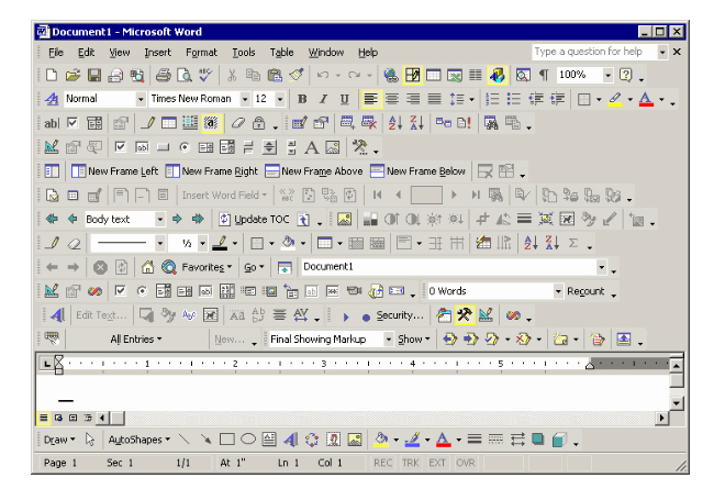
We have higher resolutions and bigger screens. I understand some people don't like the idea of adding more buttons to the UI because it can make it look cluttered and confusing, but rather than just adding padding around everything, why not make the icons higher resolution and maybe slightly bigger to take up the increased available screen real estate?
I'm sick of people associating "modern" with "good" and "dated" with "bad". Modern flat UIs are terrible for discovery, as it makes it impossible to tell what elements are interactable. And IMO, they're just plain ugly, but that's a matter of personal opinion.
Windows 7 with the Classic theme (which really was just a slight evolution over Win2K) was peak UI/UX, and you'll never change my mind. It's been downhill ever since, getting worse and worse with each generation.