I would love some logarithmic y axes on these plots. As is, the faster versions are basically horizontal lines, making one think whether perhaps something might be wrong with the benchmark and the compiler just optimised everything away to an empty function.
Sinilarly, what's going on with the performance of bisect_left_c? (Second graph.) Why is the graph completely flat at first, only to then ramp up with a perfectly straight line? If you add some measurement points in between, will it turn out the high measurement on the right of the graph is actually a measurement error?
Thanks for the feedback! I experimented with using the matplotlib `plt.xscale("log")` function, but because the x axis already distributed by powers of 2, it to some extent is already a log axis (unless I'm making a very wrong assumption). I was curious about the behavior of the lines, and how they seem to ramp up in weird ways. I tried to mitigate by increasing the number of samples in the benchmark, but I haven't been able to get graphs that look as nice as the original article. I think to some extent though, that is because the `sortedcontainers` implementation is so bad. If the `y` axis was scaled better, you would be able to see a more linear increase in execution time.
Also, if you want to, the repo provides a build script for the C-extension so you can mess around with the benchmarks. I would love for you to find some bugs in my implementation :).
> > I would love some logarithmic y axes on these plots.
> I experimented with using the matplotlib `plt.xscale("log")` function, but because the x axis already distributed by powers of 2, [...]
I said y, not x ;)
Also, the x axis is not distributed by powers of 2, right? I see 0 through roughly 2.7*10^8 — either that or the axis is confusingly labeled. :)
I would want two graphs here:
1. High-res linear-linear to show the expected logarithmic behaviour (surely binary search is logarithmic, right?), as well as possibly some performance cliff as you run out of cache and start hitting RAM for a decent part of the search.
2. Linear x but logarithmic y, on which you compare the various implementations. The point is that because all implementations presumably have the same complexity, and furthermore probably have caching issues starting from similar (though not necessarily equal) points, the most interesting point of info is their _ratio_. And since log(2*f(x)) = log(2) + log(f(x)), the ratio between two functions is simply their _distance_ on an yscale("log") plot. Much easier to see, especially if the ratio is like 100x.
Perhaps you'll even see that for sufficiently large inputs, the ratio shrinks because the search becomes memory-bound. :)
Ah, that is fair. I misinterpreted your point. The reason I say the x axis is distributed by powers of two is because it is only evaluated at powers of two:
sizes = [2**i for i in range(1, 29)]
The limits that matplotlib fills in are largely superficial, the benchmarks and the x axis are only being evaluated at powers of two.
Your points about the other two graphs though is very good. I think my graphs could use some clarity.
The main reason why I didn't use a log scale and compute on much much larger inputs is mainly because it would just take too long for my laptop to compute.
Oh I see! That makes sense, but is also quite dangerous: caching issues tend to result in fascinating effects around powers of two. I once benchmarked a fairly naive matrix multiplication algorithm on almost every size between 1 and 2100, and the powers of 2, especially 2048, had the most amazing non-monotonic effects around and on them. Even sizes also strongly differed from odd sizes.
Now for binary search that effect will be smaller, but still, at powers of two you might more quickly get that consecutive probes have the same remainder modulo the number of cache sets, meaning they get put in the same cache set and hence conflict much harder than one might expect.
All that to say: more samples, in between the ones you already have, would be quite nice. Especially on random input sizes (but _also_ on round numbers!), just to rule out any of the above-mentioned shenanigans. (I particularly suspect the large 2^28 sample as perhaps falling prey to this, but perhaps not.)
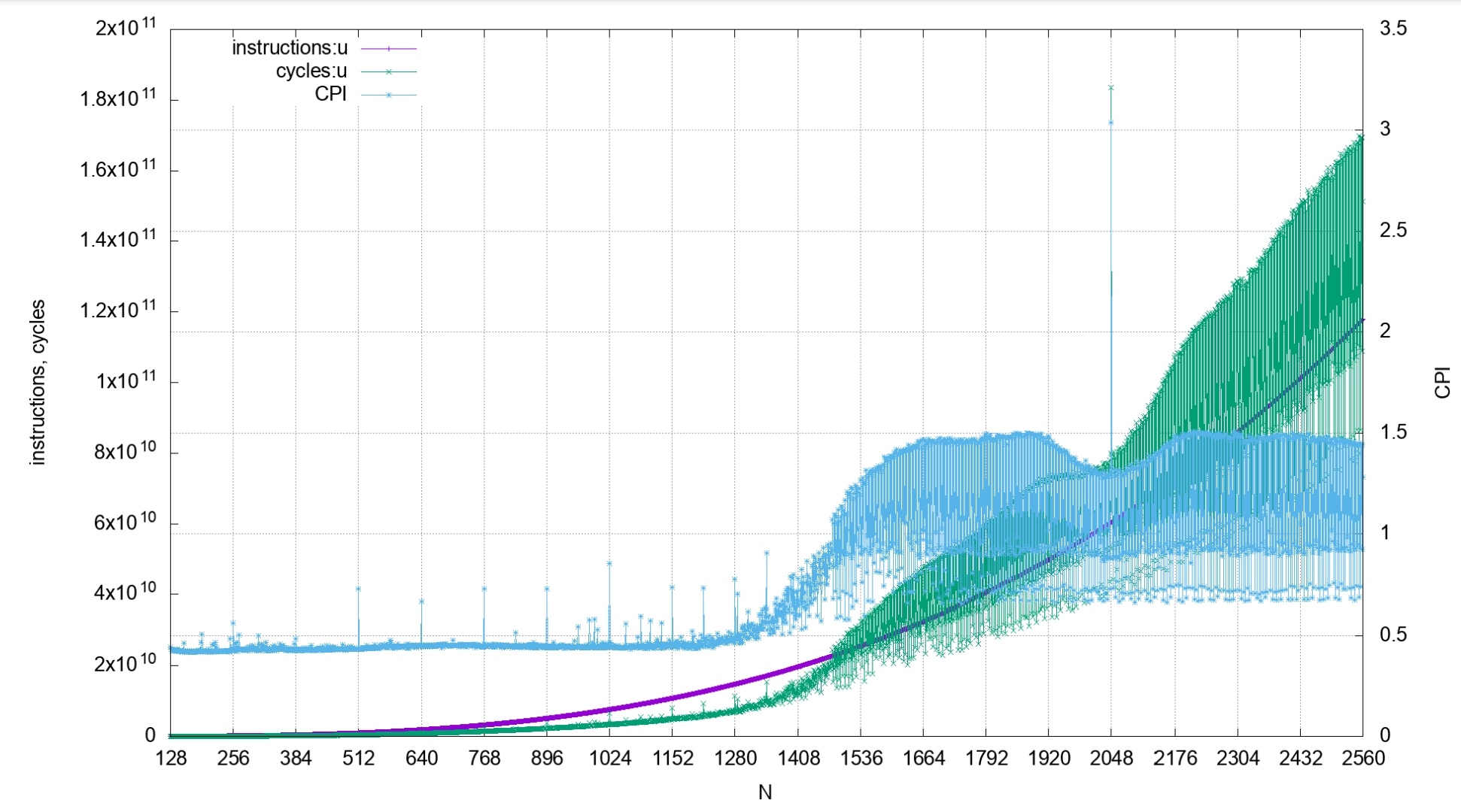
That makes a lot of sense to me--I added another graph to the README which shows the performance at every size between 0 and 2*15, rather than just powers of two :). It is in images as "4.jpeg".
Hey if you take your dataframe or Python object and print it to the console and throw it in a gist, folks in this convo could give you some great charts.
The python objects are all created on demand by the benchmarking code in the repository—changing the “sizes” object will change the number of samples/etc.
Sinilarly, what's going on with the performance of bisect_left_c? (Second graph.) Why is the graph completely flat at first, only to then ramp up with a perfectly straight line? If you add some measurement points in between, will it turn out the high measurement on the right of the graph is actually a measurement error?
If this works it would make a nice python lib.