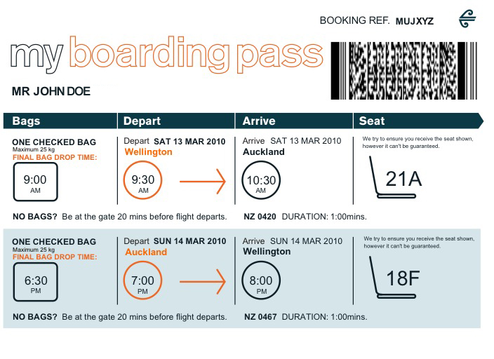
Boarding passes are printed on thermal printers, which are exclusively monochrome. Thermal printing is the perfect technology for ephemeral bits of paper like boarding passes and tickets. The printers are compact, fast and phenomenally reliable, require essentially zero maintenance and have no consumables other than the ticket itself.
This redesign would require full bleed CMYK printing, which is none of those things.
This is a perfect example of why business people tend to ignore designers and regard them as jumped-up decorators. If you're going to suggest that someone changes the way they do business, at least have the courtesy to find out why they do things that way. If you're not trying to solve a real problem, then you're a stylist, not a designer.
As far as airlines are concerned, boarding passes are a solved problem and have been for decades. These supposedly simple changes would cost them millions in equipment upgrades and reduce the reliability and throughput of their ticketing systems, for no obvious gain.
Sure, and it looks nice.. but it still appears to be based on guessing what airline/airport employees do and about their concerns or constraints. How can you know whether a design is better if you haven't even talked to the client?
No CMYK is required. There is black and a spotcolor. Any company worth their salt alo carries a PMS (or Pantone) spotcolor. Example KLM PMS 299 see http://hansstol.totaldesign.nl/nl/klm.html
This means the tickets could be pre-printed with one spotcolor and have the variable info thermo-printed on that. (The design features variable info such as destination in color. That is not possible. Variable white text inside the color isn't possible as well because the color has to be pre-printed).
Nice design. With just a little tweaks it would work well, me thinks.
No, you don't understand printing. Thermal is strictly monochrome, it doesn't do shades of grey. The dot-matrix elements have only just enough resolution for text and are incapable of rendering legible halftone type.
I have no idea why your answer comes in above the other one that was provided hours earlier and said the same thing. Also that one did not make a negative comment ('you don't understand printing').
If you care to click on my username you'll find my blog regarding pre-press, printing and implementing ISO for graphic design and print. Other than that I welcome you to read my article on Smashing Magazine '10 Pre-Press Tips For Perfect Print Publishing' http://www.smashingmagazine.com/2009/10/27/10-pre-press-tips... Cheers.
I feel like we must have read different articles. Here's what the OP had to say about colour printing: "Print limitations (airports seem to have crazy basic print machines, colour may be an ideal but not a realistic ask)"
He certainly seems aware that this might be an issue. Indeed, when you look at the designs, you see that the information generated at pass issue time is either black or one other colour. Thermal printers are already capable of this, as I suspect the OP is aware. So no, the redesign does not require full bleed CMYK printing.
"This is a perfect example of why business people tend to ignore designers and regard them as jumped-up decorators."
A good point, could there be a color background which the thermal printer prints on top of? Even if that's not possible from the full examples it looks like most of the color is branding related so could be converted to black and white.
Yes, this is pretty common for printers installed in service desks at the airport. However, they tend to not have overly-branded stock because in the irregular circumstances you tend to get a pass from a service desk, you might be rebooked on a different carrier, and would therefore have a mismatched boarding pass.
I see your point, but with this kind of thinking we would have badly designed monochrome tickets forever.
Is it a better design? Yes. Does it account for everything? of course not. Is the technology there? Not quite — but ideas like these could spark something in someone somewhere.
As a frequent flier, I neither a) have any issues with the way boarding passes are designed currently nor b) have witnessed bewilderment in fellow passengers due to poorly designed boarding passes.
Is this a case of design for the sake of aesthetics alone?
To any would-be boarding pass designers out there: he first thing I do with a boarding pass I no longer need is throw it in the garbage. They are ephemeral. Disposable. Spend your time working on something more persistant.
I was going to facetiously suggest that if designers wanted to work on another ephemeral product, they should redesign the patterns printed on TP (first suggestion: chevrons indicating which direction to pull). Then I remembered http://www.getshitter.com/
I was wondering exactly the same thing: are boarding passes really _so opaque_ that they require significant redesign?
In fact, I don't even find boarding passes to be ugly. Or pretty. Or anything, really. They just /are./ I usually print my boarding pass at home and fold it into a little square and put it in my pocket.
If you want to redesign the inefficiencies of air travel I think boarding pass redesign comes at the very bottom of a very long list.
The biggest problem I see is finding your seat despite knowing row and column information. The usual problem is off by one errors because the row labels on the overhead bins doesn't line up as expected. It is also hard to tell where rows start (eg where is row 30 when you first come on) so people have to walk forwards while monitoring labels to their side.
No design is perfect. For example, the current United boarding pass does not anywhere print the name of your class of service! If you're trying to access a Lufthansa lounge with a UA business-class boarding pass, you will have some trouble as agents squint looking for the word "business" or "first" somewhere on your boarding pass (it appears nowhere) and grudgingly accept that the flight number has a letter after it which indicates either the fare class (if printed at a kiosk) or the cabin class (if printed by an agent).
So, a UA boarding pass may say "930D" meaning that it's for flight UA930 booked into a discount business class fare (D fare), or "930J" meaning that it's for flight UA930 booked into the business class cabin (J), but nowhere on the boarding pass will it say "Business". I've heard stories of people who are only allowed into a LH first-class lounge when the agents, unable to prove that a boarding pass is really for the F cabin, finally give up and decide that the seat assignment "1A" must be first class.
So, no design is perfect. As everywhere this is an area where you need a deep understanding of what the product is for in order to design a useful product.
One obvious example of something that is missing here because of a lack of deep understanding of how air travel works is the ticket number itself, i.e. a reference to the actual underlying travel document which lets someone travel. You don't need this number immediately (passenger full name and flight number should usually be enough), but it can help a LOT with ancillary systems (online checkin, frequent-flyer mileage credit, etc.) Whenever I make travel arrangements, I always want to know my ticket number, which is strong evidence that I really have bought the trip (and don't just have a "reservation" that can be partially or improperly ticketed).
I'm willing to accept that maybe it was a deliberate choice in this design to abandon the record locator (the six-character code, sometimes called a "PNR", that uniquely identifies a traveler's itinerary from a particular operating carrier's point of view), but abandoning the ticket number seems a bit too much.
For a deeper example, the design in this blog post includes a "stub" which shows you where you're sitting (great) but does not include your date of travel (uh oh). If a gate agent rips off the stub and keeps the "big" part of your boarding pass, you will know where to sit (great) but may have trouble getting retroactive credit for your flight if your miles fail to post (because there is no date of travel on your boarding pass, which may make it harder to recognize and certainly makes it harder for you to remember which date of travel to look for).
(The "stub" in this design does have a barcode, but this almost certainly wouldn't be good enough for retroactive mileage credit. On a legacy carrier, there are something like 15 different mileage programs you can possibly credit your flight to, all with different rules and knowledge about how other carriers work. To get retroactive mileage credit on a flight you would almost certainly want the traveler name, flight number, date of travel, ticket number, and (if you can get it) carrier's class of service.)
  Boarding passes need to change. But here’s the question:
  Is re-structuring the information enough or is the
  boarding pass concept obsolete?
i don't know if the whole boarding pass 'concept' will be obsolete because it basically passes the buck to smartphones, kiosks and intelligent seating (or some other novel contraption which alerts you to where your gate is, where and when you board and where your seat is). Maybe you know something that i don't, but those seem like problems that are solved handily (even if poorly) by ephemeral printed boarding passes with a minimum of fuss.
For me, the problem is primarily that the people who design boarding passes, either printed or mobile, seem to do a remarkably small amount of flying themselves (or at least they are willfully ignorant of the needs various travelers have). It's ok to assume that phones with embedded context info will solve many of these issues, but the amount of information contained in a printed boarding pass is significant and, for the most part, dependency free.
I'm not trying to be contrarian, i also want boarding passes to be obsoleted, but it seems to me that "the wayfinding problem" isn't going away anytime soon.
In what way obsolete? Unfortunately, I don't think it's going to be the "good" kind of obsolete where you don't have to keep track of a piece of paper. The only thing I can see now is that it turns into something of a dna/retna scan or you need to provide something biological to fly.
That doesn't mean people will know how to use them. It's easy to understand what you do with a slip of paper (keep it with your passport, show it when asked) vs get this app, keep phone charged, open app and bring up pass when requested etc.
Years ago people were proselytising about the paperless office and we still don't have that. We're not going to have paperless airports any time soon.
People in Kenya are better at taking advantage of phones than we are; the M-Pesa system is much more widespread than Square is here. People know how to use mobile tech just fine. There will still be boarding passes, but in 10 years, most people are just going to use their phones.
The airline I catch most often has the option of an RFID tag or their branded (RFID) credit card, or you can use your phone to display a QR-code via their app, or an EAN barcode if you just have the confirmation email.
If you only have carry-on luggage you just head to the gate, no need to deal with a check-in counter or anything.
Once you get to the gate, you scan your pass and it prints a small slip with seat + flight number.
Of course, international flights still have all the rigmarole of big paper passes.
Why can't we change the size as well? All the "boarding pass redesigns" I see are still impractically large.
When you fly domestic in Japan, you get a passport-sized ticket. Also, the boarding pass text itself is 100% for your eyes only, any agent will just scan the QR code to verify it in their computer/security/the gate.
It does seem like a fantastic idea to choose a standard size like a passport. Many people have passport wallets / holders. I can imagine a thin plastic credit card sized token in the future that will display the relevant information on your phone when it is near.
But if you already have the phone with you, might as well use the phone itself instead of adding another card.
Although the e-ink re-usable baggage tag British Airways is working on seems cool.... You could have something similar to replace paper boarding passes.
This may or may not be good, but I stopped reading as soon as I saw the labels "Your flight" and "Passenger name" right next to each other. Writing is design, too.
I personally detest the faux-personalisation of adding "your" and "my" in front of everything. To me it's equally as bad as the faux-politeness of having computers say "please" and "thank you".
It's not YOUR plane, it's their plane. Yes, I realise that colloquially we all say things like "hurry or you'll miss your plane", but that's a different context.
It irritates me that designers and marketers think we will appreciate politeness when we interact with a company's computer systems. I don't expect my plane ticket to be polite or personal, because it's an inanimate piece of paper written by formula.
"Your flight" refers to the holder with a 2nd-person pronoun whereas "Passenger Name" refers to them in the 3rd-person. So maybe "Your name" (sounds weird) or "Passenger flight" (label may be too long for the field beneath it?).
I don't see this as a huge issue. I would change the labels to simply "Flight" and "Passenger"
Surely the design is the easy bit? Boarding passes operate in a highly regulated and legacy-technology _and_ heterogenous environment (technologically, culturally, legally, and in terms of corporations involved). Overcoming all those challenges to gain agreement is the hard bit.
I'd be more concerned about cost. With the advent of self-checkin boarding passes have become largely homogenized - boarding passes used to actually be printed by the airline, on their own paper stock, instead of the airport authority's touch terminals.
This isn't an environment where the airlines have a great deal of control over what gets printed, or the printers doing the printing. Going from the extremely cheap thermal paper printers I see in these machines to full-color, thick card stock (like it was in the Good Old Days) would be pretty darned expensive.
Unfortunately the airline industry today is hyper-competitive to the point where anything that does not generate higher bookings and higher sales is basically just all cost and no benefit. Unless these easier-to-use boarding passes results in more bookings, it just doesn't make financial sense for the airlines, who are cash-strapped as it is without being tasked with replacing tens of thousands of printers.
Actually, if the rear / aisle iconography yields faster boarding then the time saved standing on the ground might be worth it. Airlines spend tens of millions on researching faster boarding processes.
To me, the design is intended to make everyone's life easier - that should be encouraged. From a tech standpoint, as long as the boarding passes are still scannable and easy to read, isn't that all that matters?
I don't see how I'm supposed to take these designs seriously when they're based on guessing what the core constituencies need and what their constraints are. It's easy to make something look prettier, but I have no idea if this better serves TSA agents, counter agents, gate agents--let alone the airline's bottom line. How much does it cost to print this ticket compared to the old one? How long does it take? Will I need new printers? Do the barcode readers need to be reprogrammed?
  * No AM/PM on times
  * No ticket number or confirmation code
  * Would a barcode scanner run into problems with two barcodes side by side?
  * Listing the terminal without labeling it may cause confusion
What purpose does the little "stub" serve in the year 2013, anyway, other than to make the boarding pass easily mangled?
There was that time in the not that distant past when the gate agent's pass reader was this giant console that would slurp in your boarding card -- printed on real card stock with a magstripe on the back -- and would register your name, then eject that stub from a slot in the top for you to take on your way to the jetbridge door.
Not since those machines were retired (I haven't encountered one in five or six years) have I had any airline employee tear off the stub. Why can't they do away with that?
You need the stub for seat assignment once on the plane as it is far more convenient. It is also used on some stopovers - for example SQ1 stops in HKG on the way to SIN. All passengers have to leave the plane while it is refueled, and you have to keep the stub with you to get back on again.
If all airlines would just go the way of Southwest you wouldn't need it for seat assignments. I haven't been forced to hold on to a stub for a while now.
But from a higher-level thinking point of view, neither of the requirements you mention mean a stub is necessary. I know this is a little nitpicky, but e need to step back from things like this to realize that the entire premise of a stub is only required because of previous decisions in the system.
The only things the user actually needs is (1) a way to find a seat, and (2) a way to verify their identity to agents. The stub happened to satisfy those requirements, but they could easily be solved in different ways (like Southwest has done).
That's the biggest problem with this entire article, it's only thinking about the last step of design decisions, so it's not going to come up with very innovative results.
The stub is really only needed to find your seat. It is far easier to deal with than people having to dig out phones, works for all passengers and countries etc. Whenever I am on a plane several passengers end up in the wrong seats and the stubs are used to resolve the issue quickly.
On the identity side you already have to travel with identification and that can be used a lot of the time. Things can get complicated (eg being rebooked by another airline), lots of queues, many flights leaving at similar times where the stubs are helpful because people can be helped and processed a lot quicker. The stub is something that can be consistent between passengers whereas passports, drivers licenses and other forms of identification are all over the place.
They also put the baggage stickers on that during check-in, which means keeping the stub is keeping your baggage stickers. And you'll need those in case of lost luggage.
I don't know about you, but I still need to show proof of boarding if I want reimbursement from my employer. In the (thankfully rare) instances when the electronic system fails, I've seen airlines tear off the big part and keep it. They return the stub to me, which I then send to the business office after I return home.
What a waste of time. Boarding passes are not designed the way they are to be helpful to the passenger!
If you put the seat diagram or the boarding priority on the pass, people will demand those things. The airline needs to be able to shift you around. Actually printing Economy instead of Y will cheapen the experience.
Finally, it won't help the airlines/airport squeeze you for more in-flight purchases. Let's face it, the whole flying experience is designed around selling you extra stuff.
It would be handy for me if the little stub had some more information: when the plane is scheduled to land. When I have connecting flights there's usually a point when I'm in the air thinking about whether I have time to do such-and-such before I have to board the next flight, and I can never remember when the arrival time is meant to be. It would be nice not to have to look this up on my phone or in my own notes.
In the same way, there could even be information like "You have 48 minutes before your next flight (BA55)" or "You need to change to Terminal C for your connection".
I presume the reason they don't print this "additional" information is because a) it's subject to change and often does and b) travelers may sue when this information is completely false also c) some of that information may make the traveler or the airline look bad.
For connecting flights you usually have another boarding pass, so you can look at that. Arrival times can vary a lot (because of runway and gate schedules, weather conditions) so you cannot really say "you have 48 minutes before your next flight", but something like "you probably have between 10 and 160 minutes before your next flight", and this is not helpful.
At the very least, they should give the connecting gate number, and if possible instructions to get there and to walk to the gate. I presume they don't do this since the gates are subject to change, so printing this up front could mislead someone.
To me, I shouldn't really need a physical boarding pass. They should just be able to scan an ID and inform me the gate number during boarding.
Qantas membership cards now have integrated RFID tags which can be used in place of a paper boarding pass to drop baggage and alight the plane. The only requirement is that you must check in online within 24 hours of your flight.
In fact, the bag drop is particularly clever. Qantas give their frequent flyers robust bag tags with integrated RFID chips, so at the airport you just scan your card and drop your bag. If you don't have a bag tag, it prints you a "classic" adhesive tag -- with an embedded RFID chip!
What was the last time you knew where to look for "gate"? or "seat"?
making the numbers bigger only help the people handling tons of those per day. Look at that corner, see Gate number. ok, right one. pass.
For the passenger who fly once a month or less, each time in a different company, you scramble the ticket looking for the word "gate" first, which is smallest print in all of them. But "12A" or whatever the gate is, is huge. as "23C", which is your seat, but you don't know that. because the labels are all tiny.
typical case of not thinking about the problem and just making things cuter. Would never call those photoshop pilots designers. Also, color printers for boarding passes? not even virgin has that! another show of zero research.
> The other thing I would love to include is a halfway fold… I bet you have had this happen — You stick your boarding pass in your pocket, take it out at the gate and the stub is hanging off. You reached peak perforation too soon!
Why does your airline ticket need to be perforated at all? In the bad old days, the airline would keep one half and you'd keep the other, but I don't remember the last time I flew somewhere and they didn't scan my ticket either visually or with a magstripe.
They still need it when they need to do a manual boarding. It's not very common, but if the computers are down and they still need to get people on the plane they'll collect the stubs and check people off on a clipboard.
Uh, I just take whatever they print out, stick it in the wallet, and make sure the itinerary is sent to TripIt which works with FlightTrack Pro [1] and Flight+ [2], which will both let me know about the gates…
Sure, it's prettier, but still way too much information.
Anybody that's handling the pass prior to boarding surely has access to a computer system. Why not devote 80% of the entire pass for the passenger's benefit, and just have a small scannable code for the bureaucrats?
Also, the seat diagram is pretty ambiguous and not useful for a plane with multiple aisles. I think a plane specific cross-section of the row would be more useful.
Southwest's boarding passes used to be a plastic card with a number on it. When you got to the gate, they check you in and give you the next card. People board in order, and the cards are collected as you get on the plane to be given to the next set of outgoing passengers.
The system worked quite well, but airport security rules changed to require checkin be outside the checkpoint.
Actually, a piece of paper is great because I do not need to awkwardly unlock my screen to get the boarding pass display; I do not need to worry about an accidental key press switching to somewhere else; if an official needs to actually handle the boarding pass I can hand it over; if the airline rep needs it to change my flight they can do it without having a scanner on every computer. The list is endless.
Also, consider the fact that you have to show the TSA your boarding pass. If you have to unlock your phone for that, they get full access to copy all your data if they decide you look like a terrorist.
Likely not a consideration for most people who don't mind privacy stuff, of course.
Apple's Passbook works from the lock screen without having to unlock the phone itself. The pass shows up when your within close proximity to the airport.
Do we even need an electronic boarding pass? It will not be long before all valid passports are chipped. A security agent or airline staff can just read your passport to verify you are boarding the correct flight. Gate number and flight times often change so it would be unwise to rely on your printed paper for that information. You could be told your seat number by the crew member making the final check at the door of the plane and your initials could be displayed above your sear as a reminder when you near the correct isle.
Don't knock paper too hard. While it's not so good for networked communications, it's awesome for displaying static information, tearing apart, and drawing on with incredible ease (e.g. when you need a picture, text, or information circled in addition to what's printed). It's also very cheap even if it's not free. Paper is also extremely high bandwidth - no waiting to view it. Flipping through a book yields a higher dpi and throughput than the fastest computer displays.
This is not to say that paper is superior for all the uses of a boarding pass, but it's very hard to displace something so usable and accessible to people without smartphones.
I wouldn't care to redesign the paper boarding pass. It will be killed in <5yr.
You better design a good mobile e-ticket with something more than a damn QR code, which is what I mostly find with the airlines I fly... At the moment the only acceptable solution I've found is the one provided by Passbook,
It's a big mess. Apparently someone high up in the company abused the travel expense policy, buying refundable tickets and cashing them in somehow while still getting reimbursed. It's a huge mess and the accounting department has gone from super-lax to draconian.
Interesting concept.. might want to highlight the destination a bit more prominently. When carrying multiple boarding passes, prominently displaying departure point and destination will make it easier to make sure you have the wrong one out at time of boarding..
So many redesigns of boarding passes. So very pointless apart from being nice practices in information hierarchy. There is a weird kind of prestige attached to them, I think that's why designers love doing them. Makes you feel important.
The icon for aisle seat looks like a stack of people sitting on each other's lap. No need to clutter the pass with new icons (that user will need to learn to identify and understand) when the word 'Aisle' is sufficient enough.
I get bording passes sms-ed to me. They only have basic info, but its all there. Then on bording they issue a paper one that you carry to your seat. Works well, but for non frequent users it can be slow.
This redesign would require full bleed CMYK printing, which is none of those things.
This is a perfect example of why business people tend to ignore designers and regard them as jumped-up decorators. If you're going to suggest that someone changes the way they do business, at least have the courtesy to find out why they do things that way. If you're not trying to solve a real problem, then you're a stylist, not a designer.
As far as airlines are concerned, boarding passes are a solved problem and have been for decades. These supposedly simple changes would cost them millions in equipment upgrades and reduce the reliability and throughput of their ticketing systems, for no obvious gain.