One of the amusing/annoying things I've learned when working with business/finance people is how the spreadsheet seems for them to be a freeform tableau with which to conveniently display an assortment of calculations, as opposed to a structured data format.
For example, I'm inclined to list financial data in this somewhat-normalized format in an Excel spreadsheet:
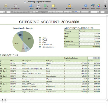
However, people I've partnered with, and who most definitely (I think) have a better grounding in financial math than I do, might structure their spreadsheet like this:
    Apples  1/10/2013   40  $50     Oranges 2/1/2013    10  $40
    Apples  1/15/2013   30  $80     Oranges 1/12/2013   12  $200
    Total Apples:       70  $130    Total Oranges:      22  $240

                                Pears   2/2/2013    50  $100
                                Pears   2/9/2013    20  $40
                                Total Pears:        70  $140
(you can imagine the bespoke text-formatting/cell-coloring that also ends up as part of the spreadsheet)
While I understand that their priority is to not care about data processing...not only is this format extremely annoying to machine parse, but it seems unwieldy for any professional use case. When you want to add more rows to each category, you're going to run into layout problems, for one thing. And at some point, your wrists are going to get a nice dose of carpal tunnel syndrome from all the clicking-to-navigate that you end up doing.
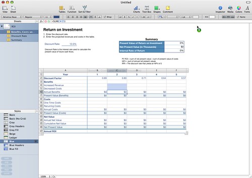
Interestingly, Apple's Numbers tries to break people of this (perhaps unsuccessfully) by decoupling the 'sheet' with the column/row/cells grids. You can have multiple cell tables on a single page.
When I first saw this functionality I was really excited by it as a way to keep data consistent and independent of the layout. In reality I think the tooling around creating/moving/linking the cell groups is a bit awkward to use. Perhaps some day it will get there, or someone else will pick up the idea and run with it some more.
You miss the point, both Lotus Improv and Excel are an (pseudo-)endless wall of cells.
Numbers puts bounded tables on a page[0][1] instead of fitting the pages (and everything, really) into an endless table dating from Multiplan, thus solving the "hacking the cells to implement layout" problem. In this example[2] a table is actually selected, and allows for south, east and south-east extension.
I see the latter case, and far worse, at my work every day as a mechanical engineer. What it boils down to I think is, is that this "annoying" implementation has worked fine for them for many years, and our company at least has little competition and thus little incentive to develop more efficient methods. Seeing this is painful to anyone who's done modern database processing, and I'm making inroads with my manager at improving this state of affairs, but some guys don't know any better and hate being told what to do. One coworker prefers to punch in hundreds of values into his Casio calculator at a time instead of dragging a row in Excel. He knows how to do this in Excel, I've seen it in spreadsheets he's made, but for that particular usage case an old habit dies hard.
For example, I'm inclined to list financial data in this somewhat-normalized format in an Excel spreadsheet:
However, people I've partnered with, and who most definitely (I think) have a better grounding in financial math than I do, might structure their spreadsheet like this: (you can imagine the bespoke text-formatting/cell-coloring that also ends up as part of the spreadsheet)While I understand that their priority is to not care about data processing...not only is this format extremely annoying to machine parse, but it seems unwieldy for any professional use case. When you want to add more rows to each category, you're going to run into layout problems, for one thing. And at some point, your wrists are going to get a nice dose of carpal tunnel syndrome from all the clicking-to-navigate that you end up doing.