This behavior and macOS’s terrible default window management ultimately drove me back to Windows for serious work. I suppose I never fully adapted to the macOS way of doing things, but I never understood what they envisioned users were supposed to do here. Is the intended behavior that the user minimize any VSCode windows that are not currently in use?
But then what if I have multiple windows open because the other has some reference codebase? Do I keep that in a separate desktop instead? It’s just perplexing.
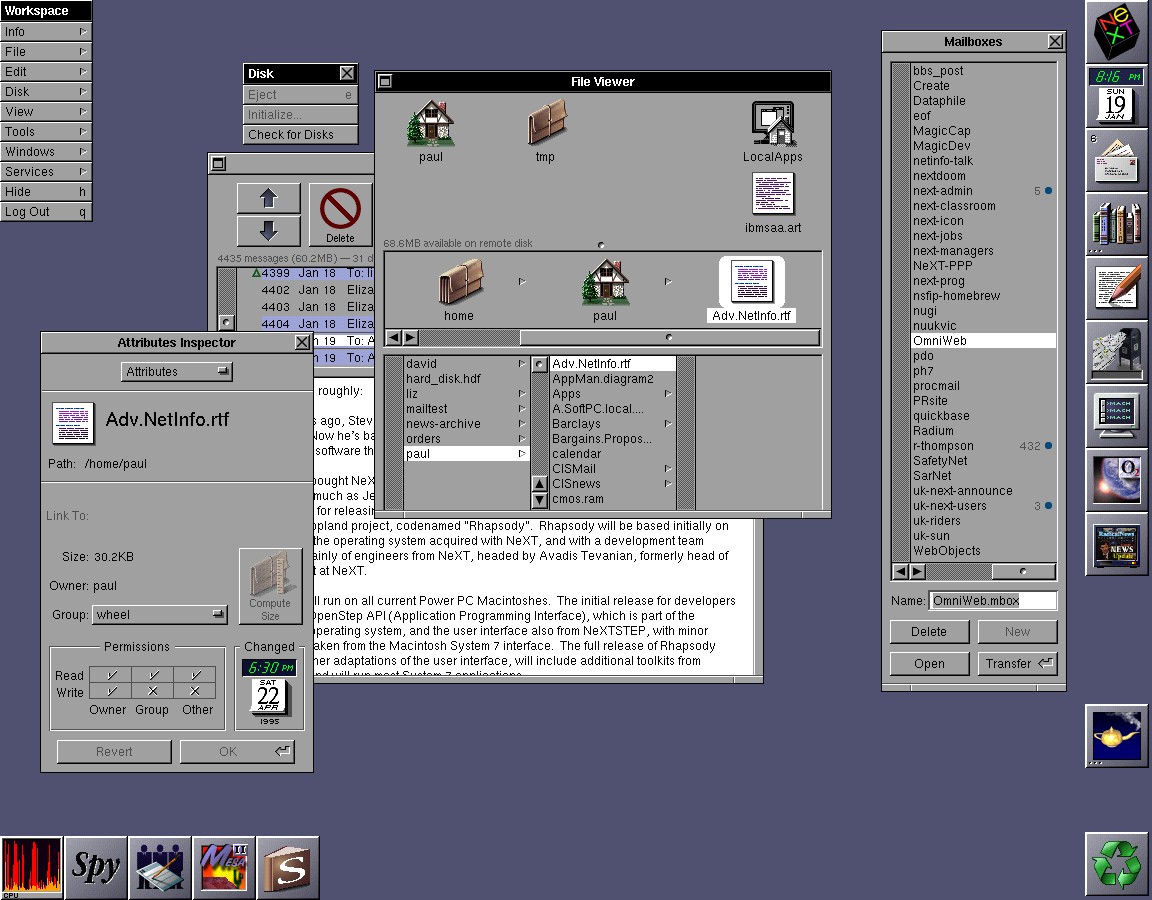
This is where you see the NeXTSTEP under the hood :-). A very long time ago, this made perfect sense, as applications from that era were multi-window. You can sort of see how it worked here: https://www.paullynch.org/NeXTSTEP/NeXTSTEP.screenshot.jpg (no affiliation, just the first relevant Google result). The Mailboxes window (to the right) and the email display window (in the background, just behind the File Viewer window) were separate, but they were part of the same application. That's why moving all of the application's windows to the foreground when switching to that application was the right call back then, the expectation was that you'd usually run a single instance of that application, and that application would have any number of windows. IIRC if you didn't need one of them too frequently, you would just iconify it.
Contemporary applications (especially cross-platform lowest common denominator applications, like most Electron apps) don't really do that anymore. Pretty much every modern email client has the mailboxes view in a side pane or something, whereas NeXT would have the email view, the mailbox view, address book views etc. all in separate windows. If VS Code has multiple windows, they act pretty much like fully separate instances. It's just not the kind of multi-window application that (what eventually developed into) the modern macOS UI was built for.
Edit: this has been, at various times, been retrofitted onto various contemporary design notions in terms of simplicity or intuitiveness. That's 100% ivory tower bull: this interaction model was pretty common on late 80s/early 90s interfaces, especially on Unices, and everyone gradually moved away from it precisely because it was anything but simple or intuitive, it was confusing as hell. Even as early as the early '00s it had gone out of fashion, and holdouts were just plain weird. E.g. GIMP used to have this mode (and just this mode) in its 1.x-releases and if you asked anyone why they hated it, that was their first answer, before they got to everything Photoshop did and GIMP didn't.
It is a windowing system built for one monitor and one desktop. Its metaphors broke completely once they added multi monitor multi desktop per monitor support.
Even the menu bar does not make any sense when you have two monitors. Let alone the useless command tab that picks up whichever window (or not even a window) it wants
Only Gnome does multi-desktop really well in my opinion.
Unless Windows has fixed things, I found that windows alerting on an alternative virtual desktop could lock everything until I found the popup. There were plently of other sharp edges.
Same. I got a company provided MacBook and used it as my daily driver for a few years. Really tried to buy into the ecosystem. But some things just felt so clunky, so when next laptop replacement came after ~3 years it was back to Windows.
Which I'm not also always a big fan of. But the basic interactions just make more "sense" in my head. I thought it was just familiarity in the beginning, but even after getting familiar with my OS X (at the time) I didn't become effective.
In the same vein, I upgraded to Win11, but downgraded after a month because of the new useless task bar. It couldn't "ungroup" stuff. Had to wait for over a year before that came and I upgraded again. Not being able to see all my open windows on the task bar felt exactly as using MacOS again, just stupidly unproductive, why change a winning formula, Microsoft? (My guess is their designers use Mac and don't "get" Windows..)
This does not scale well with the number of windows, e.g. going to the next pdf open might mean cycling through half your windows. Hence you get grouping to make this simpler. Whether it should be grouping by app, by virtual desktop, by time opened, "smart", manual, whatever is another discussion.
I suppose this makes sense if you have relatively few windows that each themselves encompass self-contained task state: one terminal window with a bunch of tabs, one VS Code window with a bunch of tabs, and so on.
I've always found this rather, uh, un-simple to deal with because I both suffer from attention problems and because I tend to want to consider a whole box of windows together as a complete task. macOS's per-appbundle model, inherited from NeXTstep, isn't perfect, but it does at least get closer to what I want.
I used to write software in Delphi, and Alt-Tabbing through several forms and code windows and panels and hypertext documents and compiler error listings and whatnot was just a gigantic pain. It really, really soured me on Windows' way of doing things: I could just never get the mental model down for how windows would stack in the Alt-Tab order given my need to flip between six or seven of them somewhat randomly in the course of working on something.
But then what if I have multiple windows open because the other has some reference codebase? Do I keep that in a separate desktop instead? It’s just perplexing.