I think this suggestion of mine was downvoted last time too, but I don't get why!
One would always want to test stuff in software development, especially if it was fraught and can easily be tested.
Mostly there are no tests to be undertaken in history -hence it it's so much hearsay. But here is an opportunity to gain some genuine certainty, in a way that is normally unavailable! The implementors of this method should absolutely test their process!
It does not say that in the article - this one and on a previous HN submission where I read about this.
However, you are right - if you go to Tutorials and Scanning there is reference to the creation of a 'campfire scroll'. And now we have some detail..... and the detail is problematic.
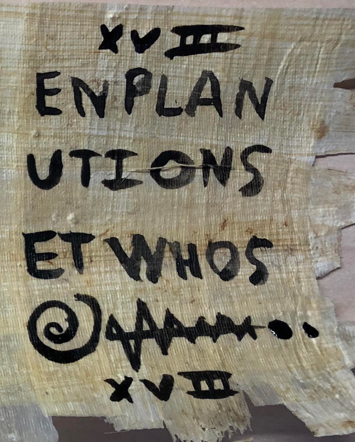
In tutorial 3, halfway down this page (https://scrollprize.org/tutorial3) there is a before and after comparison of the scroll. They ask a question "If you look back to the last page of the campfire scroll (before carbonization), can you see which area of the scroll this segment came from?".
This is mean to be obvious to answer - and one does have the 2 images to compare.
My thoughts on the comparison is - yes at a glance the there is a section that appears to match up - the 'angular squiggle' next to the @ symbol. However, if I look more closely at the 'angular squiggle' I see features and spaces in the generated image that do not correlate with the photo before carbonisation. The troughs are too deep, the spaces are too big. It seems to be a superficial similarity only.
I wish I could show what I mean by referencing the images.. But I will provide links for others to see what I mean when I say there is a superficial correlation only.
Final thought - why not map the 2 images one over the other on the site? Why ask a leading question rather than provide a proof? I hate that kind of presentation - it smacks of providing enough information for someone to make an incorrect snap judgement.
I don't know man... implying people are publishing nonsense is what smacks the most here. If you think they are over fitting, show it, don't just air doubts idly.
I would post an image analysis - but the images on that site make it hard to compare before and after photos, not to mention that you can't post images here.
The before pic, needs to be flipped to compare to the after pic.
The before pic is not flat - it is taken on a curve. This makes it hard to use for comparisons.
The after pics are terrible quality.
As we are dealing with a long squiggle I can't describe it easily - people will be confused at what I am talking about.
However, once you get the images more or less in a comparable state, I can see things do no line up as you would expect. The first 'peak' points a different way. The lines do not line up. Stuff like that.
One would always want to test stuff in software development, especially if it was fraught and can easily be tested.
Mostly there are no tests to be undertaken in history -hence it it's so much hearsay. But here is an opportunity to gain some genuine certainty, in a way that is normally unavailable! The implementors of this method should absolutely test their process!