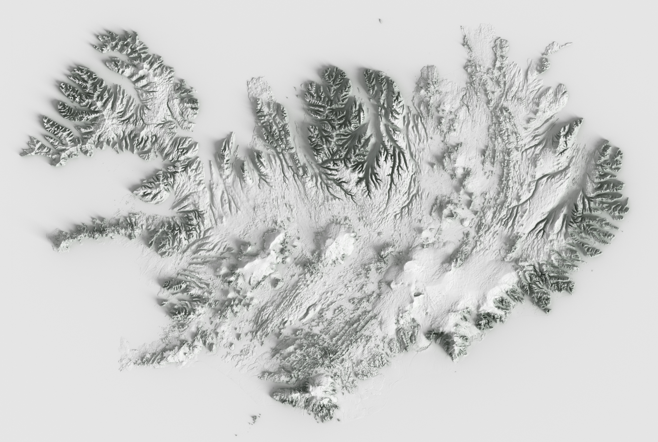
In Swiss-Style Relief shading, the light comes from North West, which is impossible in the northern hemisphere. This makes sunny south facing slopes shaded and shaded north facing slopes light.
Legend says that this was an intentional design decision, because right handed people usually have their desk lighting on the top left of their desk, giving the map a 3D like appearance.
I agree, I misworded the statement, the sun does indeed shine from northwest for a couple of hours in the summer months in Switzerland as well.
The point in the linked article is that the grandseigneurs of Swiss topography didn't like that the usually sunny and warm south slopes show up dark and shaded in the map (and the other way around). They felt this to be unnatural and an error to be corrected. That was back in the 1920s and obviously has not been changed.
Could it be that it renders the sunlight at the appropriate time of year to be on that face of the mountain?
I always want to be on the sunny side of the mountain in summer...
It happens in Switzerland, too, at least perhaps west-northwest. We have a north-facing window (at latitude of almost 47° North) and in summer the room gets sun both early morning after sunrise and late evening before sunset.
This was my first thought too then I remembered my own experiences from every single year. Maybe this is a mid June sun. The sun stays above the horizon more than 12 hours March 21 to Semptember 21, so it must raise and set to the North of the West/East line. If you go North enough it will stay above the horizon all the time in some days and you'll get light directly from the north at midnight.
Sometimes, but not always: it likely depends on the style of the map and how accurate it is as well I think, and maybe depends on people's perception: thanks to computer UI buttons from the 90s, it is common for upper and left-most surfaces/bevels to be lighter, so there is some assumption there.
works well, but that's not really a detailed map with normal cartographic details like roads and towns on overlaid with relief shading, so difficult to say.
However even if you do try and do it accurately, places on the equator are likely troublesome: i.e. the whole of Africa or something: you're unlikely to want to do the fully-accurate thing there of above the equator (or where the sun is) being shadowed from the south and below the equator being shadowed from the north, it'll likely be confusing in the middle.
In fact it works with the provided example but, empirically, it does not on area detail of detailed maps. Crests and valleys will switch.
> computer UI buttons
That is a consequence of consolidated established style, not a cause.
> the whole of Africa
It will work on the view of the full shape but it will not on the area detail, where the viewer will lose the notion of global position and attempt to interpret it like any other spot.
> In fact it works with the provided example but, empirically, it does not on area detail of detailed maps. Crests and valleys will switch.
I don't think that's always the case though: I think it's likely similar to optical illusions: you can technically correctly see it both ways, but it depends on the person's brain and what they're used to as to how their brain sees it.
> That is a consequence of consolidated established style, not a cause.
I didn't say it was a cause, I said that it might lead people to be able to more readily recognise top/left as the lighting direction more readily as "raised" due to being used to computer UIs having top/left being lighter signifying raised elements, and them being more familiar with it that way.
Try it. In my initial experiments as a cartographer, as is normal for learners I did "fix it", and tried "boreal morning or afternoon real light directions": the effect will be wrong, in an actual map. ...Learners "make it the right way" and learn that the """right""" way is wrong.
> more readily
Sure consolidated UIs will contribute in the spiral of circular consolidation of natural ("brain") patterns and conventions, but the "light from top-left" use predates UIs by very many centuries: when we read a document it is more typical to have it lit, not darkened by one's own shadow from a body interposed between sun and document; when we gather around a fire we face it.
Probably because the predominant direction of light is the south. That would mean lighting it from below, which looks unnatural because we're used to stuff being lit from above.
A good instance of the very simple explanations and theoretical solutions that, "hiding in plain sight", manage to possibly remain unseen for a very long time.
I nearby noted that "you do not cast your shadow on your documents" and that "you gather around a fire facing it". There is something even simpler:
___ the sun is above. ___
So, to represent something with a light coming from "the south" is as unnatural as lighting a face from below.
I think it's a very interesting bit of Swiss history. All the work of Dufour (the General of the Swiss Confederation Forces in the Sonderbundskrieg) and his team in measuring, mapping and producing one of the highest quality topographical maps that still holds up today.
As you might have guessed, military purposes were a big driver (it was an army general that was initially tasked in producing the first high quality maps covering the whole country)
> In Swiss-Style Relief shading, the light comes from North West
I would rather say it comes from the top-left. If you orient your map with the south upwards, it will look ok, as if the relief was shaded in the morning.
No, I mean that you have to re-shade the maps with light coming from the south-east, and display them with the south up. This will give the correct effect for the northern hemisphere.
A more universal solution is to orient your maps with east up (which is a common convention), and light them from wherever the sun is. Then the morning light in the rendered maps will always come from the top (in the equator), top-right (northern hemisphere) and top-left (southern hemisphere).
Legend says that this was an intentional design decision, because right handed people usually have their desk lighting on the top left of their desk, giving the map a 3D like appearance.
Here's an article on the topic (german only), it seems to have caused quite the debate back in the day: https://www.swisstopo.admin.ch/de/home.detail.news.html/swis...