> this is not the characteristics of a satisfying tool
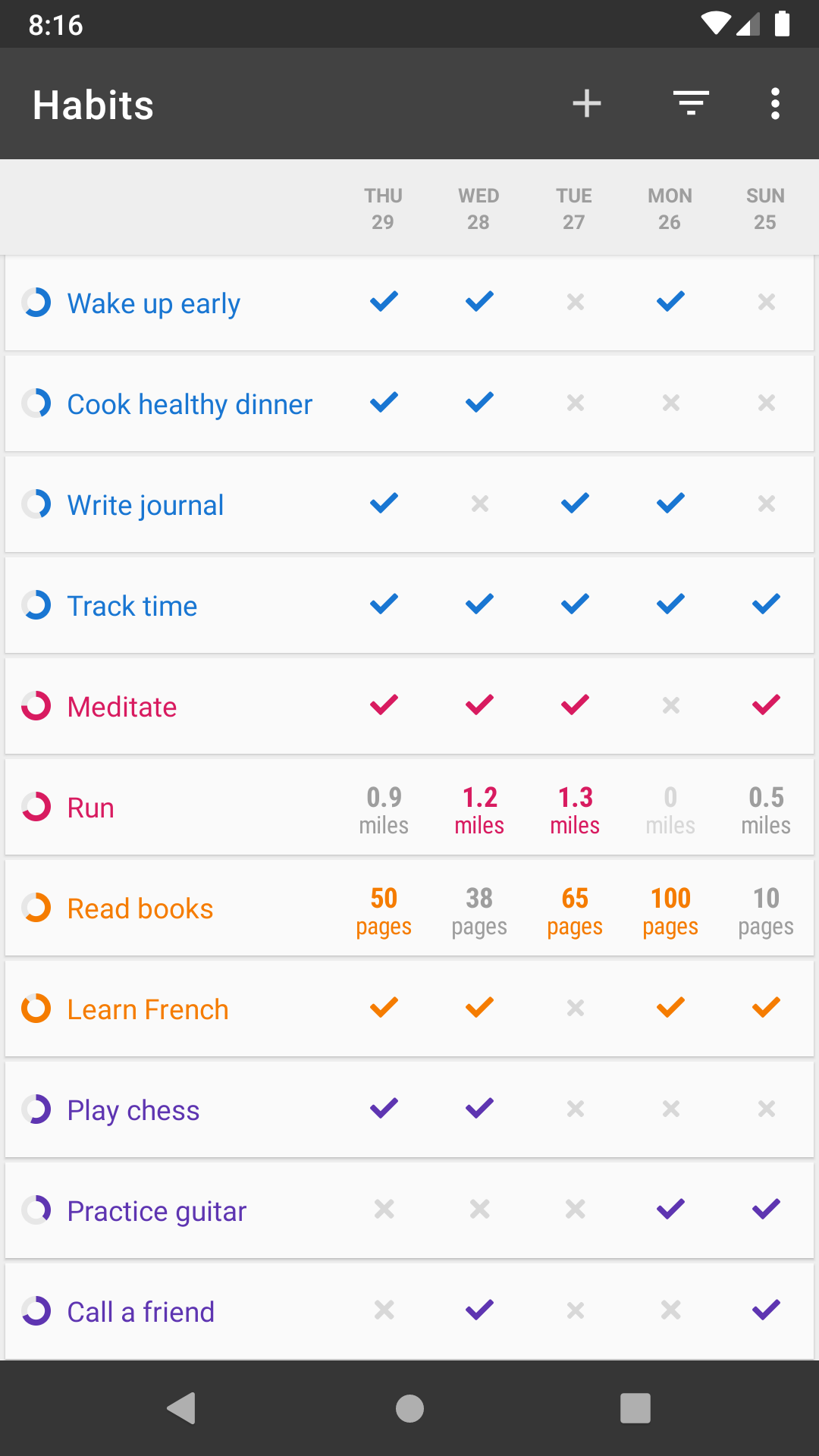
You should take it into context: it's used inside a habit app, where seeing checkmarks is center to the UX. You might not be a user but I can tell you seeing checkmarks is crucial to keep the users engaged, and so making the checkmarks the center of attention can be very helpful. I personally really liked it. Learning apps (Duolingo, Coursera) should all adopt this approach (or at least allow users to opt into it).
Even in context, consider a user may want to check multiple habits off at one time (I've done 3 things, now recording those in the app), and stopping for each one to see this LONG animation would be problematic for me. (caveat - I'm not familiar enough with the app to know if it plays each time or what.)
If it does play a lot, it'd be annoying enough that I'd be looking for a new app or looking to see if there is an accessibility setting to remove animations.
You should take it into context: it's used inside a habit app, where seeing checkmarks is center to the UX. You might not be a user but I can tell you seeing checkmarks is crucial to keep the users engaged, and so making the checkmarks the center of attention can be very helpful. I personally really liked it. Learning apps (Duolingo, Coursera) should all adopt this approach (or at least allow users to opt into it).