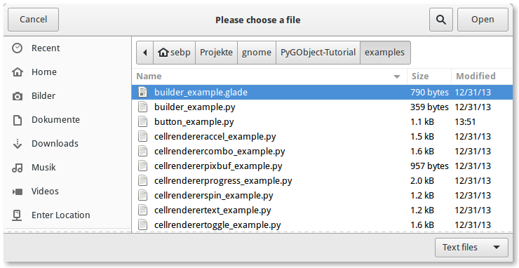
But if very basic components like file choose and file save dialog are incredibly painful to be used with buttons scattered through all window corners (fitts law anyone?) then "nothing" starts resounding in your mind.
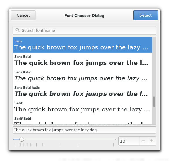
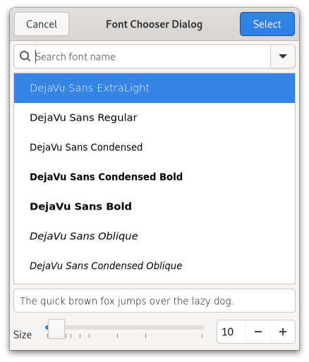
No, there is an extra settings button before select which looks to me totally secondary not to be present by the primary button. Primary actions should be together:
- Choose letter
- Choose size
- Click select
...In a row or L movement
We will get this extra UI darkening: now is not evident you can type font size numbers cause all controls are flat.
In gtk3 at least inputs look like inputs and buttons look like buttons.
The non-standard and objectively poor positioning of the buttons is fascinating. What was the logic behind this?
It seems to me that designers are much less likely to give their time for free to a software project than programmers. Is that why OSS suffers from problems like this? A junior UI designer would never make these kinds of decisions.
I can understand why designers wouldn’t work for free. What I don’t understand is why an average coder couldn’t do some basic googling and learn the fundamentals. You can get a long way by imitating commercial work and following standard conventions. So is it lack of skill, or some sort of mistaken belief that the conventions established by the experts are wrong?
I’m wondering here if the idea is to imitate a forward/back step from a wizard (albeit with the buttons in the “wrong” vertical position) Not a paradigm appropriate for repeated everyday interactions, mainly because wizards are not designed for efficiency.
Without strong leadership and buy-in from everyone involved, it's very hard for design or UX to be involved in open source projects in a meaningful way.
Implementing a design requires discipline and a shared vision, which is often against the bazaar-like nature of open source projects. Everyone's working on their own particular piece and can't agree about anything at all – just look at the internecine battles that are still going on about which init system to use.
In my experience, any attempt at making an interface better, even if it's proven with data and testing, results in extreme pushback about dumbing down. The attitude seems to be that making software accessible is not 'real computing' and therefore should be fought tooth and nail.
Designers often don't work on open source projects not because they don't work for free, but because it's a miserable experience.
Having said that, good counter-examples to this are the recent Blender redesign, where significant effort has been put into making the software more consistent and easier to use, and the Elementary distro where one of the goals is to create a good user experience.
Reason? i can only think like:
what? space is not optimized! there are useless corners but all buttons at the bottom. also aesthetically it looks too heavy. let's visually balance everything moving every button to every unused corner space.
yeah, looks great! Check done!
Now, let's get rid of all visual clues for actions/controls...
The positioning is not objectively wrong. Where do you get this from? Did you make tests with people who never used a PC before? Who are not biased? Or is this your opinion, which would be subjectively by definition.
UI usage is mostly learned.
Just to be clear, I don't think GTK is the perfect UI system. In my opinion, there is none.
UI usage is mostly learned, you're right. All UIs are fairly arbitrary, helping users understand the current state of their computer and perform actions, by using metaphors to help construct a mental model of what's happening.
But we need to be aware of those learned habits, metaphors and conventions and build those affordances into our own designs if we want people to use our software efficiently.
A convention often used in modals and other popup windows is to put the close icon in the top right. So putting the confirm button there could cause a user to click it wanting to close the window and confirm a destructive action instead.
Another convention is to put the confirm/cancel buttons at the bottom of a dialogue window. Buttons like those don't normally go in the title/toolbar, and putting them there goes against the top-down, left-to-right way we read things.
Putting things in non-conventional places is not 'wrong' per se, but adds extra friction to every interaction.
No, it's not true. On the top of my head there is Inkscape which truly is intuitive (despite GTK) and, arguably with their latest betas, beautiful.
I wish we could have something like it with Qt/KDE. Calligra's Karbon once was a nice promise but it is now only a shadow of what it was meant to be and even living a slow death.
The OP is saying that the comment that says GTK is unintuitive is useless is true, and you are saying that GTK is beautiful and intuitive, which is just confirming the OP's comment. I think you miss the point here.