Really great! This reminds me of how epic and iconic this company truly was -- I lived in a constant state of delight as a child using their software and software developed on their platforms starting with the old BRUN command on apple ][
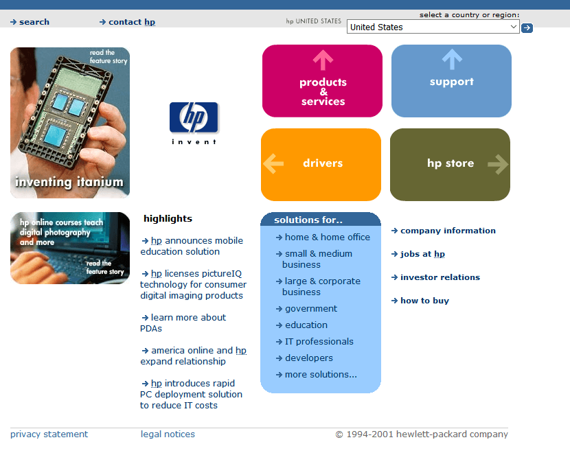
For a few years around 2001, rounded corners were a big part of hp's branding. I was in a dev shop that maintained part of hp.com, and we had to have them everywhere. I didn't work on their site very often myself, but I think that team must have been experts at rounded rectangles. :-) At the time it was still sort of a cool effect on the web.
This made my day dude, thanks for that. Imma dropping everything now and going to make rounded corners button with WebGL canvas, using signed distance function in a fragment shader.
I told my wife it wasn't possible for her website since I didn't want to do it with images to coddle IE, which was apparently the state of the art at the time. She still brings it up 10 years later!
That reminds me of the old trick of using a 1x1 pixel in an empty table cell to ensure that internet explorer would actually expand the table cell to whatever width you set it to (height still needed another trick if i recall correctly).
would work, too, but then the minimum height of the cell would be whatever the line height was set to, and the line-height property didn't behave the same across browsers.
It's funny how old tricks make a comeback. I see a lot of 's in React codebases to preserve whitespace around JSX tags.
And the old trick of a 2x2 pixel gif with one colour transparent, and the other a non-transparent colour which, when set as a background to the table cell, provided an illusion of colour transparency with the main background behind the table.
I never did it myself. I know there are plenty of reasons to dislike flash. And I know plenty of people absolutely hated sites created solely using Flash.
But I have to admit I enjoyed the creativity I saw on many Flash sites. There a generic sameness to much of the modern web. I know Flash sites were useless for SEO, and probably for accessibility too. So I don't think things are necessarily worse now. Just more generic.
Of course, you can create a Flash-like site using web-native technologies, but it's probably more work.
Wasn't the problem with "Flash sites" that it was way way worse than any regular website... as a website? Kinda like SPAs today. You had to reinvent stuff the browser already did perfectly. But as long as you made Flash APPS to be run embedded on websites, it was pretty awesome. Animation, video, etc. No competition, hands down just great tech... until HTML5 caught up.
I was going to say something similar. A lot of the drawbacks from flash sites also apply to current SPAs. I know you can get usable and SEO friendly SPAs, but it's so much work compared to plain HTML files or templating in the backend.
Until surprisingly recently, there was no built-in way to make a rectangular element on a webpage have rounded corners. People had to use all sorts of dirty hacks to make a final product that "looked like" it was a native, built-in feature. Usually in the old days it basically amounted to various forms of "putting a picture of a rounded corner" (often a gif) in each of the corners of the element you were putting on the page.
There were a lot of different ways to do that, but one of them was to use "tables" - tables these days are usually only used for what their genuine, semantic intent is: for drawing a literally spreadsheet-like table of data. But back in the earliest days of the web, they were the only controllable way to visually lay things out on any kind of grid, so despite the fact that they were "supposed" to have nothing to do with visual layout, they'd get used all the time for that - often getting used to do visual borders and stuff.
So to do rounded corners, you'd basically make a table that was a 3x3 grid. In the corner elements of the grid, you'd have tiny pictures of rounded corners; in the side elements of the grid you'd basically have nothing (they'd be really skinny elements, either very wide or tall). Then the middle element in the grid would be gigantic, and would hold your actual content.
I was about to weigh in on how 9-slicing is absolutely a valid strategy for UI components, and give you an example from my professional work, only to realize that I can't think of a single example that wasn't, "hack around some library that doesn't have border-radius".
I'll be glad for the day when 9-slice is a truly obscure technique.
And for an authentic contemporaneous example of this technique, here's my website that I designed in 2002 when I was in high school: http://cydeweys.com/archive/
You won't know it from looking at it because you'll only see the rendered static HTML, but that entire site was actually written in C++. Using the AP C++ libraries (yes, that AP).
Is this code adding successive divs to simulate rounded corners? Looks incredible -- invariably someone would need animation on these too would this work?