Gosh there are a lot of these programs, aren't there?
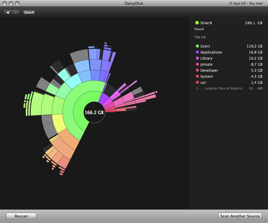
For some reason I find it really hard to read these tree map visualisations. I know the theory and all that, but for me they just aren't an intuitive way of displaying that kind of information. For me a radial graph (i.e. pie chart like) is much easier to grok - I don't even have to think about it, I just get it. Seems like there must be plenty of people who don't think the same way though, given how many different tree map disk viewers there are out there!
I've used treemaps for many years, to reduce disk space, and have been somewhat enamored of them.
Then earlier this year, I happened to use flame graphs for visualizing profiling data.
This is when I realized I hadn't quite understood flame graphs. It became obvious that you can use flame graphs for visualizing the SPACE used by a tree hierarchy as well as TIME.
I googled and Brendan Gregg already wrote about this!
So from now on, I believe I will use flame graphs instead of treemaps to visualize this space.
-----
Details: A common point of confusion for flame graphs is that the Y axis is "time elapsed". (Chrome dev tools has a "flame chart" where the Y axis is time elapsed, but it's not a flame graph.)
The Y axis is "cumulative time used", and the X axis is the call stack. Combining call stacks sampled at different times gives you a TREE, because a given function calls multiple functions.
So if that's clear, it should be clear why flame graphs can be used instead of treemaps. They are the same visualization! And flame graphs have the benefit that they use a one spatial dimension to represent quantity, rather than two. TreeMaps have the same problem as pie charts -- human perception isn't good at measuring areas.
Also, with treemaps, you have error due to the inability to represent a internal directory of zero size (you need some space for the label). Flame Graphs don't have this problem because directories are stacked on the Y axis.
There's a few reasons why rectangular shapes are superior... They fill the available space better than circles, and you can generally compare areas in rectangular shapes better than areas with curves. But, generally you're using these tools to spot outliers, in which case either approach works just fine.
You could try this Electron-based app SpaceRadar that should run on Windows, Mac, Linux https://github.com/zz85/space-radar
It has some support for sunburst graphs, flame charts, and treemaps (disclaimer, author here)
You can drill down in Diskitude by right clicking. I agree it's not as nice as Daisy Disk, but it's the best I've found for Windows (for my tastes) and you can't beat the price...
The problem with radial graphs is that files get visually larger if you move them to a directory deeper. They're fine for a single layer, but not hierarchical.
I would suspect it works in a similar fashion to this[1] modification of WinDirStat, which parses the MFT to do rapid scanning, but loses the ability to selectively refresh parts of the tree.
It unfortunately doesn't seem to work properly with Storage Spaces. It can account for about 2% of the used space on my 50%-full thin-provisioned D: drive.
Not sure about Storage Spaces, but for non-local files in Onedrive on Windows 10 there are two size columns in WizTree for size and space on disk. Not sure it lets you select which value is used for ordering though.
For Windows my favorite tool is SpaceMonger version 1.4 (last freeware version). For some reason I find the layout algorithm very pleasing and the nesting easy to read. Other apps tend to put too many little rectangles too close together and it becomes unclear which files belong to which directory. Also I really dislike the popular "pillow" effect.
QDirStat —it's original code, by the same author— is actually part of KDE.
Just open Konqueror, visit a directory and select View -> View Mode -> File Size View.
I agree that treemaps are confusing
Thats why I prefer to use: Directory Report
http://www.file-utilities.com
It looks just like the MS-Explorer but always shows the folder size
This program is awesome. It's useful for e.g. quickly running in a website project folder to figure out what's taking up space as you can browse and delete files as you go.
I know what you mean. I'm building a terminal-based semantic web app after having started out in Ruby on Rails because I was finding I couldn't think about the app itself because of all the web stuff getting in the way not to mention prevaricating about what front-end framework to use and to Webpack or not Webpack and on and on. I would use a console version of Rails in a flash.
My google-fu is failing me, but there is a tool that can parse the output of du and present it graphically (written in Tk I think) which can be useful for headless systems.
For some reason I find it really hard to read these tree map visualisations. I know the theory and all that, but for me they just aren't an intuitive way of displaying that kind of information. For me a radial graph (i.e. pie chart like) is much easier to grok - I don't even have to think about it, I just get it. Seems like there must be plenty of people who don't think the same way though, given how many different tree map disk viewers there are out there!
For what it's worth I use Diskitude (http://madebyevan.com/diskitude/) on Windows and Daisy Disk (https://daisydiskapp.com/) on Mac. Both are great!