I guess the old copy is showing up for everyone. It was updated last night but changes weren't saved. It'll be fixed later today.
It's not so much that people won't use it. If they won't use it or don't find use for it, you won't even get signups in the first place. I am only strictly speaking from experience but if you have a product that people don't want to try, they won't sign up for it. I've done this before- the question is- why are people signing up for it but only want to try it out in the app store?
Yuriniyazov makes a good point- maybe they're afraid of downloading it anywhere else besides the App store due to possible malware/security breaches. I'm definitely willing to take that as a strong possibility although it's just a little off from what we expected before with grooovy.
Hm, for some reason, you're viewing the old copy on the site. It was updated last night but I guess something happened and the changes didn't go through. I'll have this updated shortly.
I get where you're going with this but we don't find the need to fully list out all features/functions at the point with a landing page. The purpose of the landing page was to obtain signups, which we're getting successfully. The issue is that all these people just want to wait for the stable version in the App Store. I had someone email me just 5 minutes ago telling me that he doesn't like betas because they crash. What do I say to that?
When we are ready to launch, we'll have a full site letting people know what we're about. We won't do it any earlier because there are some key features to making this app work but we don't want to disclose until we're almost ready to launch.
The reason why we enforce the description of the photos is because it's usually the meaning behind the photo rather than the photo itself that matters.
If you tell people you like gummy bears, they don't give a crap because millions of other people in the world do. But when you tell them that you eat all the white gummy bears last and you have to eat them headfirst, you've provided a very intimate and personal bond to which someone else can relate to. Anyone can take a photograph, but only you can tell people the story behind it.
That's true. But at the same time, there has to be at least 1 user out of 386 signups now that would beta test right? And a lot of them are saying they'd want to use it but just want to wait till it's out in the App Store. Is it the new norm to only start using apps that's already stable and in the app store?
Friends of Friends who've used this app are still using it even now and it's slowly expanding through word of mouth. So we know that there's a market for it, but we're just not sure why our signups are unresponsive when it comes to beta testing.
"Is it the new norm to only start using apps that's already stable and in the app store?"
Wait, are you saying that there was ever a time when it was the norm to find a website that promised an app, and then send your UDID to the makers of that site in the hopes of receiving an IOS archive from them that you then have to drag via iTunes onto your phone?
You guys suffer from tech myopia. I am very technical, I have written iOS apps, and I would never put something onto my iOS devices that I just received from some dude on the Internet, and I know that Apple puts a fat sandbox around it; compare that to an average user who only know how to get apps from the App Store.
We do it via hockeyapp download link. We didn't think it was a problem considering the fact that Grooovy's beta test went well and everyone else using it currently is doing the same thing.
But I think you make a really valid point. I think your reasoning so far is the best I've gotten so far to explaining this odd trend that's never happened with us before.
I think that there's potential but the current layout of the homepage doesn't appeal to me. Just because of the homepage, I'm not inclined to continue using the app. I know you guys aren't designers but there are a few improvements that I can see.
1) Your tagline on the bottom of the homepage tells me more about your service than the copy with the "Have the best vacations humanly possible". Lists are boring, especially without visuals. Because the homepage is the most important page, I'd focus on only getting them to try search first then find out about all the other features you offer.
2) As many have mentioned, the video thing is really annoying. I click on the video to expect something to watch, but it's blank. If you don't have a video, don't put a placeholder image there yet.
3) Where do you want to go and when? default text in the searchbar. The less the user needs to type, the better. It's also MUCH more convenient for the user to select the When from a drop down list because they usually have pretty precise dates they want to travel. Because there's this extra option, I didn't know what to type at first. I had to search 3 times to realize that you do City, State and Country.
4) Because your site doesn't have any visuals, your featured lists actually take most of my attention. Those should never take away from your search bar which is your call to action.
I'm no expert on design, but I'm just listing out what I've learned the past year (my homepage for a past startup was very similar to what you have now).
I took a few minutes to make you a sample homepage mockup that incorporates a lot of the stuff I mentioned above. Design is a really subjective matter; everyone will think differently of the mockup below, so it's up to you. Just my two cents.
Well, the problem that I mentioned is that you no longer have the opportunity to actually set your goal to 100% language awareness if your startup had made it BIG. You don't have the time to do that when you're managing a startup like that. Also, it'll cost your team more time to debug and fix your problems than for the programming wizards on your team. Your comment, although appreciated, didn't really respond to the post.
Well, the problem that I mentioned is that you no longer have the opportunity to actually set your goal to 100% language awareness if your startup had made it BIG.
But that's not true. You're buying into limiting beliefs. You need to widen your frame.
For example, if your startup is successful (enough) you can hire a CEO or COO or whatever, let them manage the day to day stuff, appoint yourself "Chief Scientist" (or even CTO, whatever) and go back to focusing on coding.
Besides, at the end of the day, you can set your goals to anything you want. There are no limits. As the man said Surprise me, challenge me, defy me.[1]
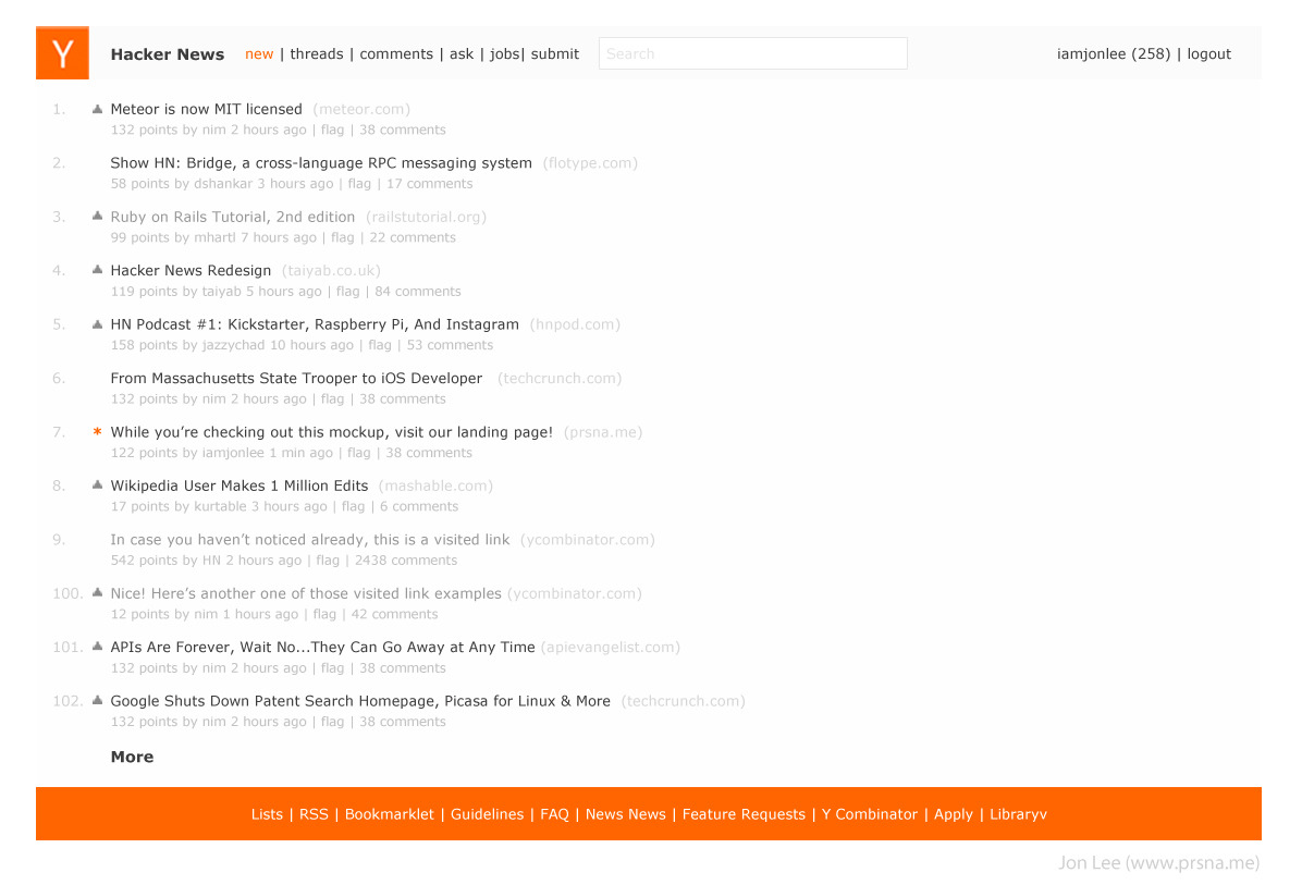
Here are some thoughts on why I made mine this way:
1) Hacker news is read by hundred of thousands of people every month- to adapt to a completely new design would wreck the user experience the users have come to expect.
2) Your patterns and icons, while I appreciate the gesture takes focus away from the headlines. The most important thing should be the headlines on hacker news. That's how it was designed to be. Everything else should pale in color compared to it.
3) As SeoxyS mentioned, I designed mine as to not disrupt the functionality that everyone's used to. What I did was "design" the page to improve readability. I made the background color behind the text a light grey so it's not as gloomy as the current site and used a dark grey font rather than the black on current site to improve faster reading. Black on white is always tiring on the eyes, which is why I tried to adapt different shades of grey.
4) I don't like HN's top nav bar right now because it takes focus away from the logo. The logo should be consistent with the one found and recognized on YC's main site. A logo on the site should be loud and clear. I made the top nav bar a darker grey so that it would give focus back to the logo.
5) The selected links are now orange instead of white. By having tiny accents of color, it adds the kind of eye candy that you want but nonetheless tied in with functionality. UX comes first, then UI. You can make something pretty after think about how you'll first make it user-friendly.
6) To improve eye candy, I gave the bottom nav the bright color of HN to really lighten up the page. I felt that otherwise there would be too many grey areas.
7) I moved the search to the top and yes, this does change what the users are used to, but in my opinion a good change. I've read many posts where people (including myself) have had a hard time finding the search button. To move it to the top nav will adapt to web standards.
Normally, I'd make the search larger and start right aligned at the end of the top nav bar and instead move the username + logout link above it, but I felt that it might be too disruptive, so I sacrificed what looks the best for a better experience (this is important).
The main text is too light and low-contrast: it looks like it is frightened of being there and trying to run away and hide! (and so the most big and powerful thing on the page is the footer, which does not seem the right priority...)
RE: 6) The orange, in-your-face footer is very distracting. My eyes are attracted to it constantly, and away from the articles (which as noted by the other commenter are too low contrast). My $0.02



It's not so much that people won't use it. If they won't use it or don't find use for it, you won't even get signups in the first place. I am only strictly speaking from experience but if you have a product that people don't want to try, they won't sign up for it. I've done this before- the question is- why are people signing up for it but only want to try it out in the app store?
Yuriniyazov makes a good point- maybe they're afraid of downloading it anywhere else besides the App store due to possible malware/security breaches. I'm definitely willing to take that as a strong possibility although it's just a little off from what we expected before with grooovy.